Faculty Name: 17/04/2020
Faculty Name: Vaibhav Mohite
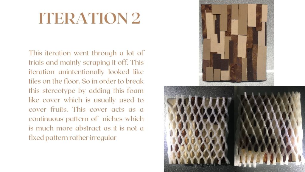
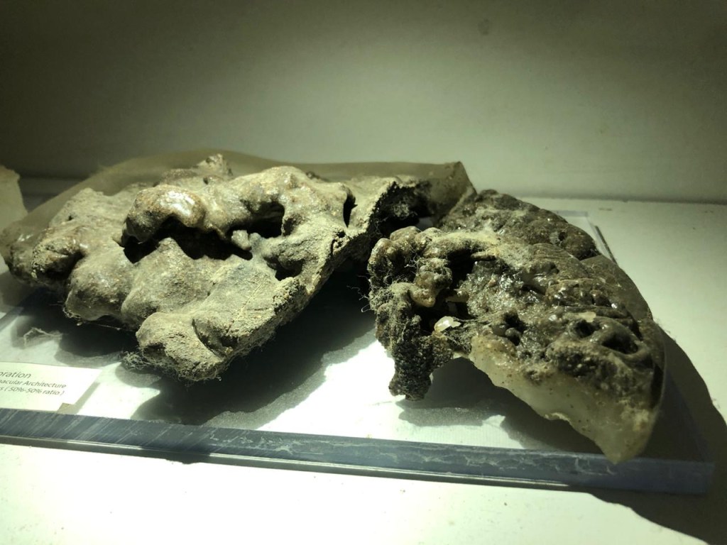
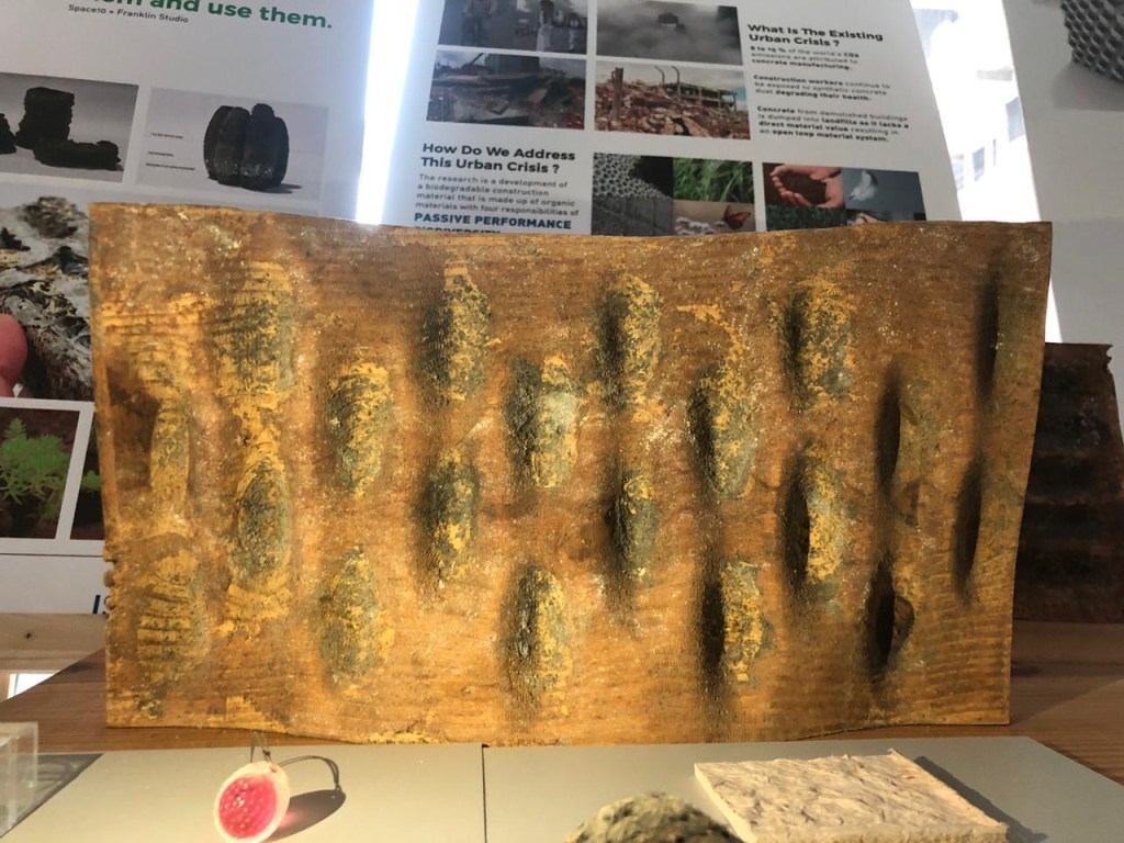
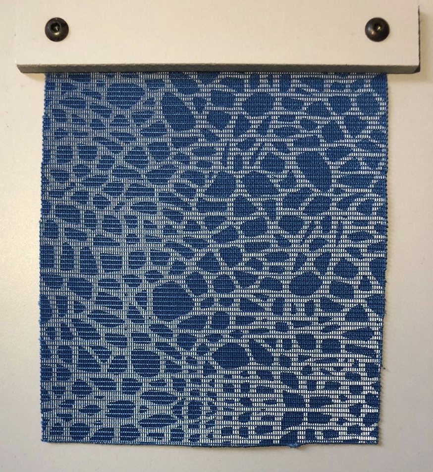
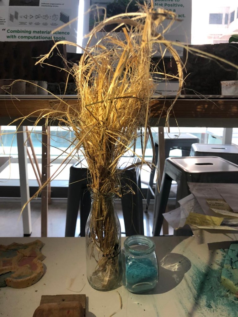
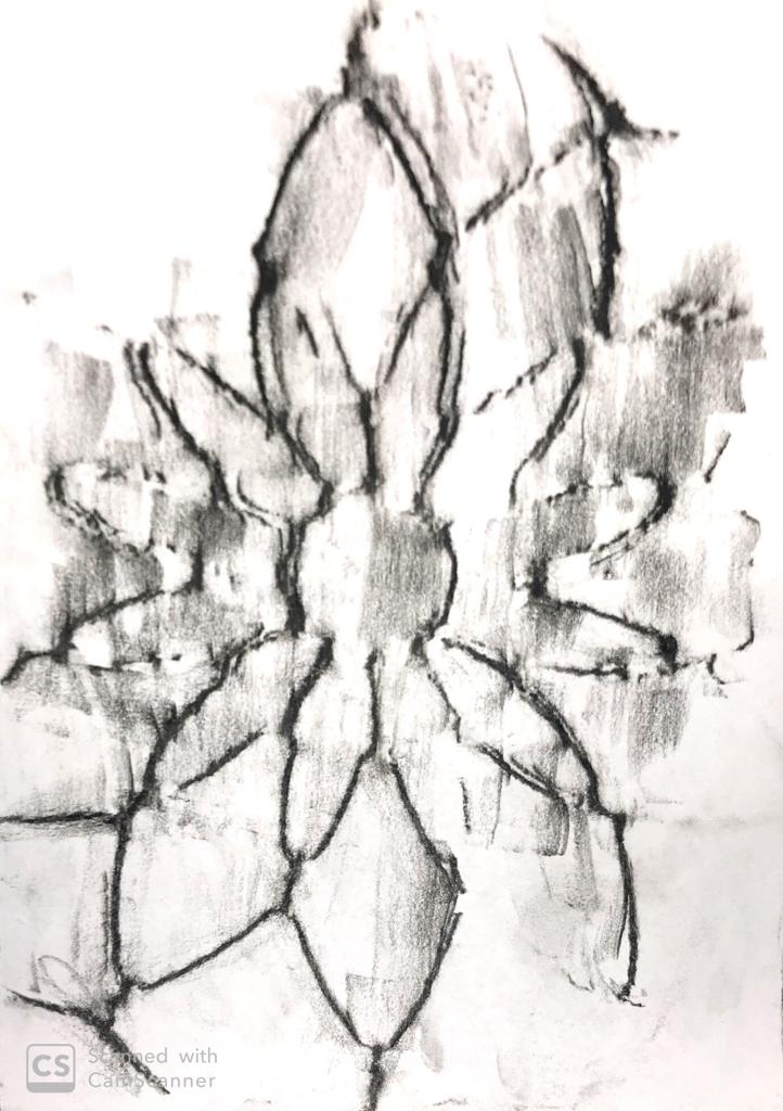
For the final week we made a few iterations for the project and then compiled it in the form of a pdf.

Faculty Name: 17/04/2020
Faculty Name: Vaibhav Mohite
For the final week we made a few iterations for the project and then compiled it in the form of a pdf.
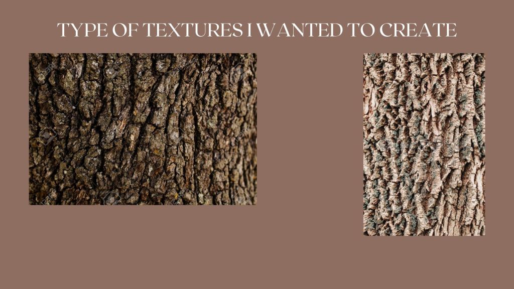
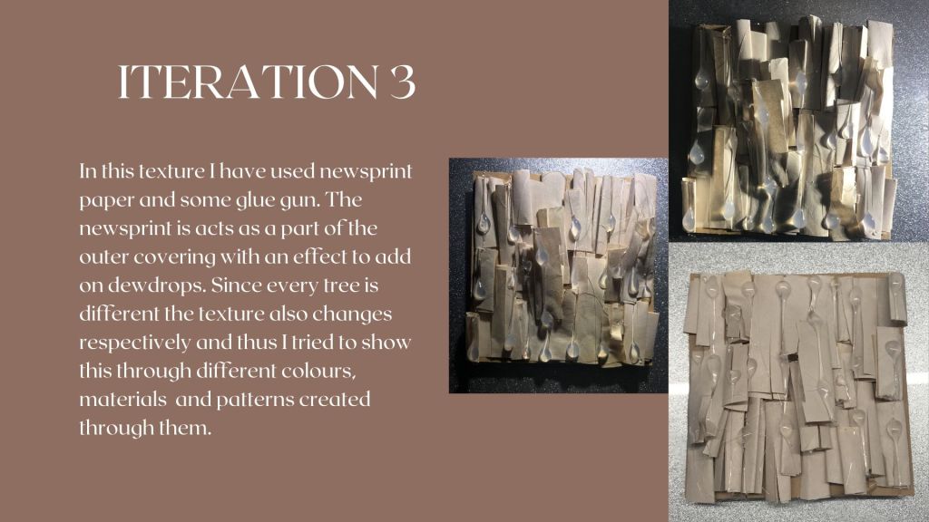
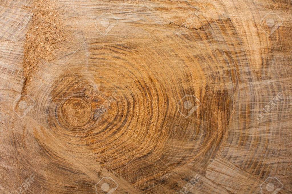
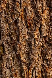
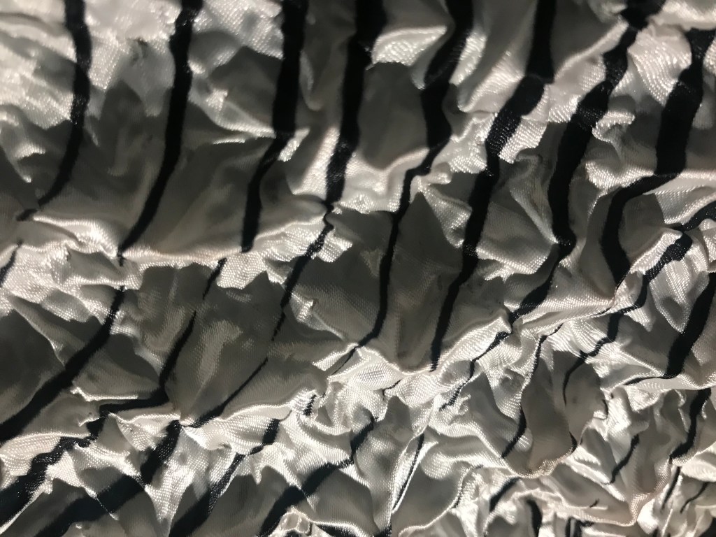
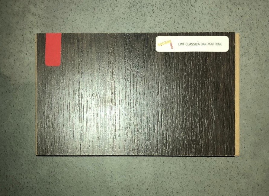
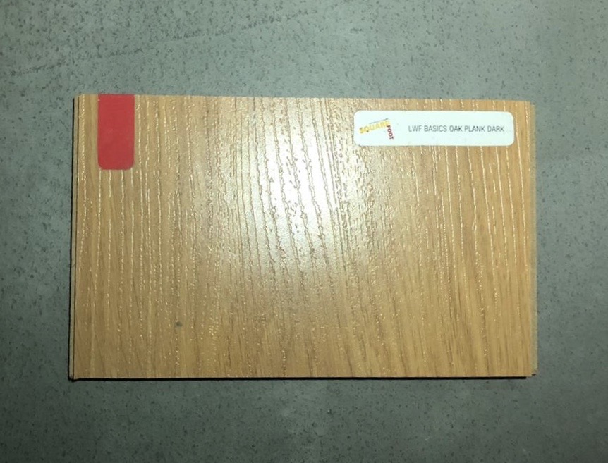
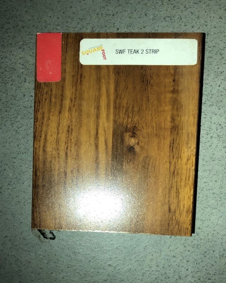
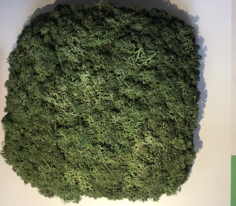
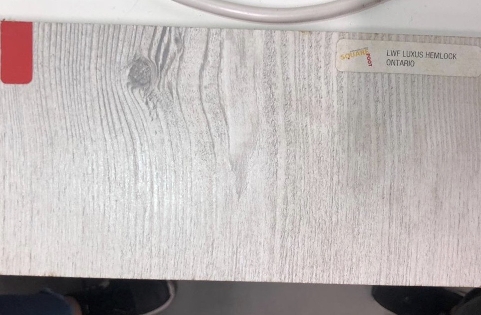
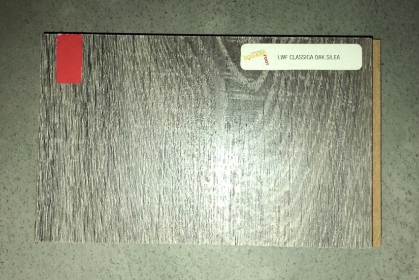
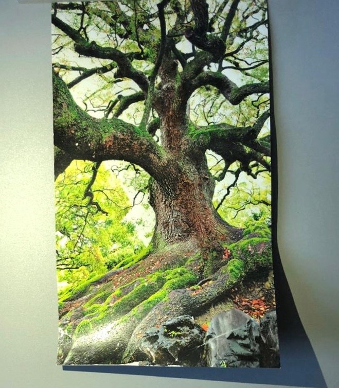
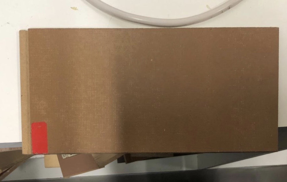
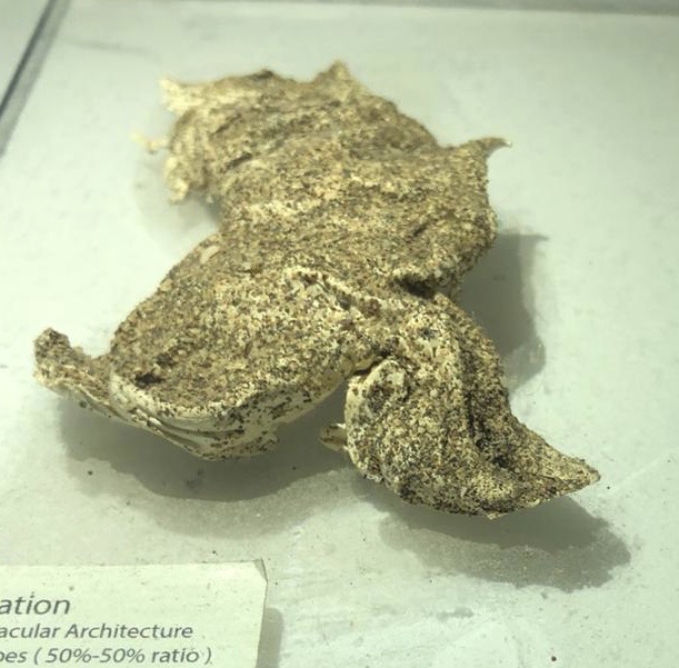
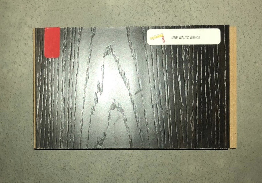
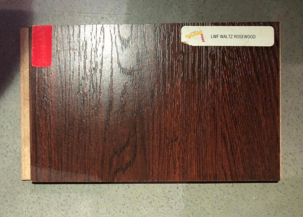
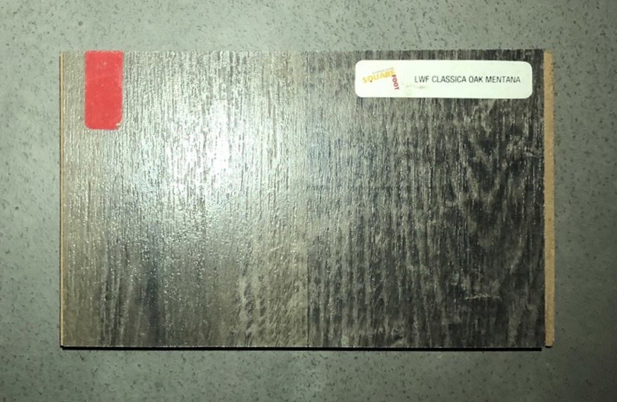
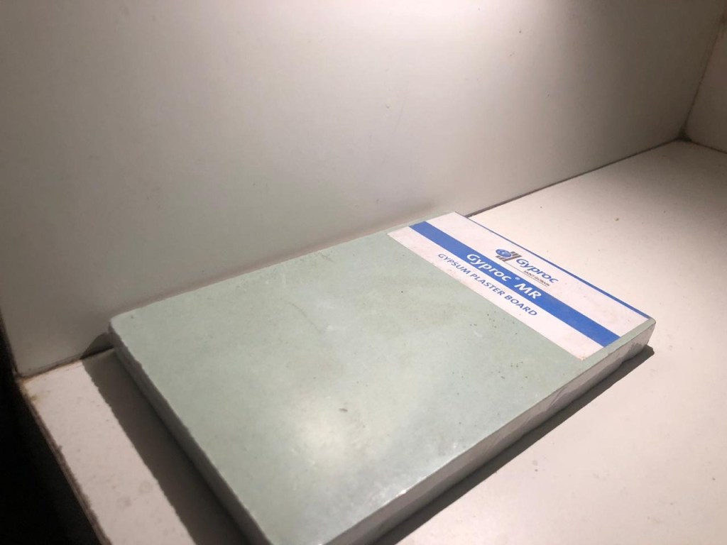
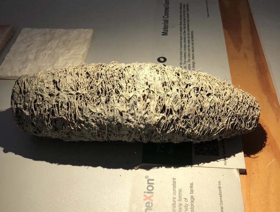
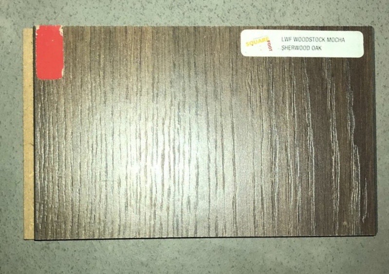
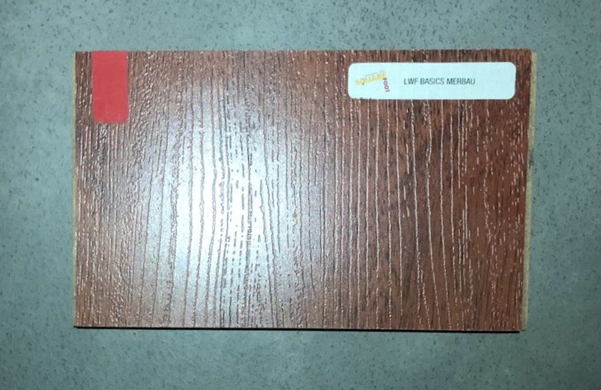
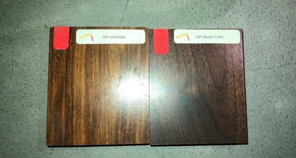
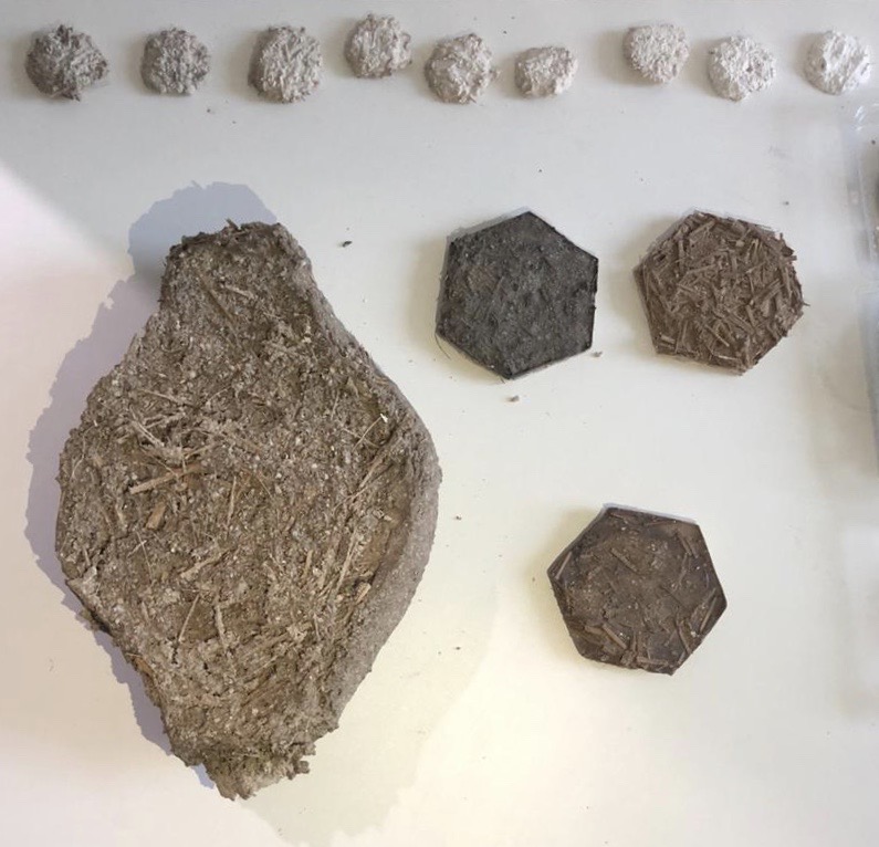
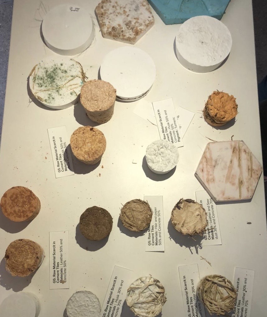
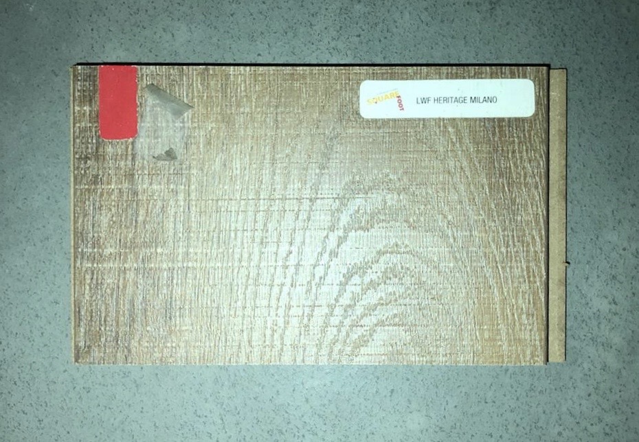
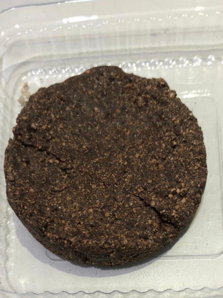
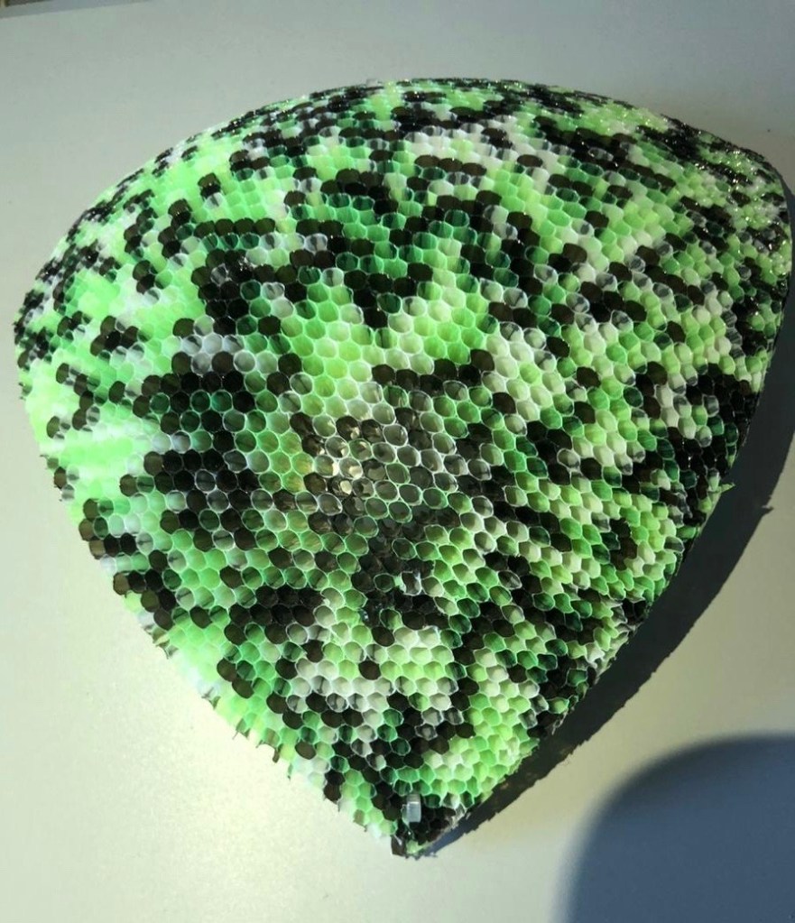
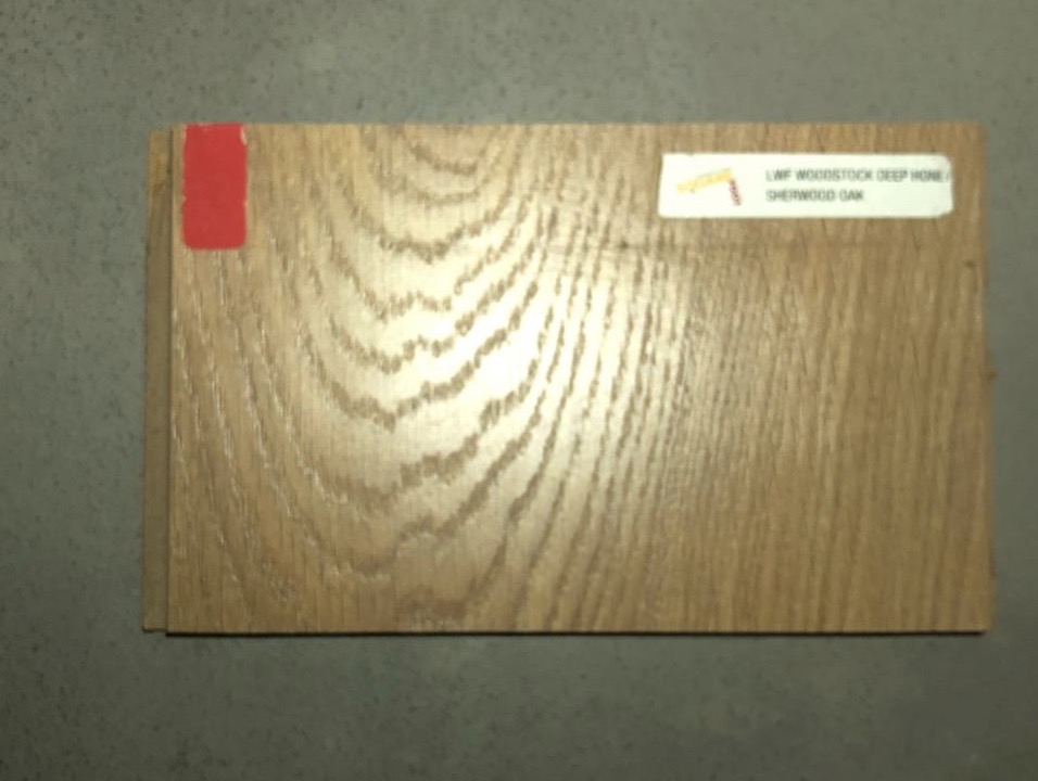
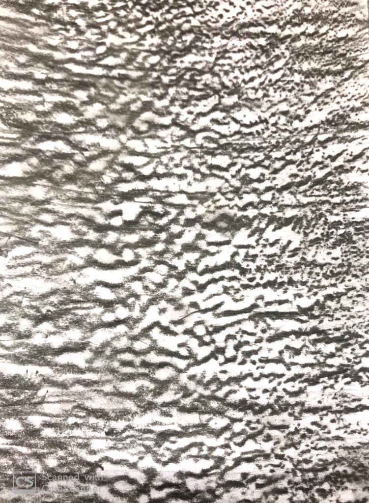
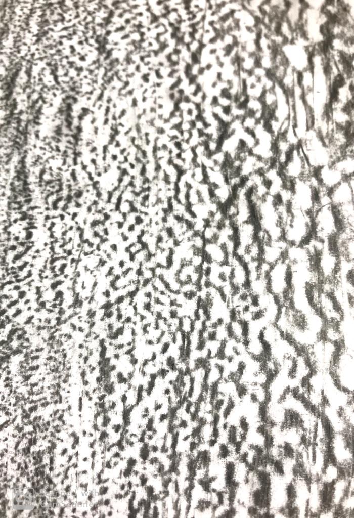
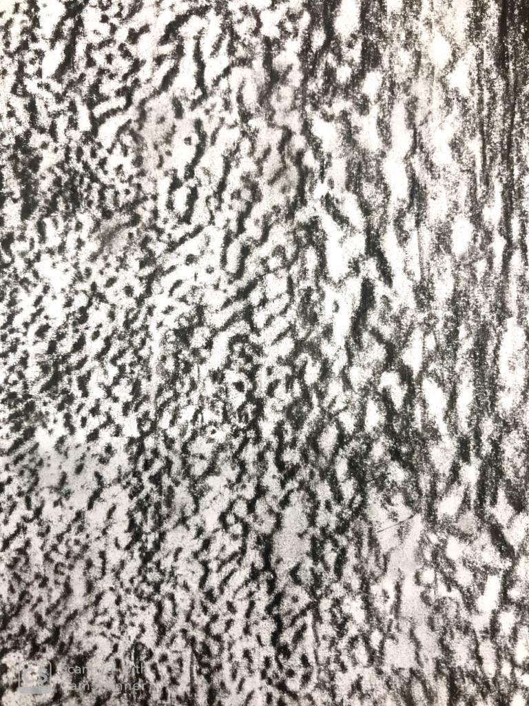
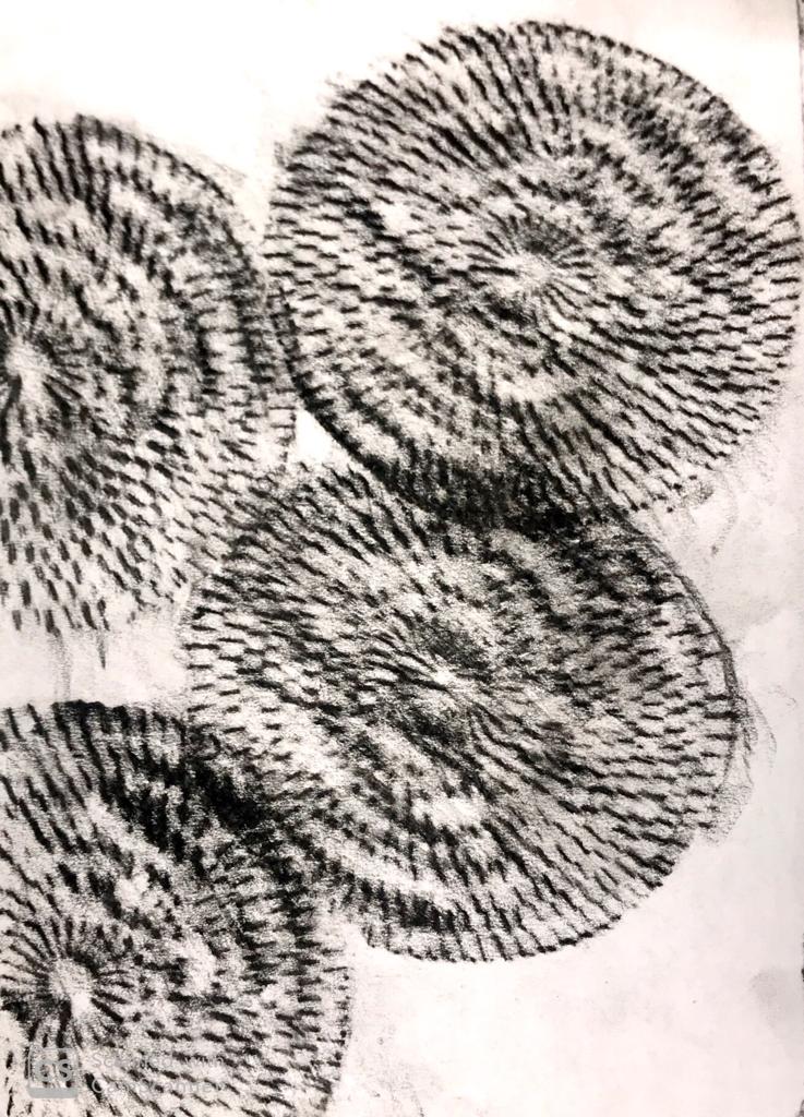
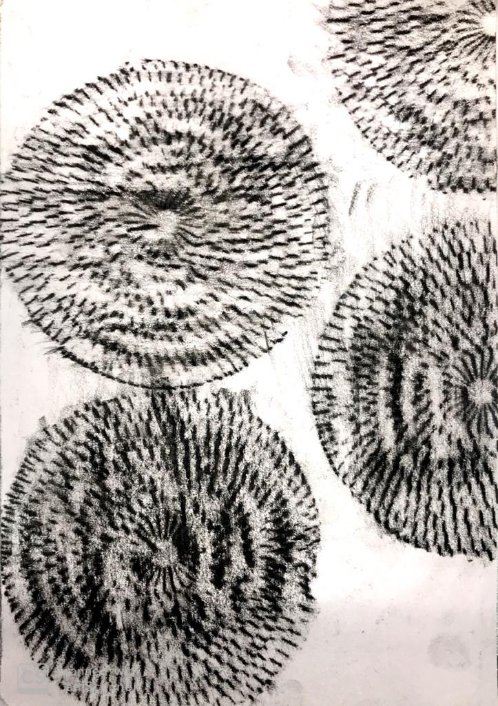
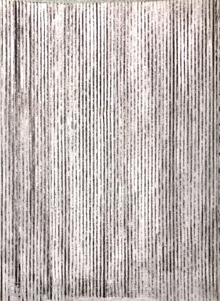
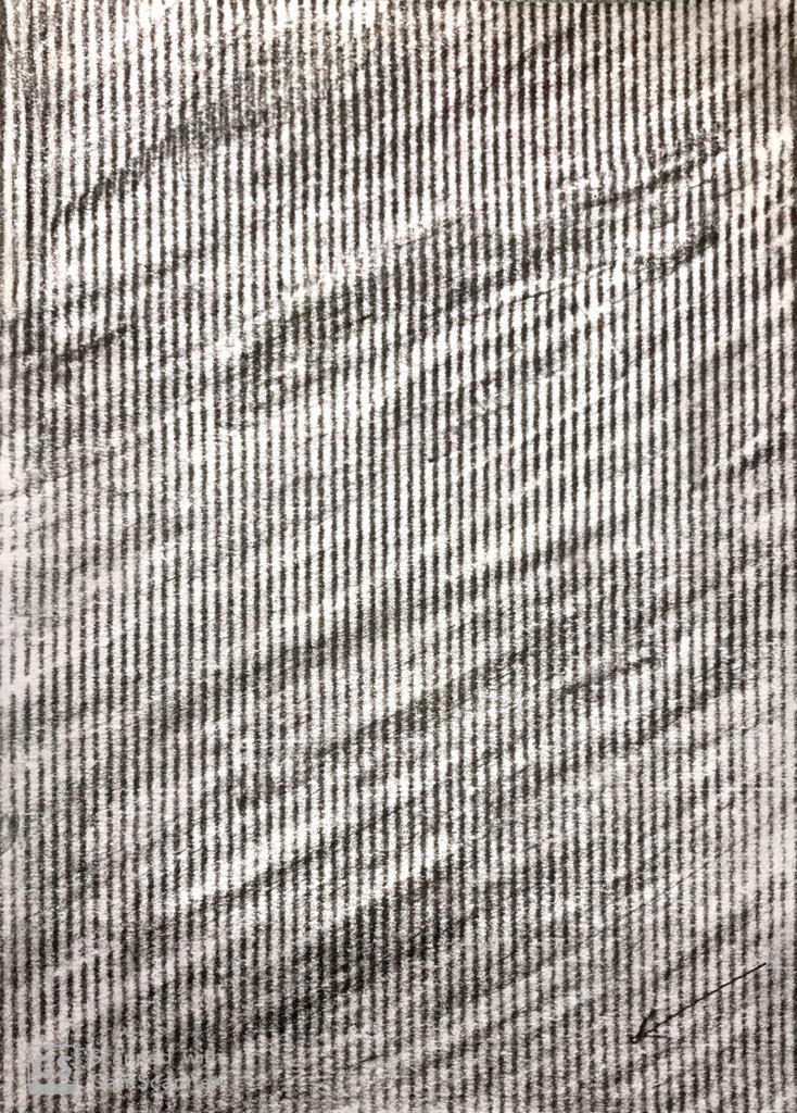
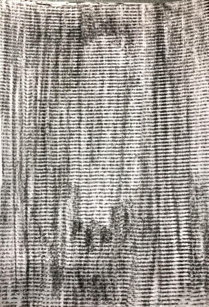
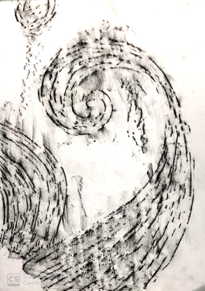
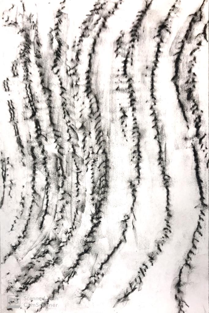
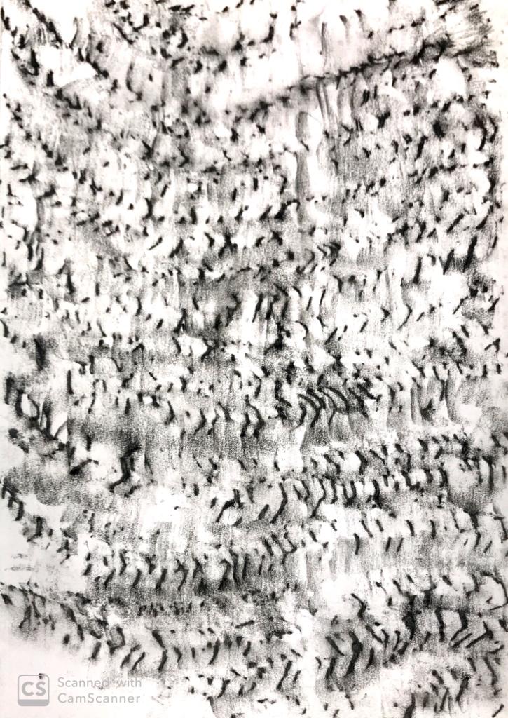
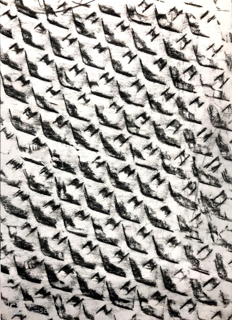
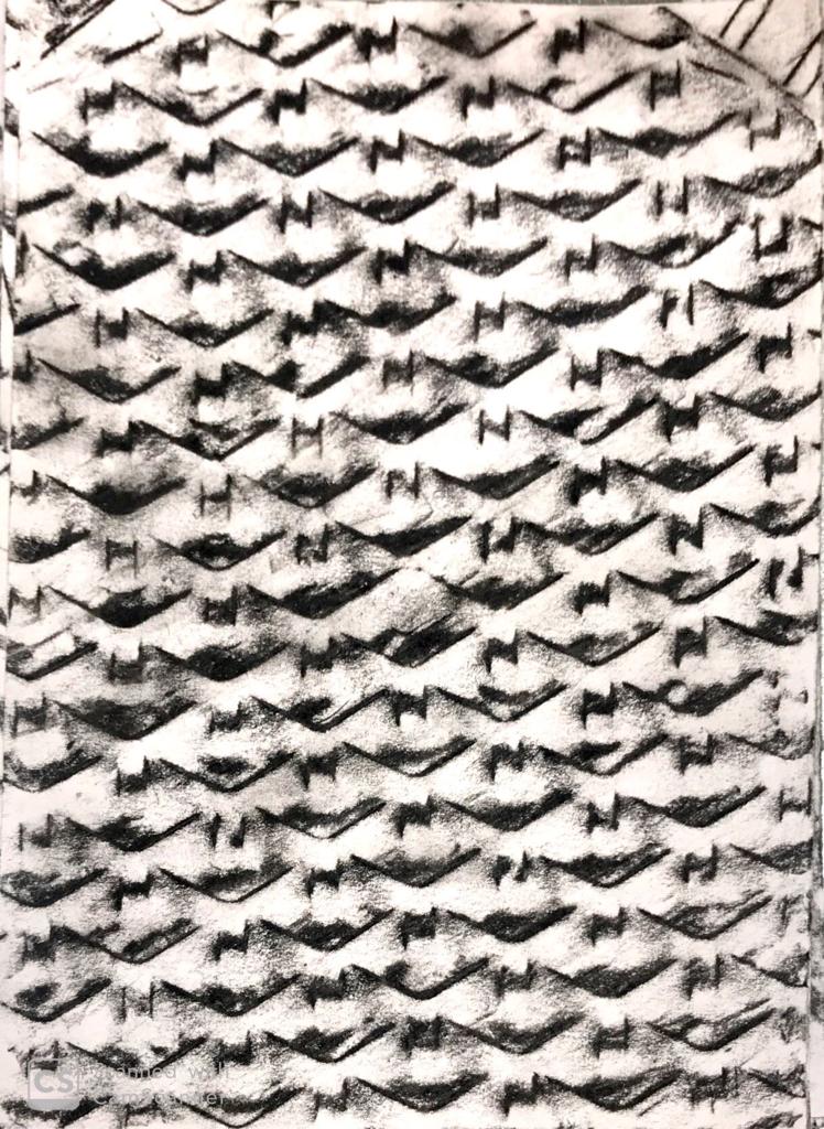
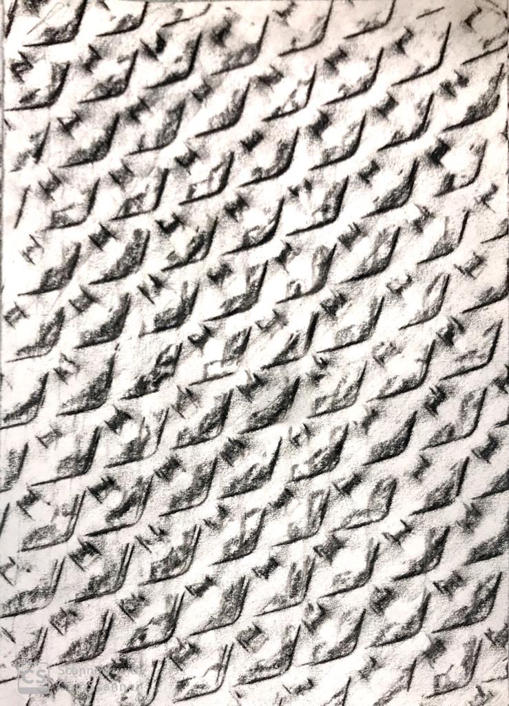
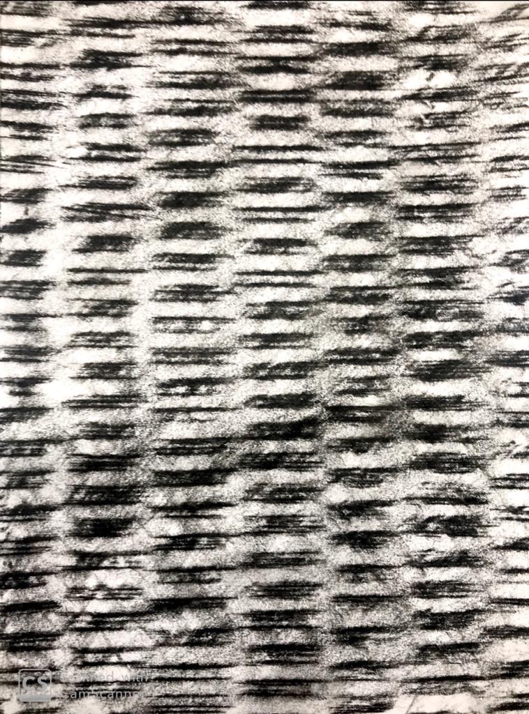
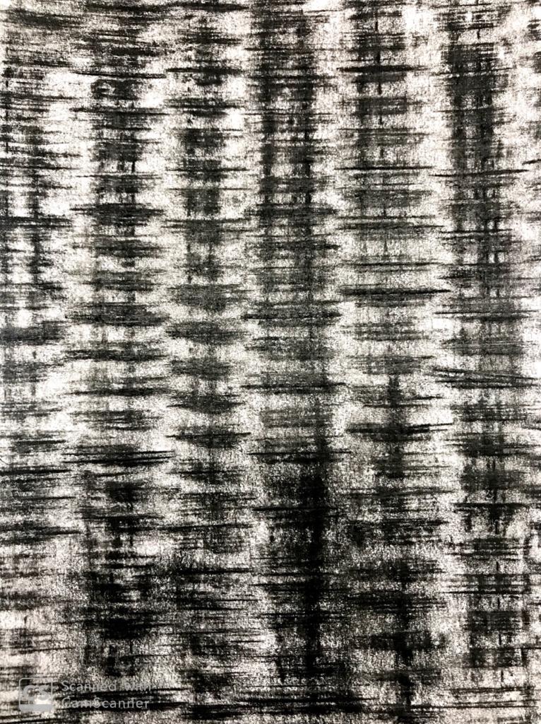
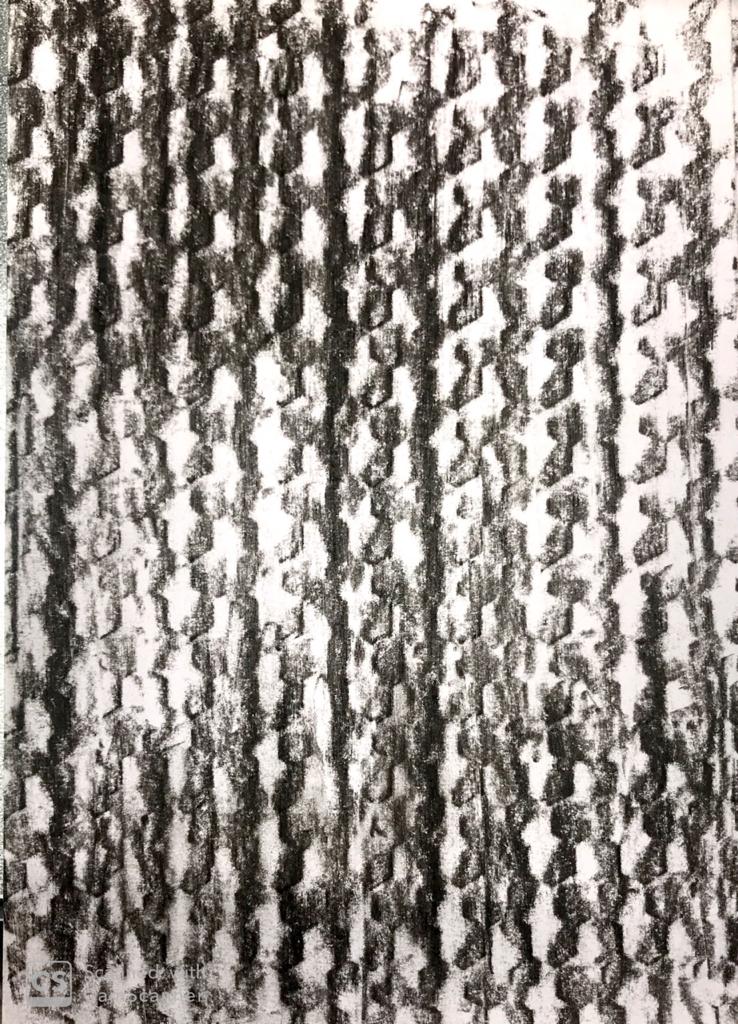
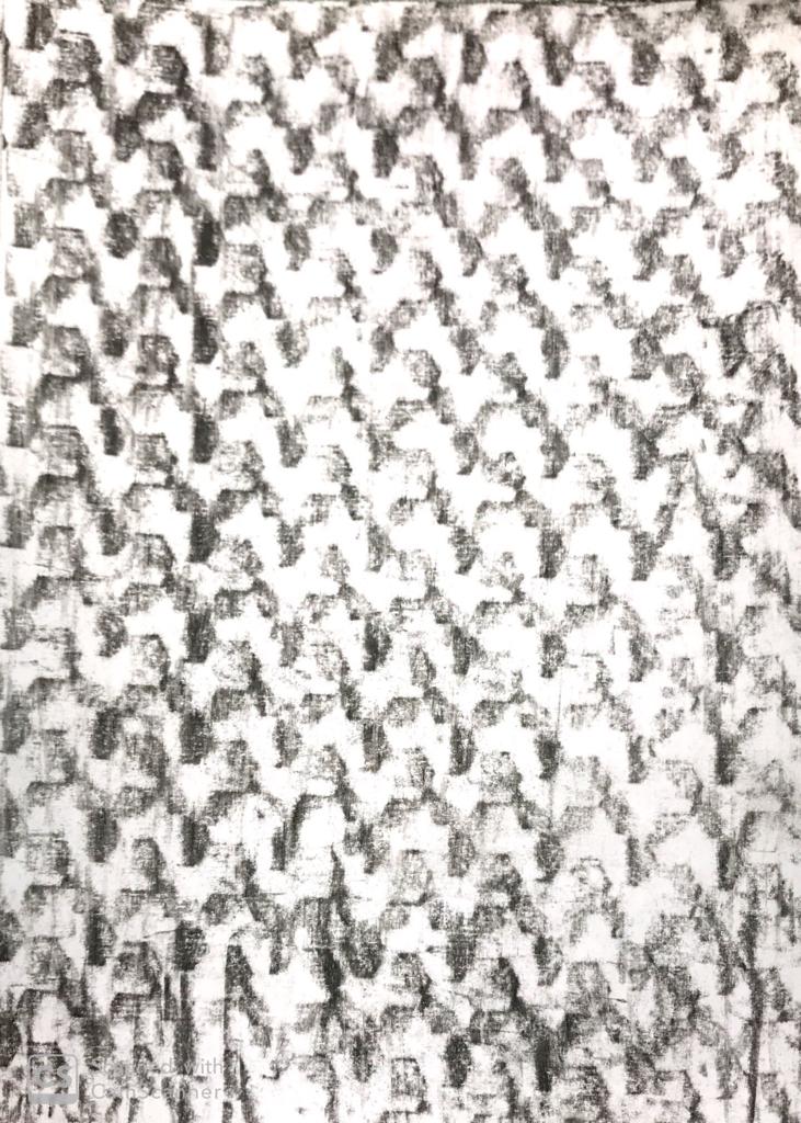
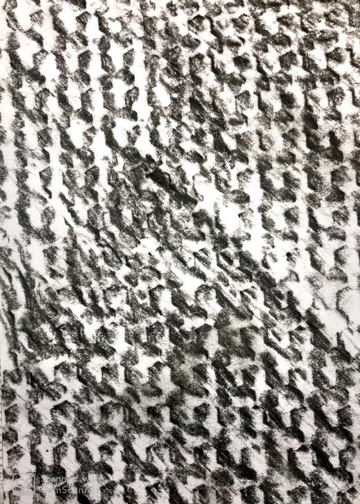
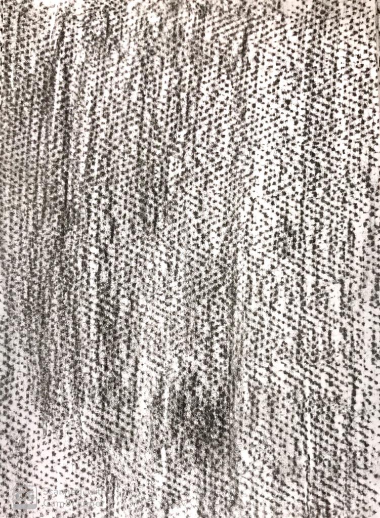
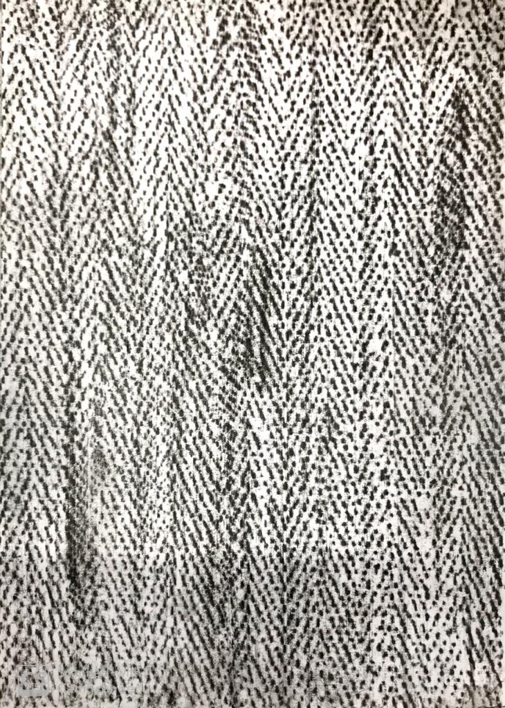
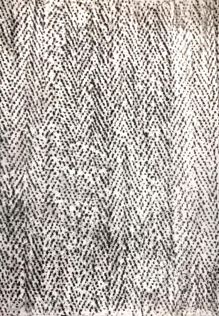
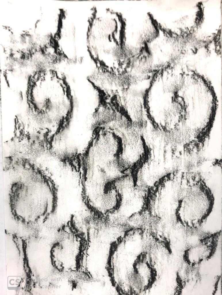
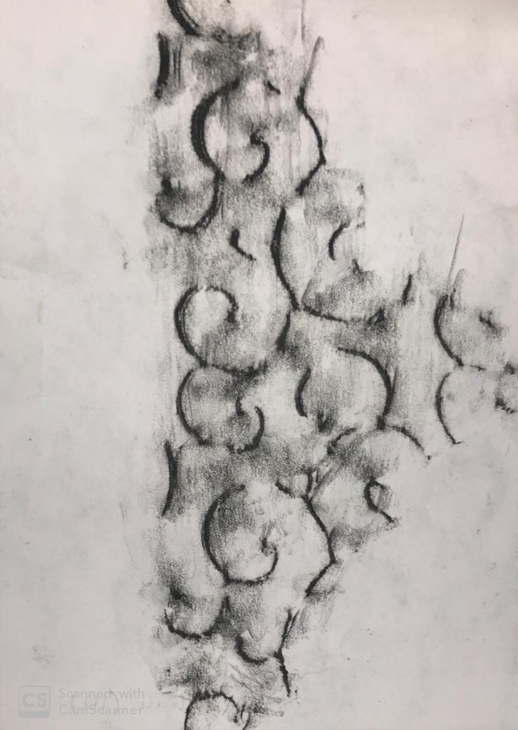
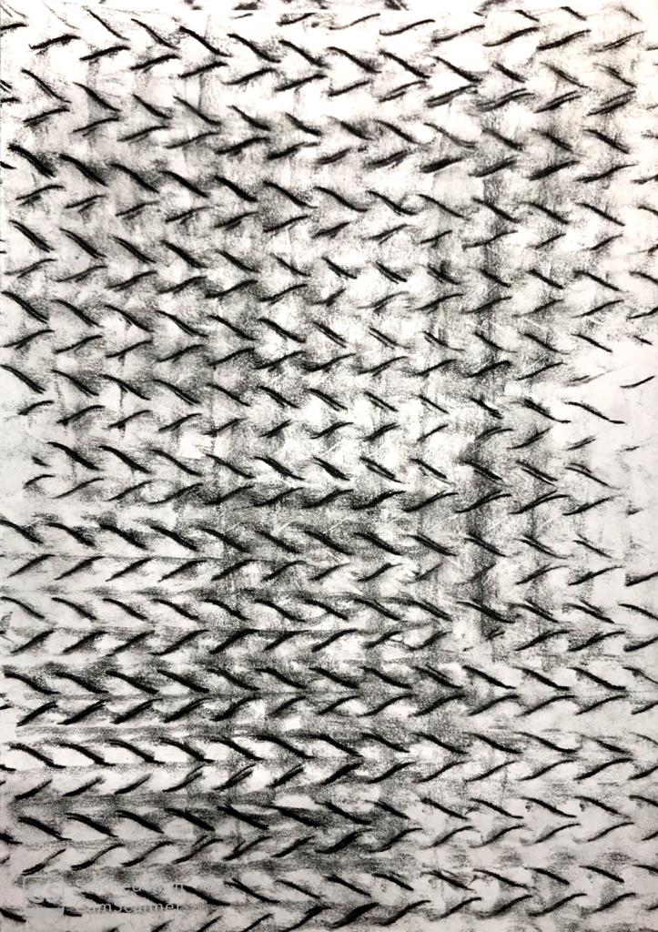
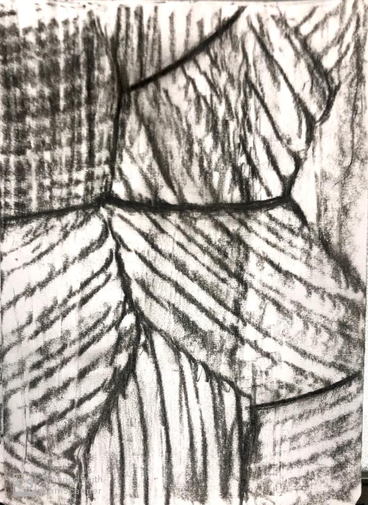
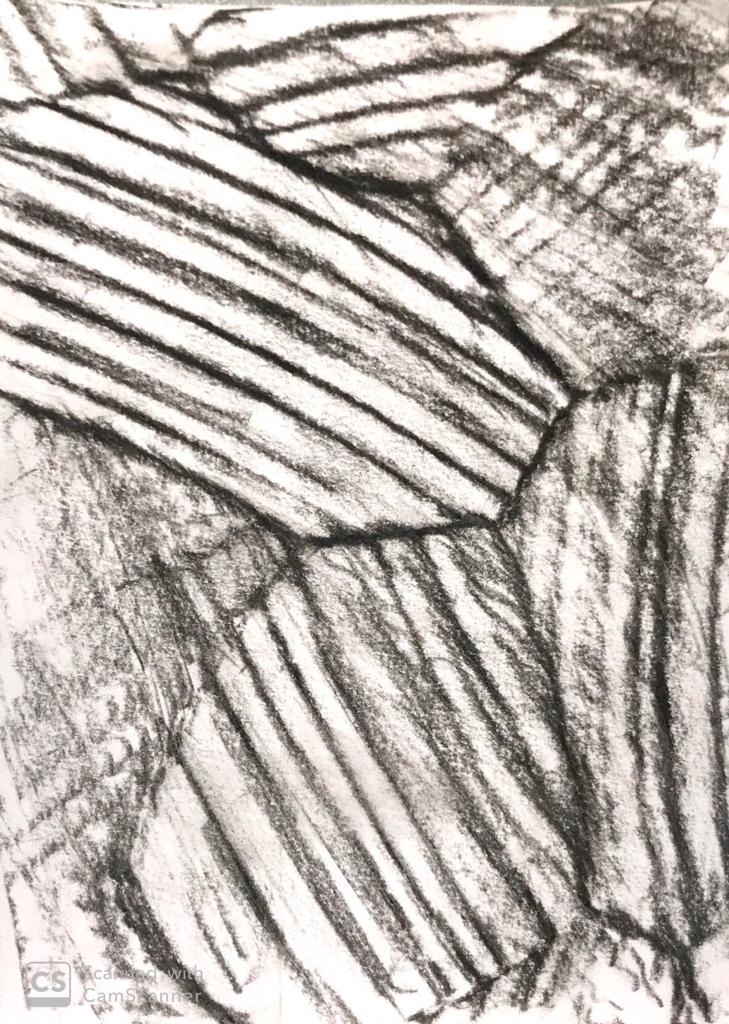
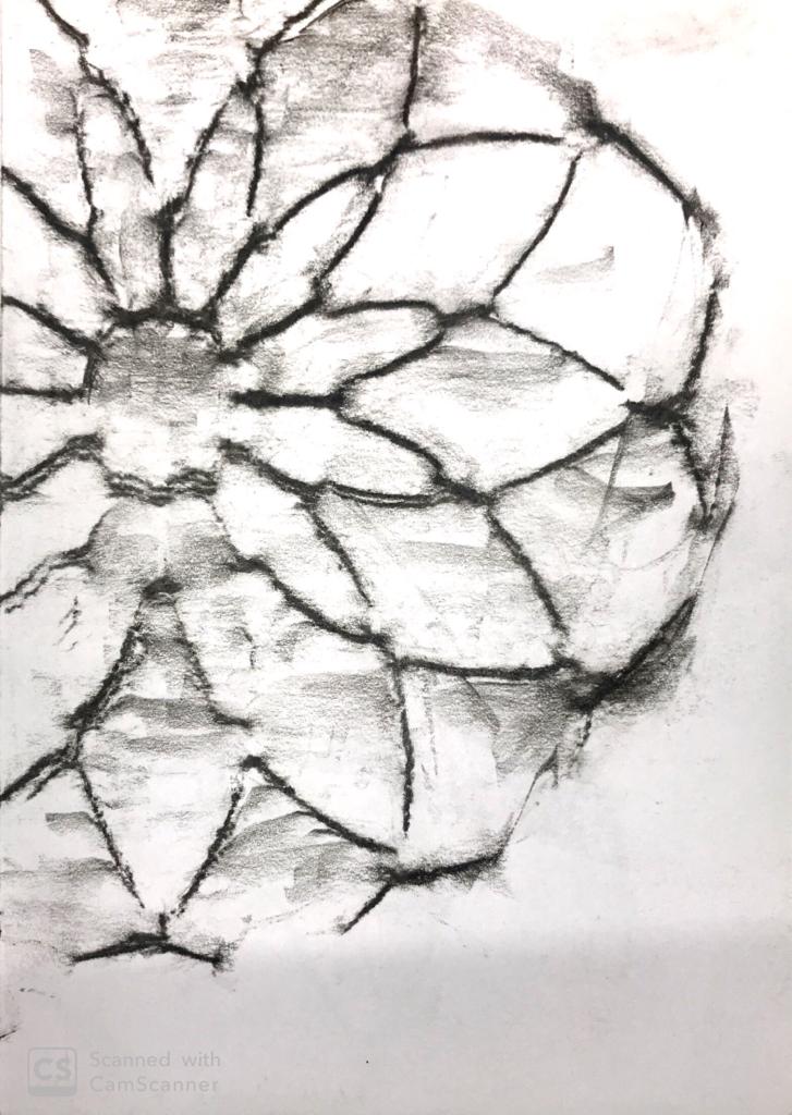
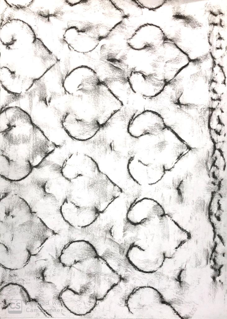
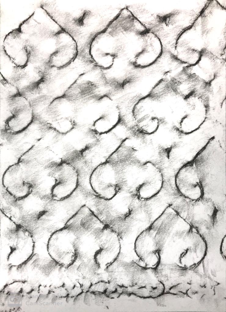
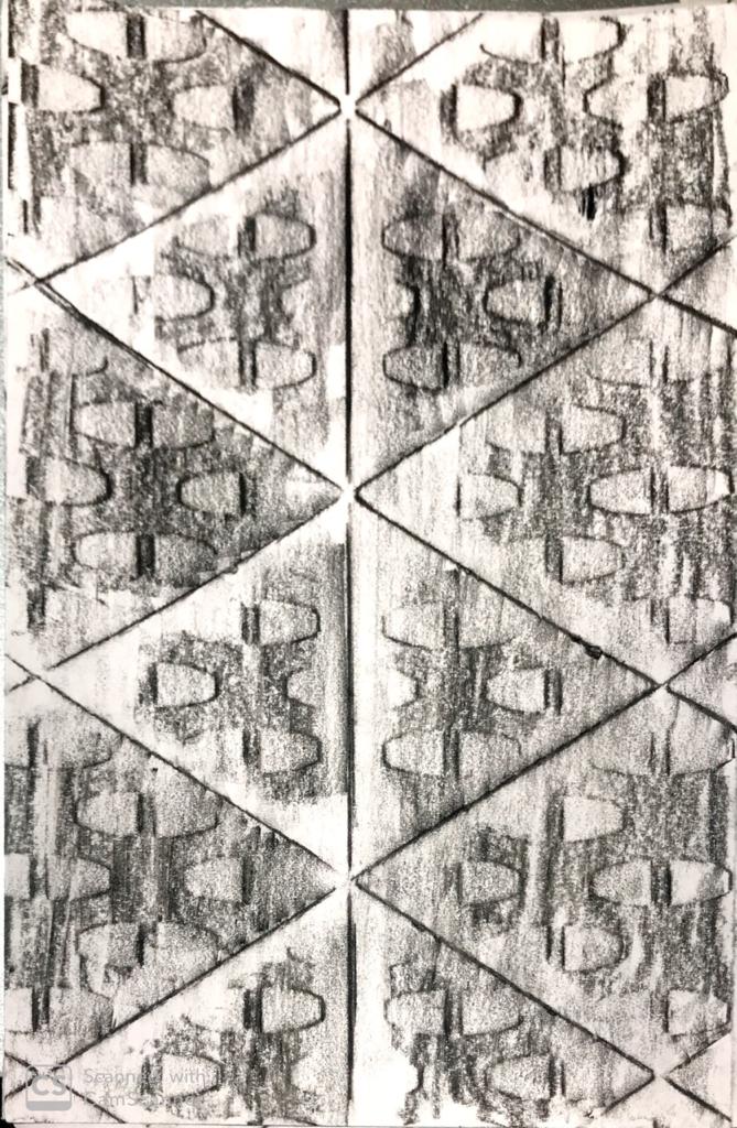
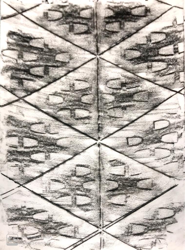
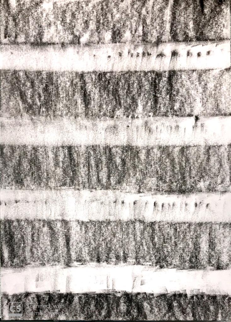
This week was when we had to show our iterations on which we had to work on during the week. Since I knew what I wanted to work on I wasn’t clear on executing them. I showed sir what I had on my mind as a reference image and showed it. I asked for a few tips and then continued on with it the next week. The two options were the bark of the tree and the back up was the the wood cut in its raw form in which its grains are seen very clearly.
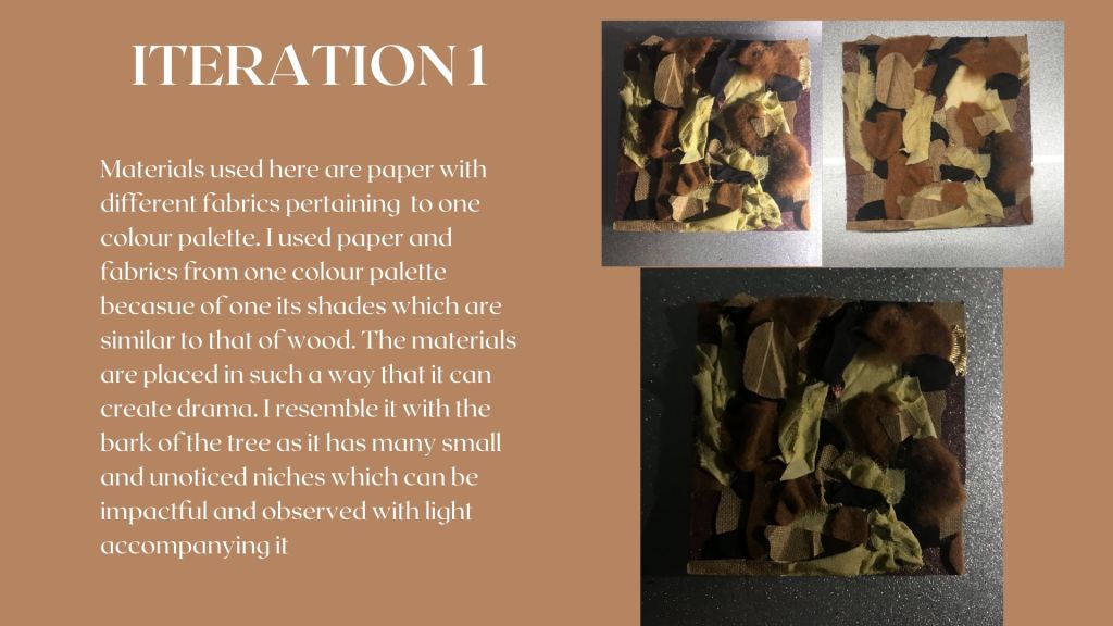
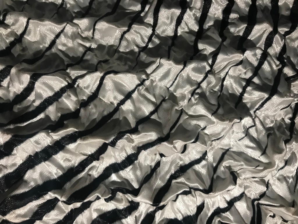
Now that we had completed with the experimentation with the fabrics which could be intense if were in college. I was left with the regret of being able to work on them the way I thought we were going to.
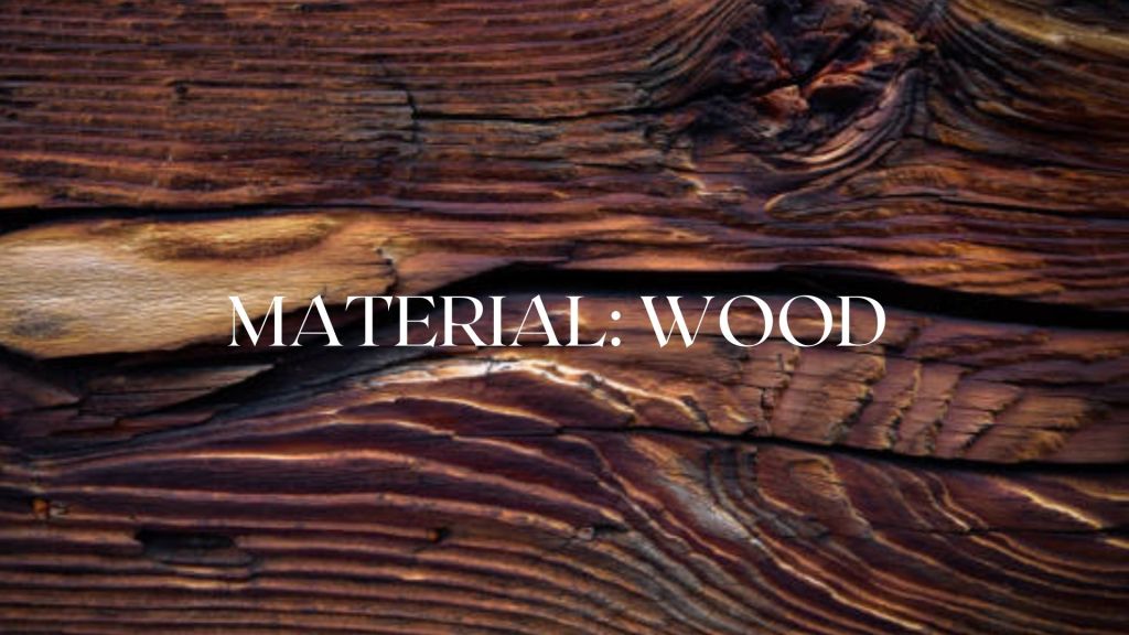
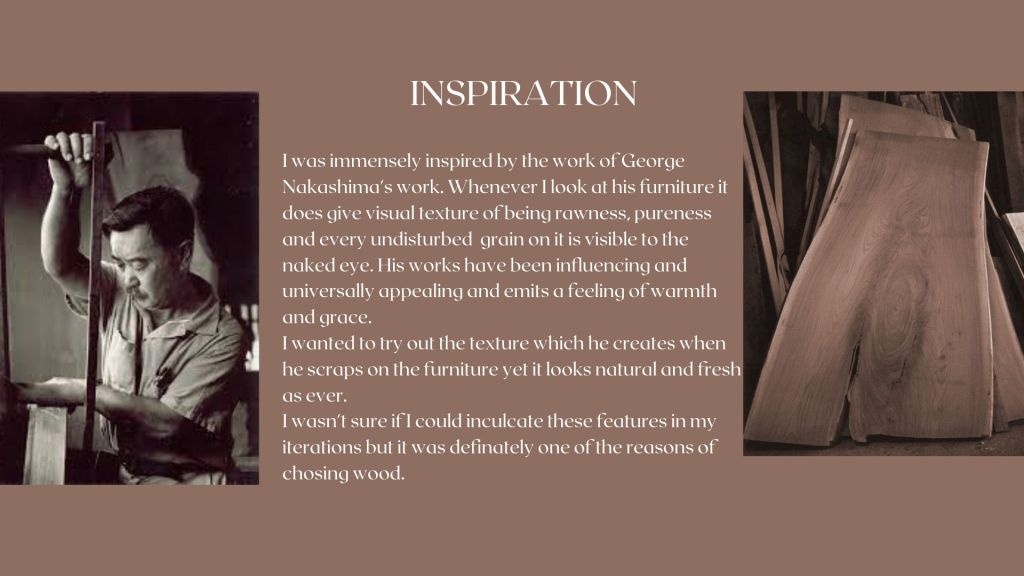
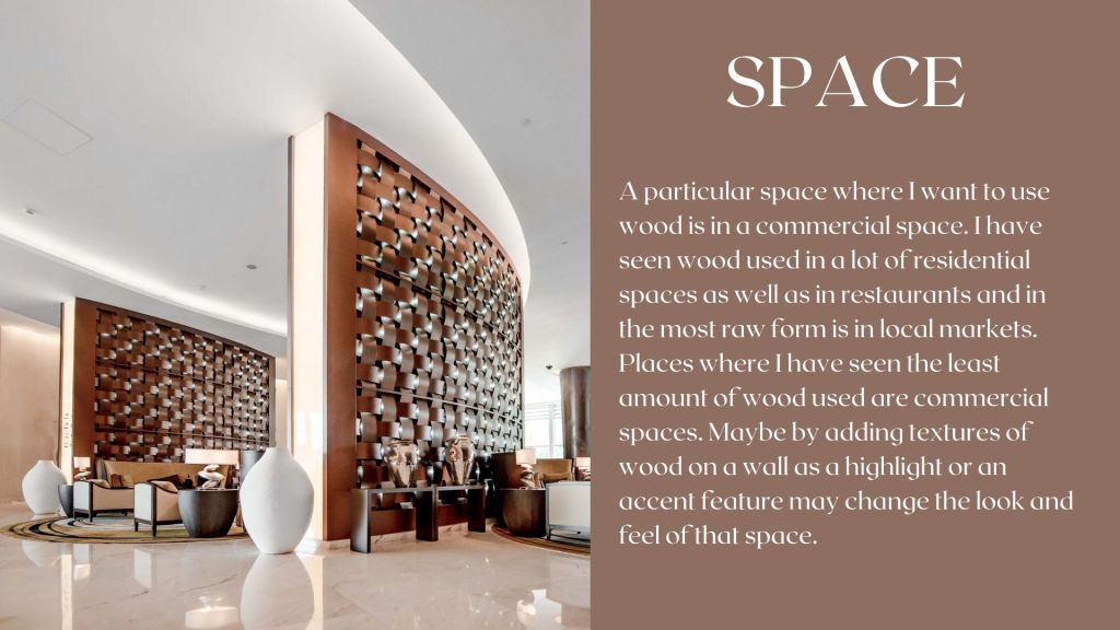
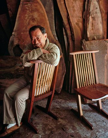
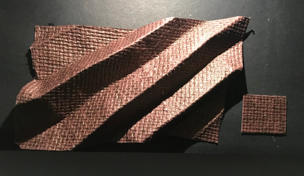
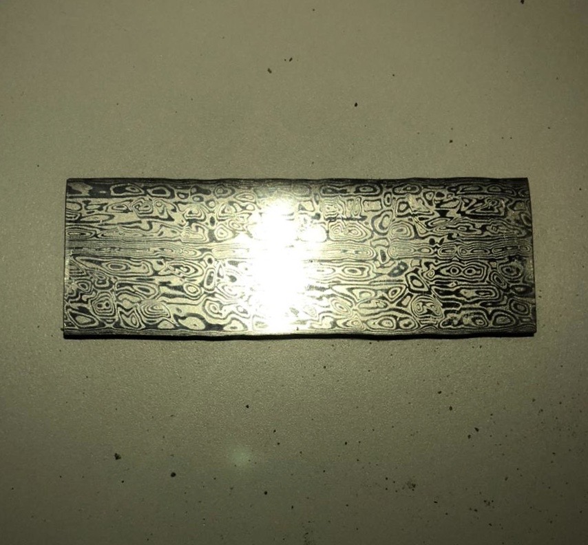
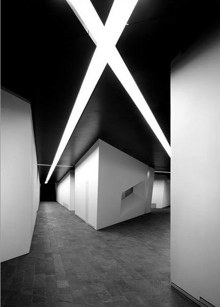
This week since it was fresh we were introduced to a new project. This project was inspired my a lot of vivid elements from the nature as I thought of it going further on with it. There were options like animals, wood and many more. I choose wood. Wood is a material with which I was always wanting to get acquainted with and one of the driving forces were the works I had seen of an American Architect who is also a famous furniture maker who solely works with wood. He seems to be emotionally and spiritually connected with the nature since early childhood which has always been inspiring him. His works to me seems to be very raw, delicate and a piece worth collecting. It seems like wood has never been in its purest form after a particular piece of furniture is finished. Each grain seen with a naked eye.

Date:
Faculty Name: Vaibhav Mohite
This week we were all home and quarantined already. Last class we decided upon the fruits on which we had to work on and then with no option left we started to work from home. Even though it was upsetting to see all of this happening I continued with a goal of not getting distracted being home.
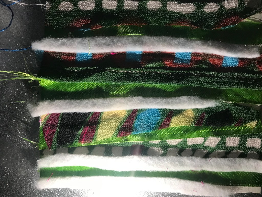
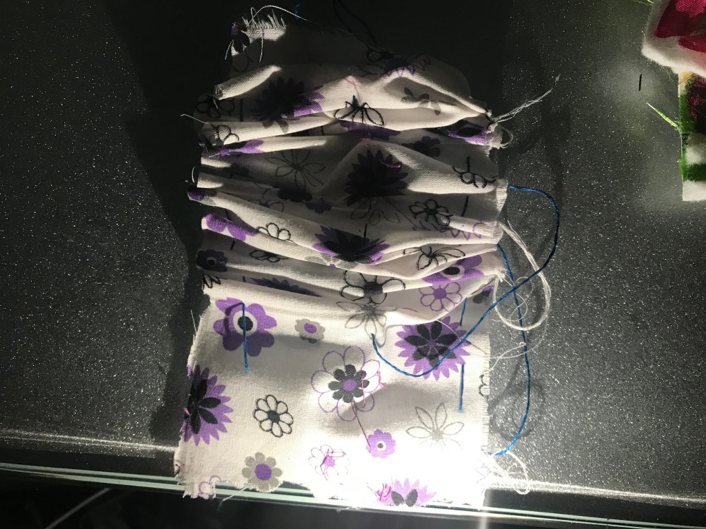
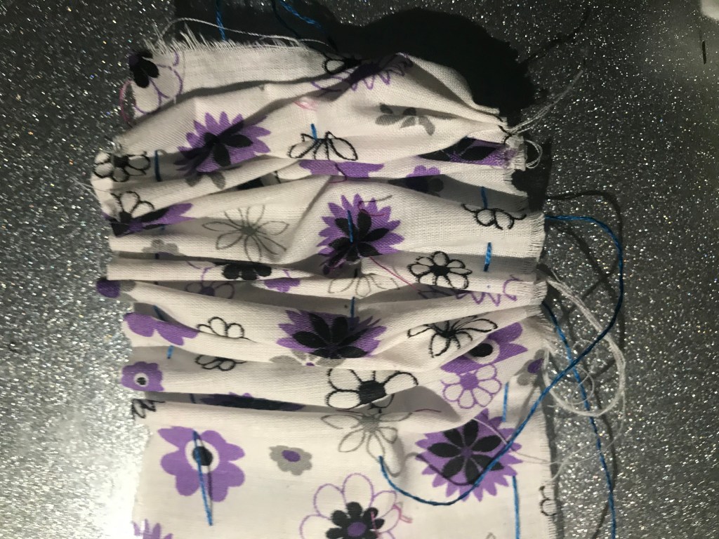
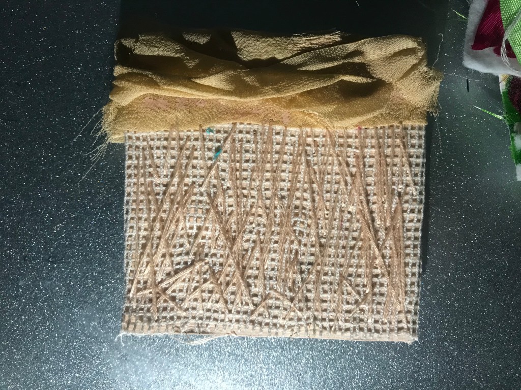
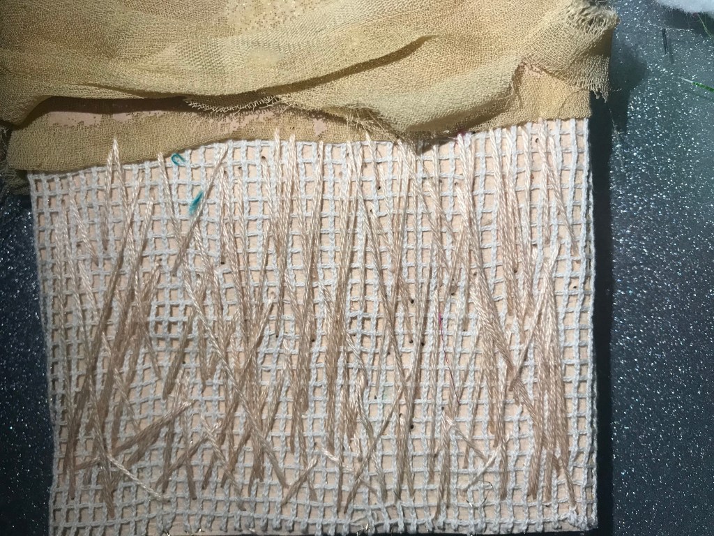
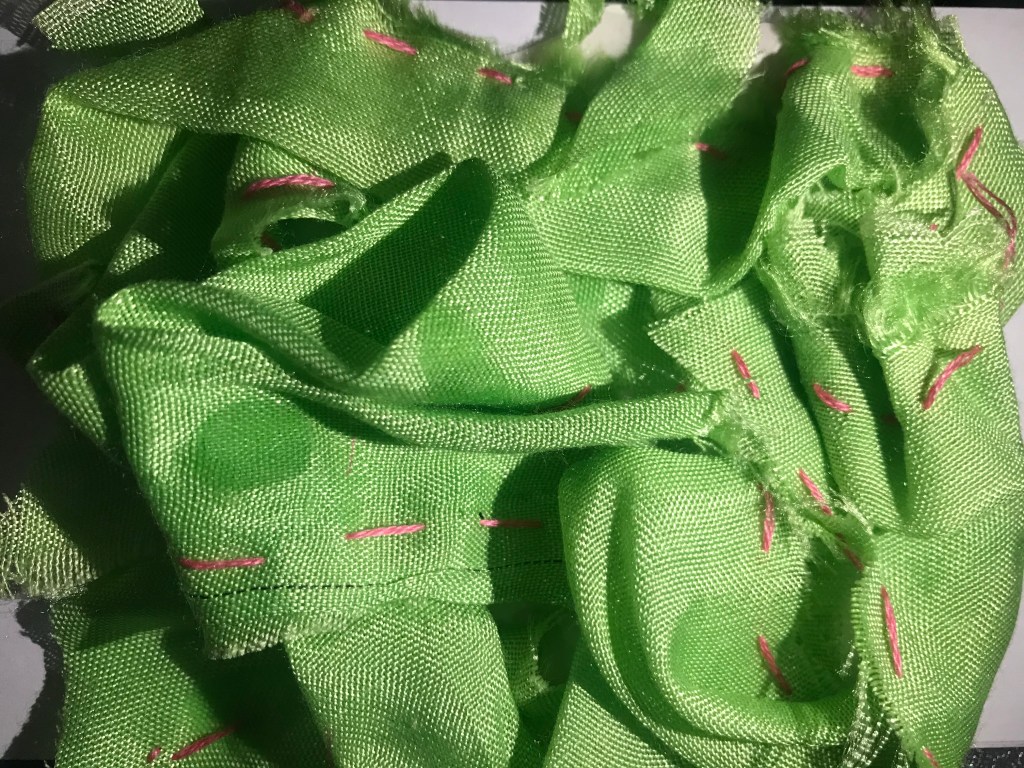
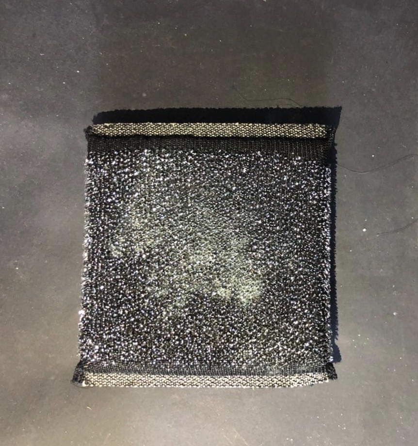
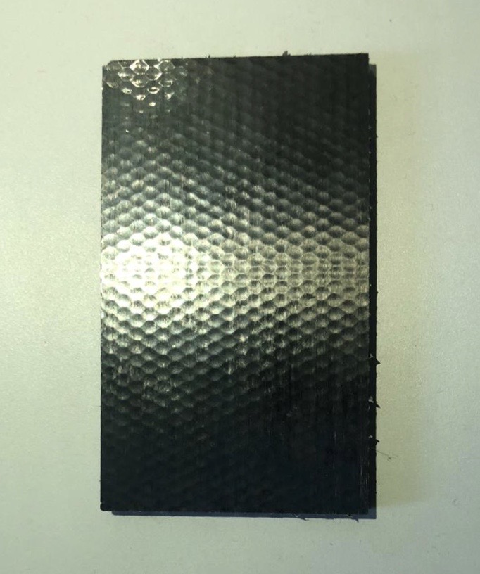
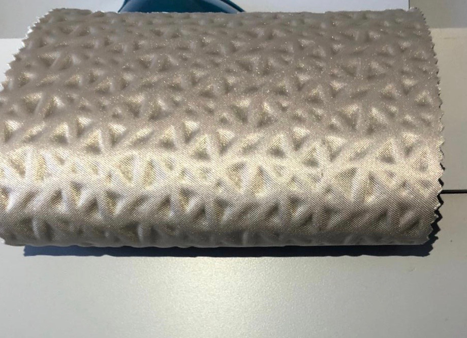
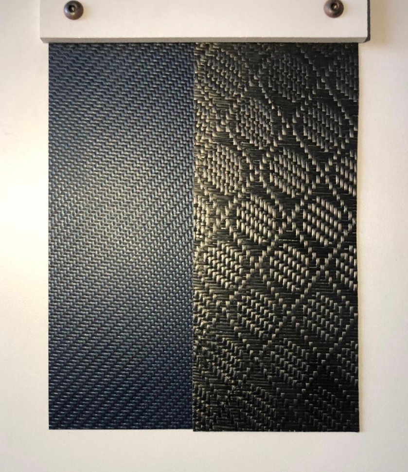
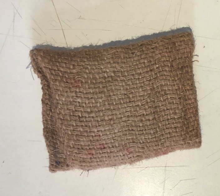
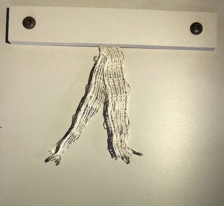
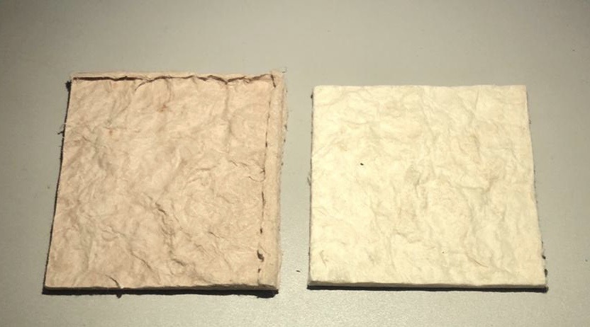
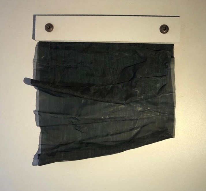
So I started working on the texture which were had to be made with the help of fabrics. While I was working with the fabrics I understood the difference between paper and fabrics. Even though both the materials were the only primary materials to start our experimentation they differed in a lot of ways in terms of properties. Both of them interacted with light differently which was the main purpose at which we were looking at. When I was using paper I was tempted to use fabrics and thought of enhancing them by using it and then when I came on to using fabrics I was tempted like wise.


Date : 6/03/2020
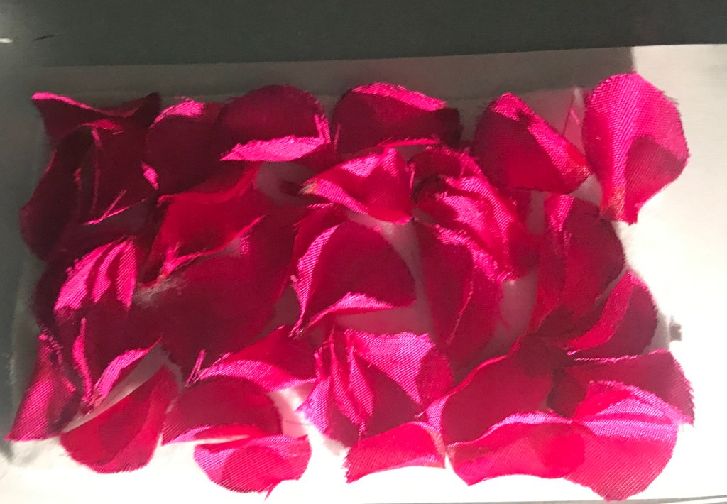
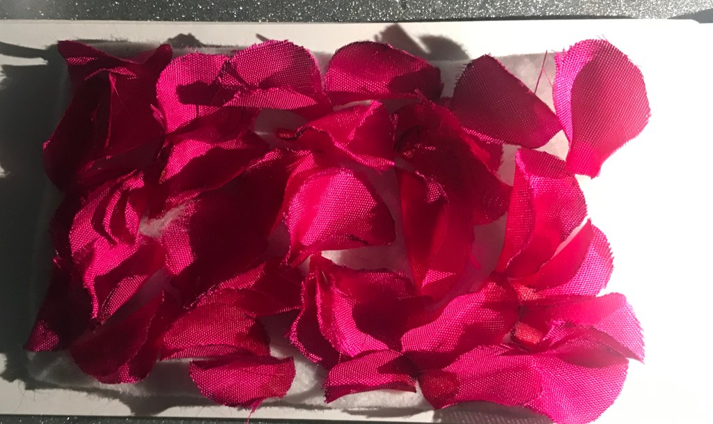
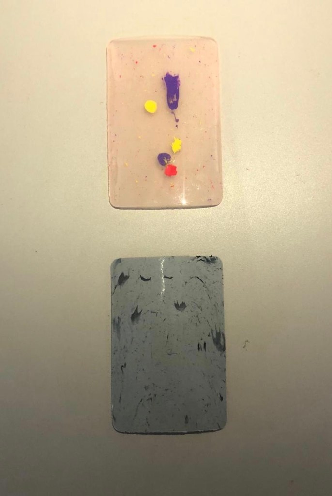
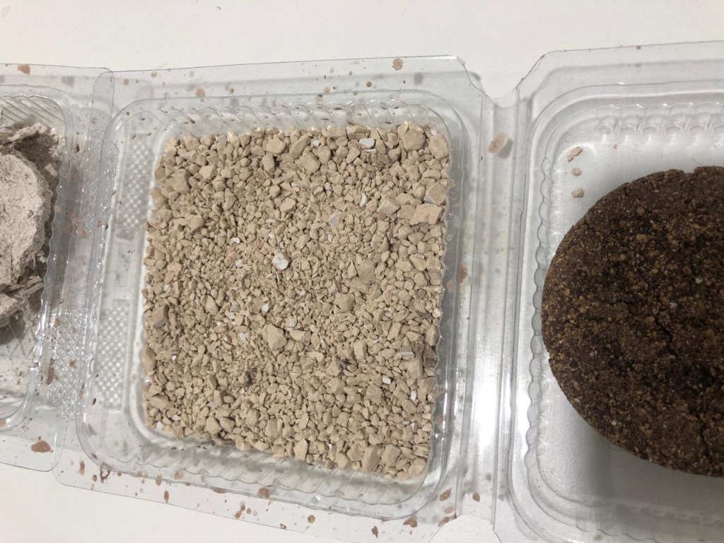
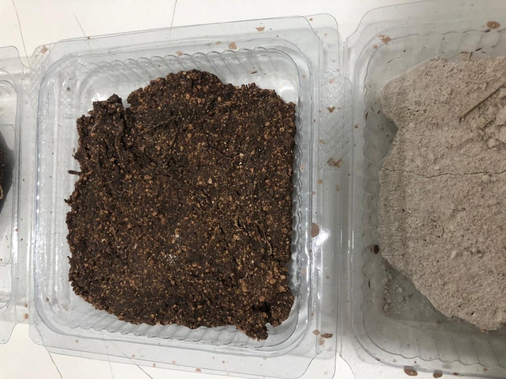
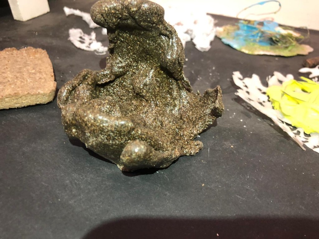
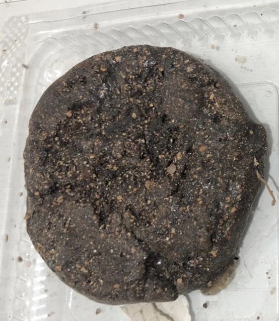
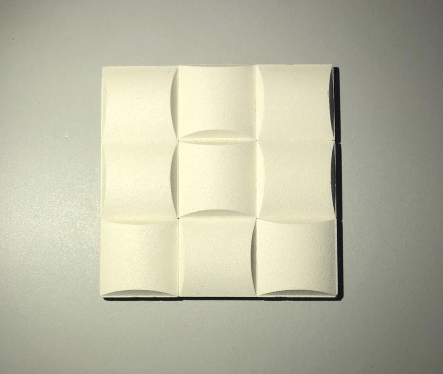
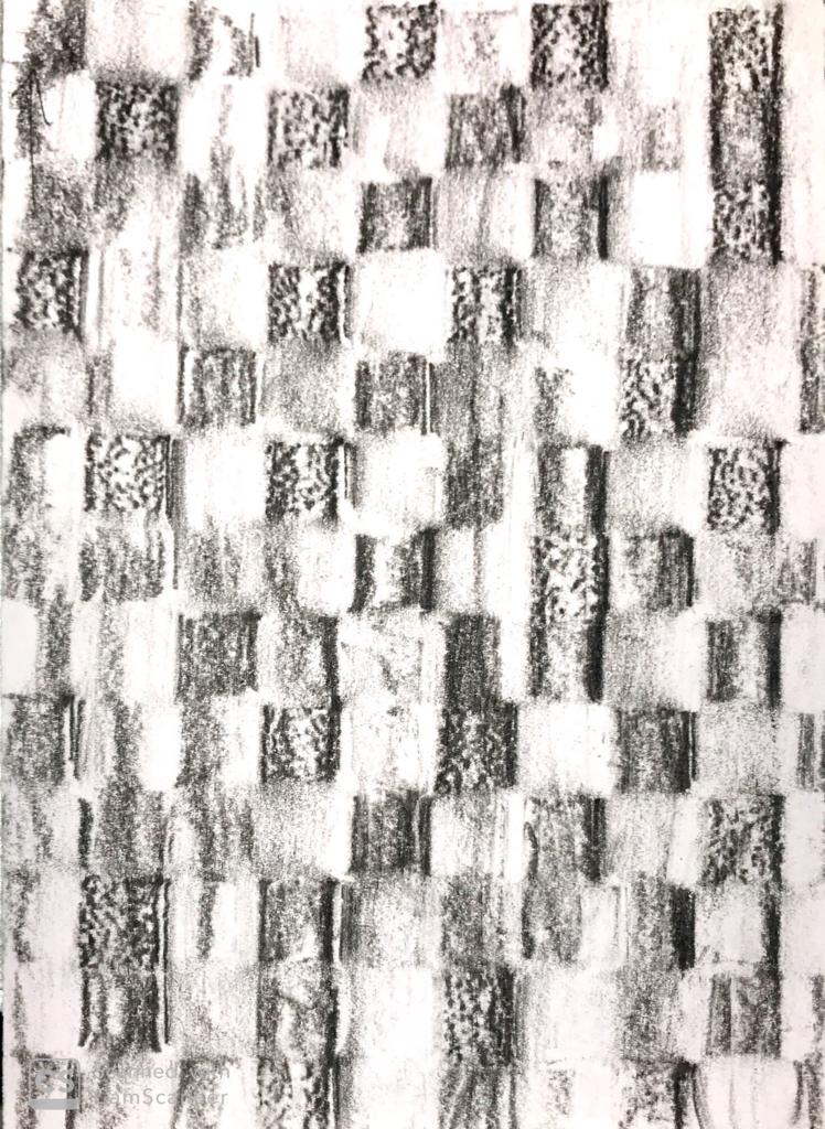
Creating textures was a really creative journey which I really enjoyed while fabricating. Since I explored with a lot of materials leaving out textured papers, I really couldn’t sometimes control free flowing variable materials like wax and many other. The beginning of this assignment was very basic, but getting acquainted with every material I had, I started getting my hands into a movement with the tools and understanding the form of materials and started experimenting with it. With every new creation every texture was getting better in its appearance. While doing this I definitely had to go through a tough selection of which is better and discarding more fair samples than I had made.
Week 7, when we started making the textures I did not take into consideration of expanding these textures onto a larger scale which we were asked to do this week. We also had a peer to peer review in class. We found one or the other interesting sample of texture. During this review we also played around a lot with light and saw the difference light could make. It literally did transform the entire appearance.
At first I thought light was something I couldn’t partially control because it wasn’t something I could really take control of. It chooses its direction or movement. But through exercises and assignments in class I realised that I really it really didnt have to be controlled it is a material itself. Now reading the light and materials article does really make sense to some extent. I was skeptical about reaching to this point but I tried to take care of the output of these textures.
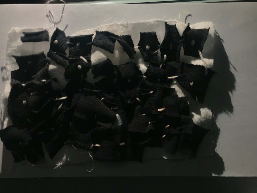
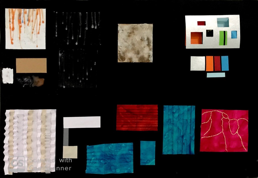
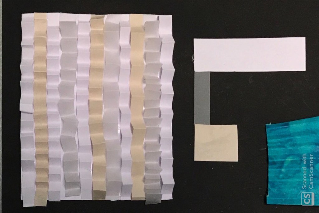
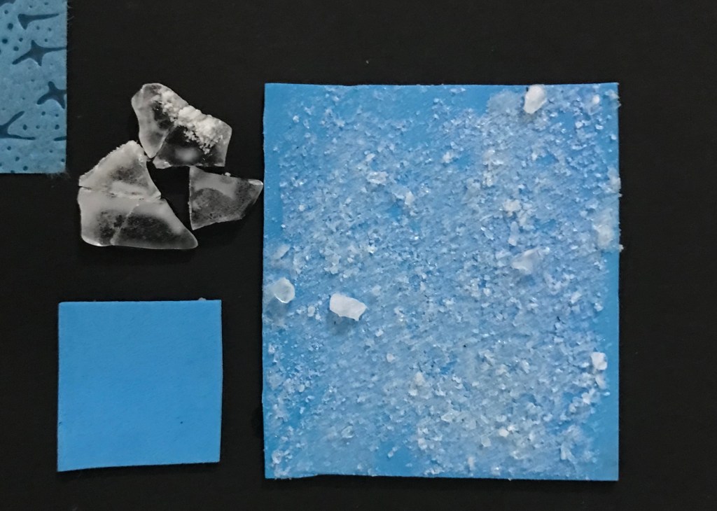
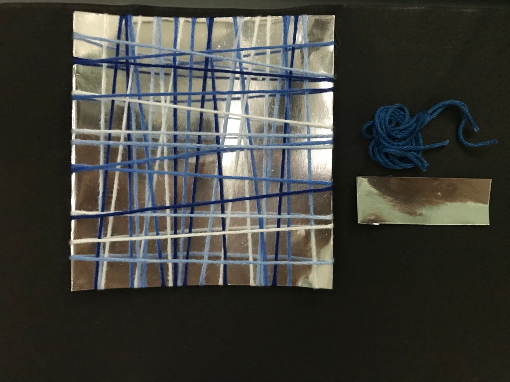
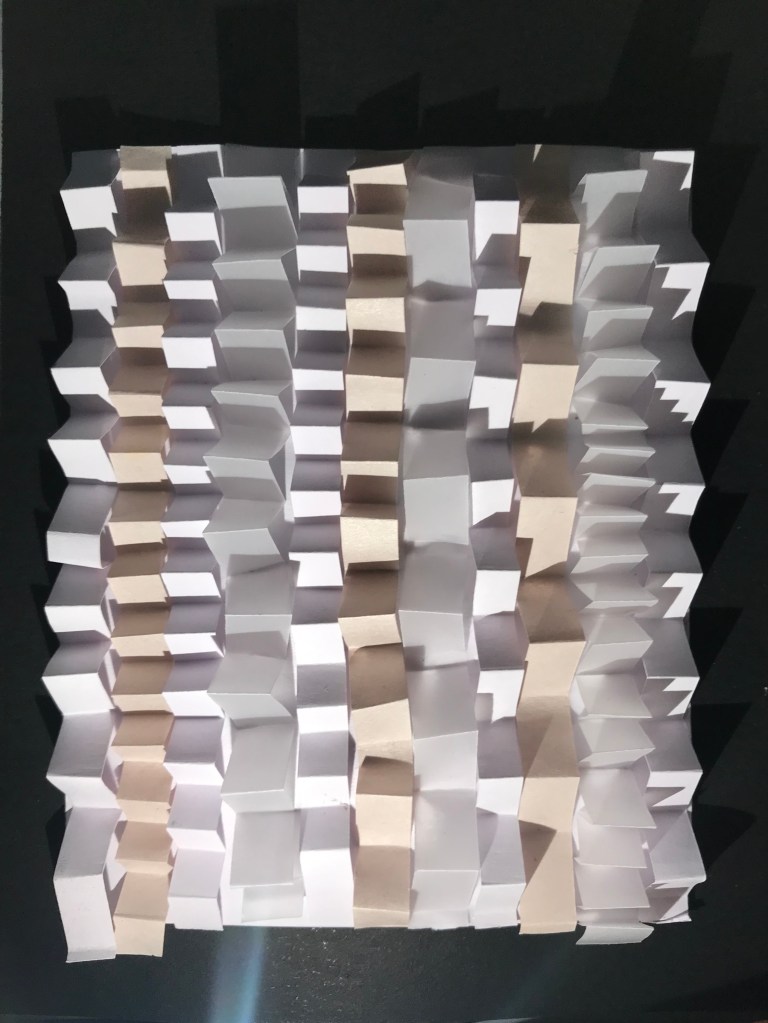
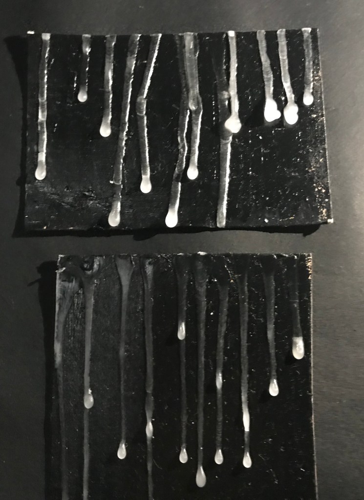
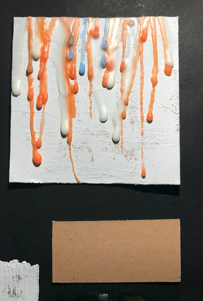
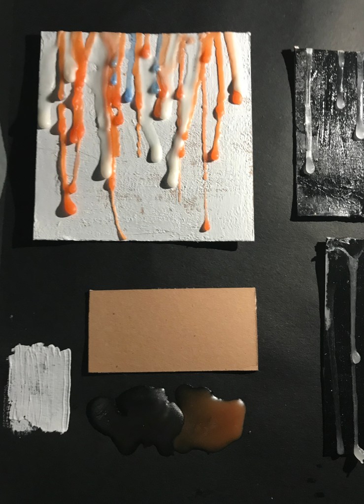
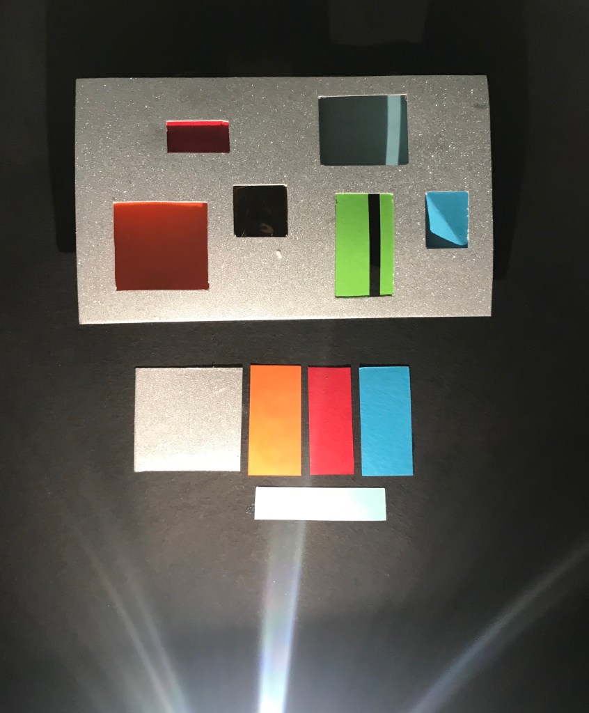
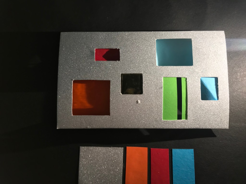
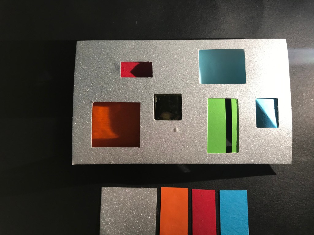
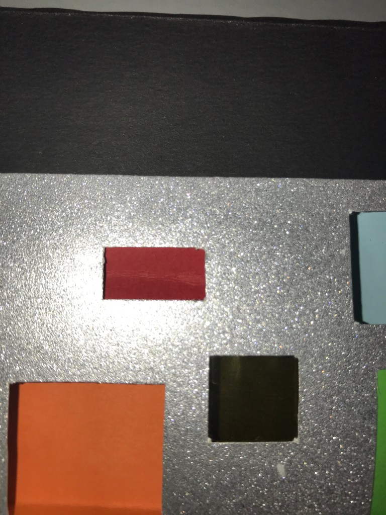
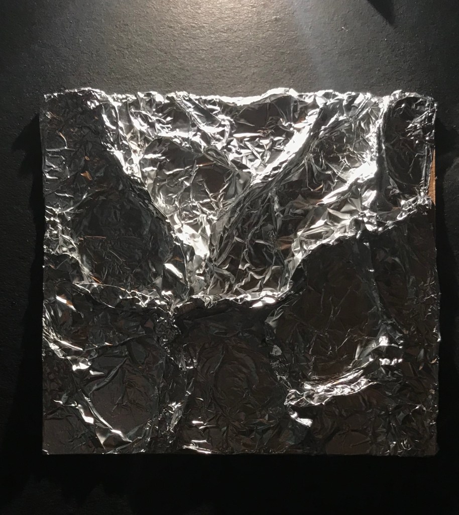
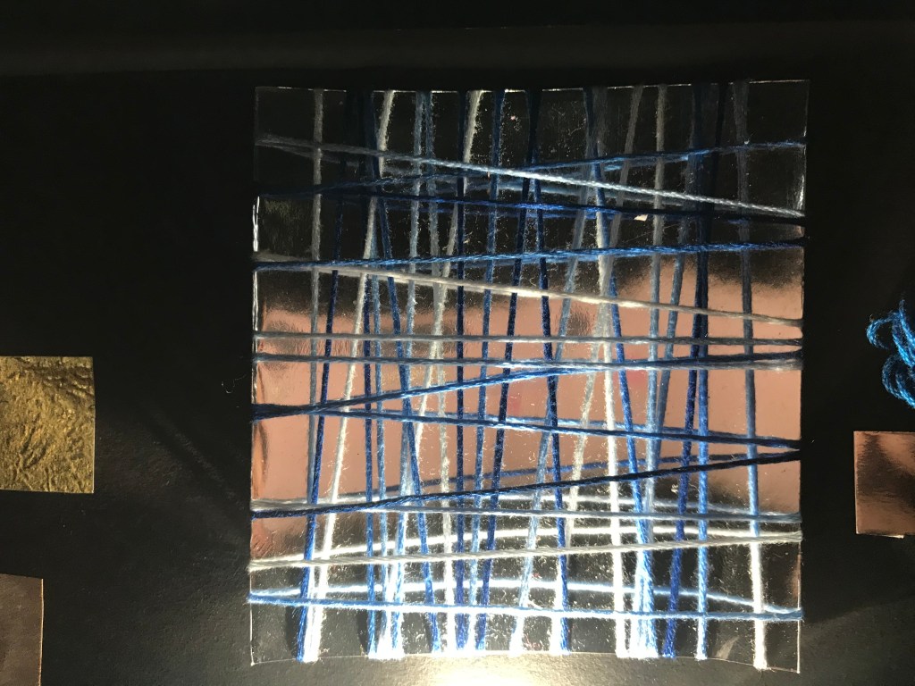
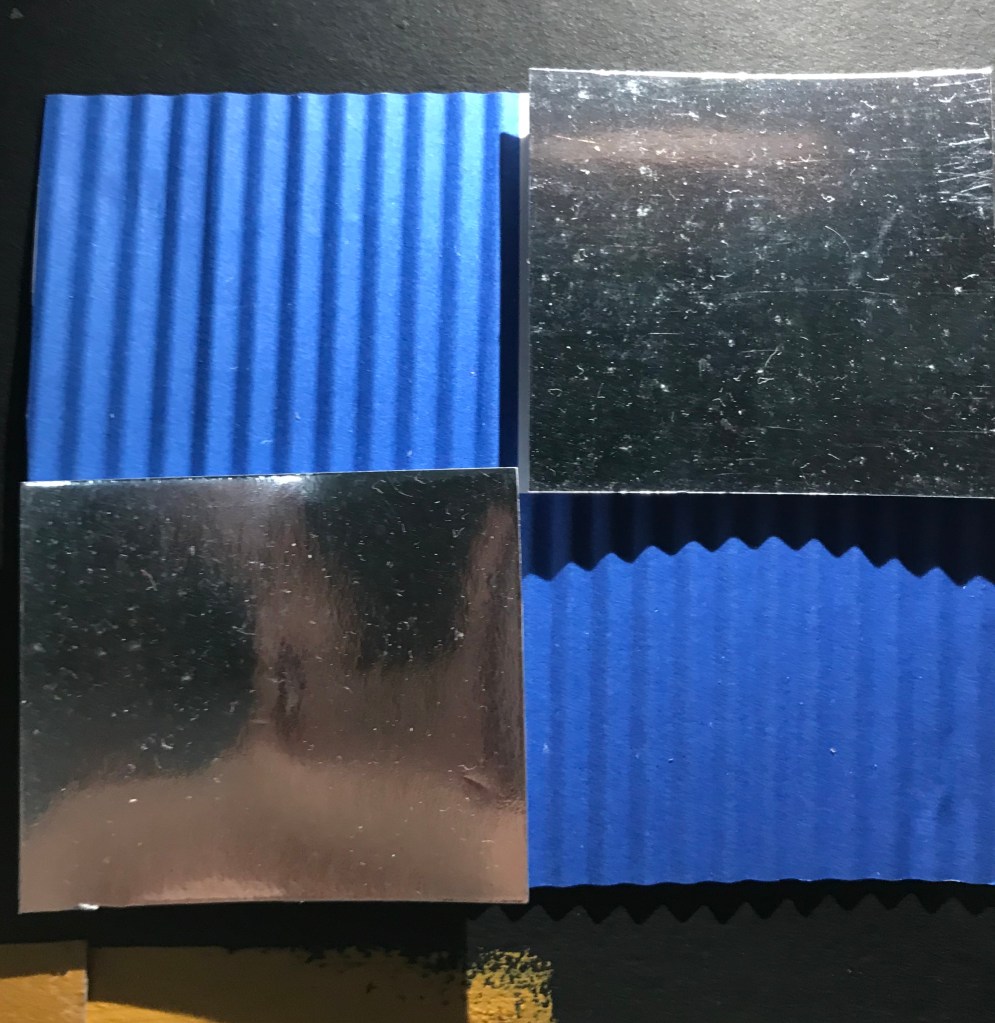
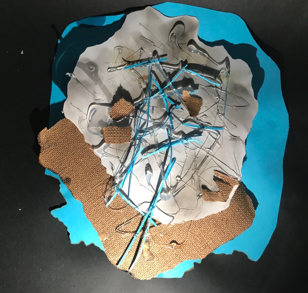
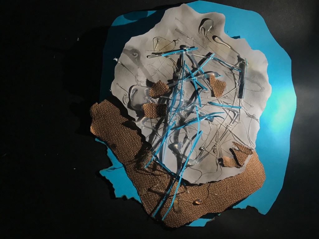
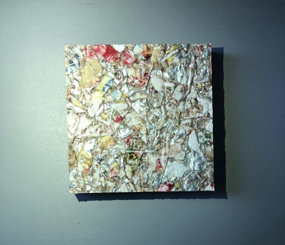
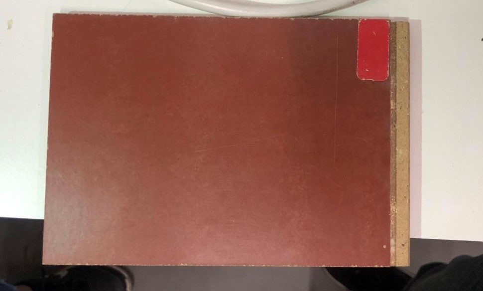
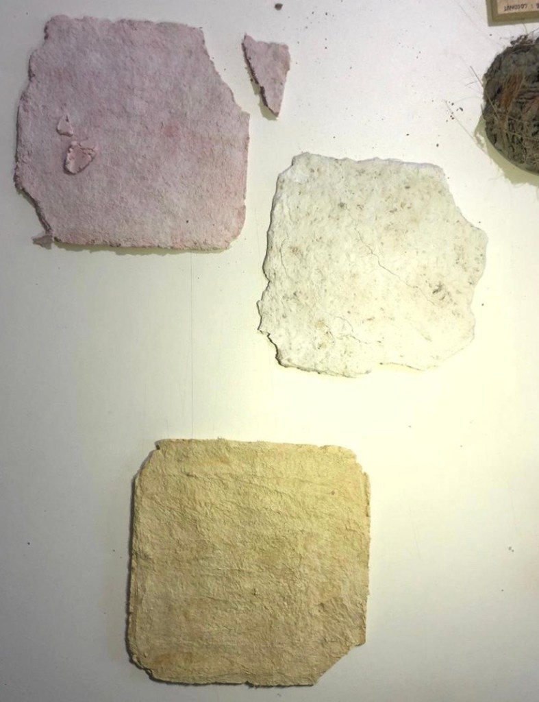
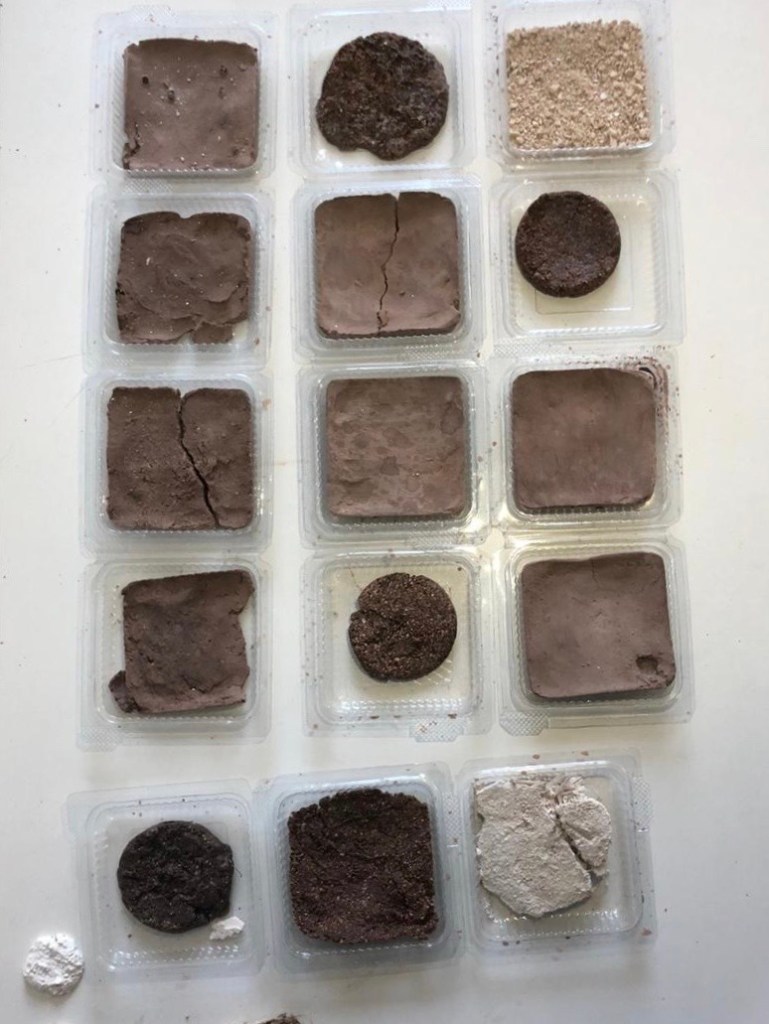
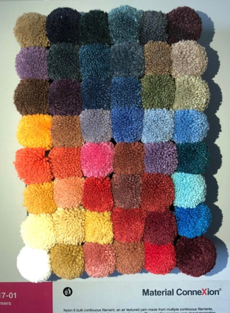
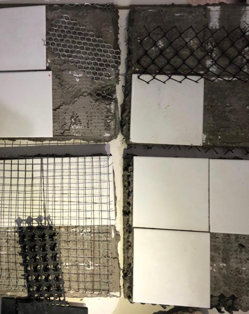
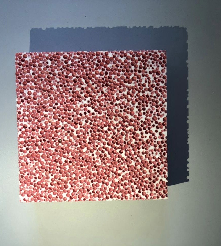
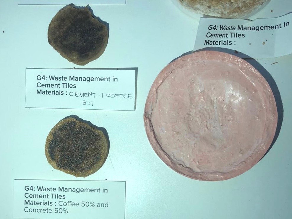
The materials that I used in Board (1) are:
THE MAIN BOARD
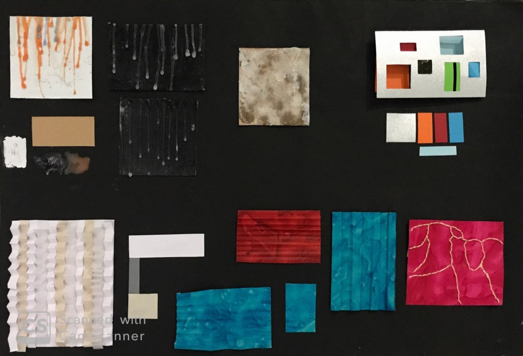
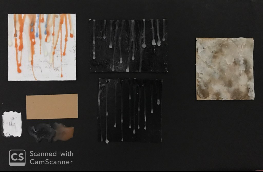
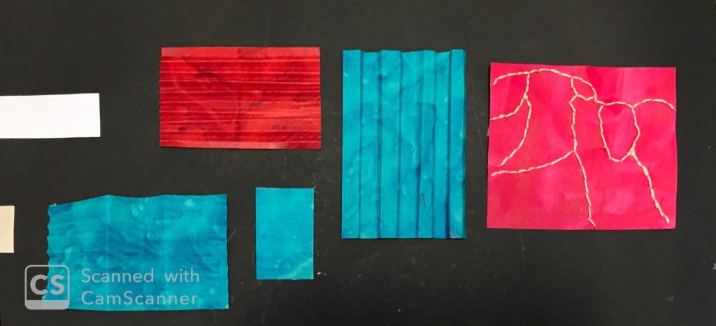
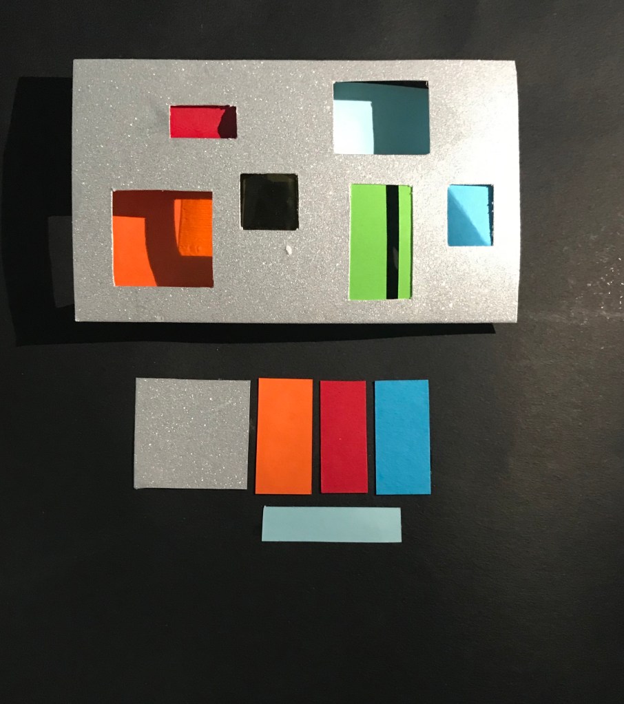
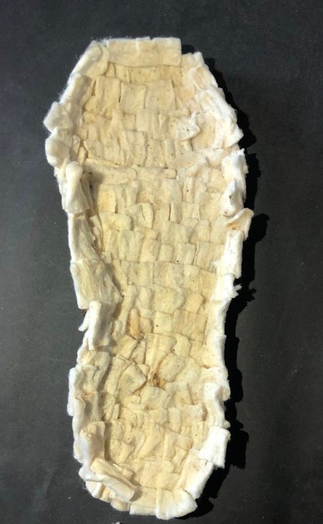
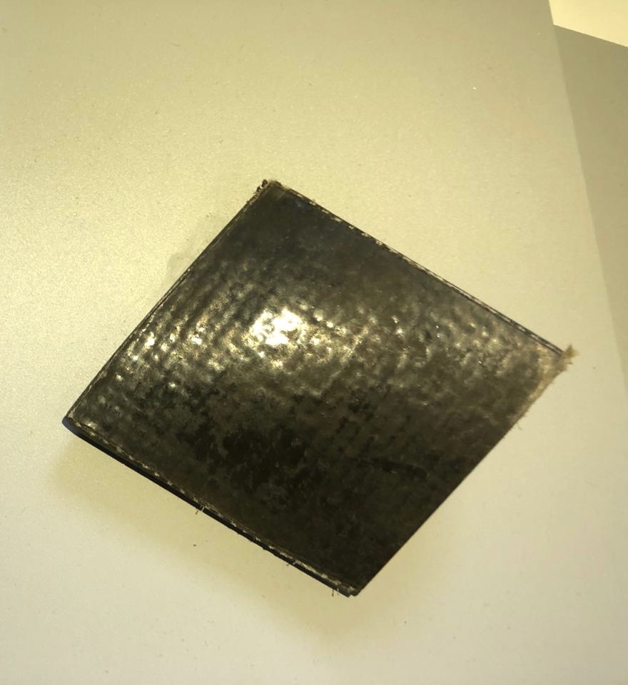
PART OF THE WHOLE BOARD
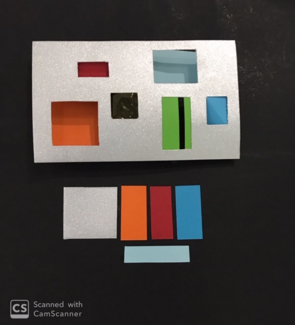
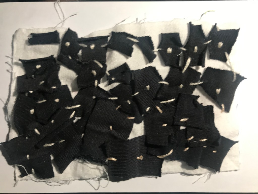
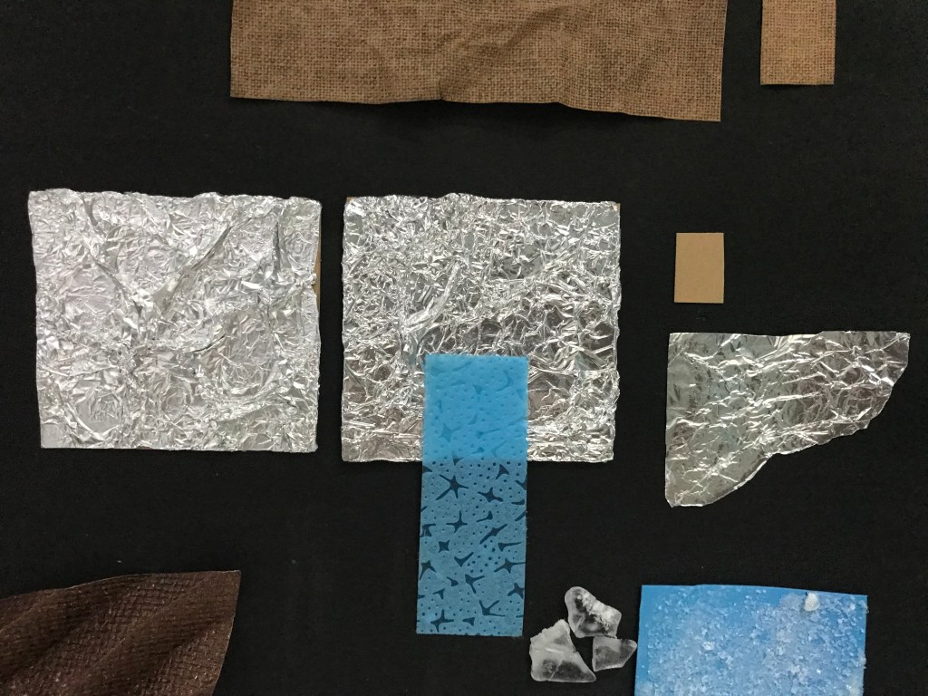
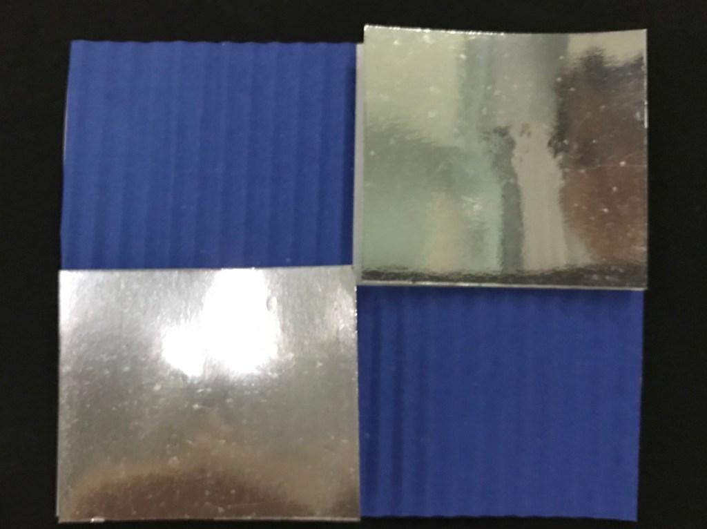
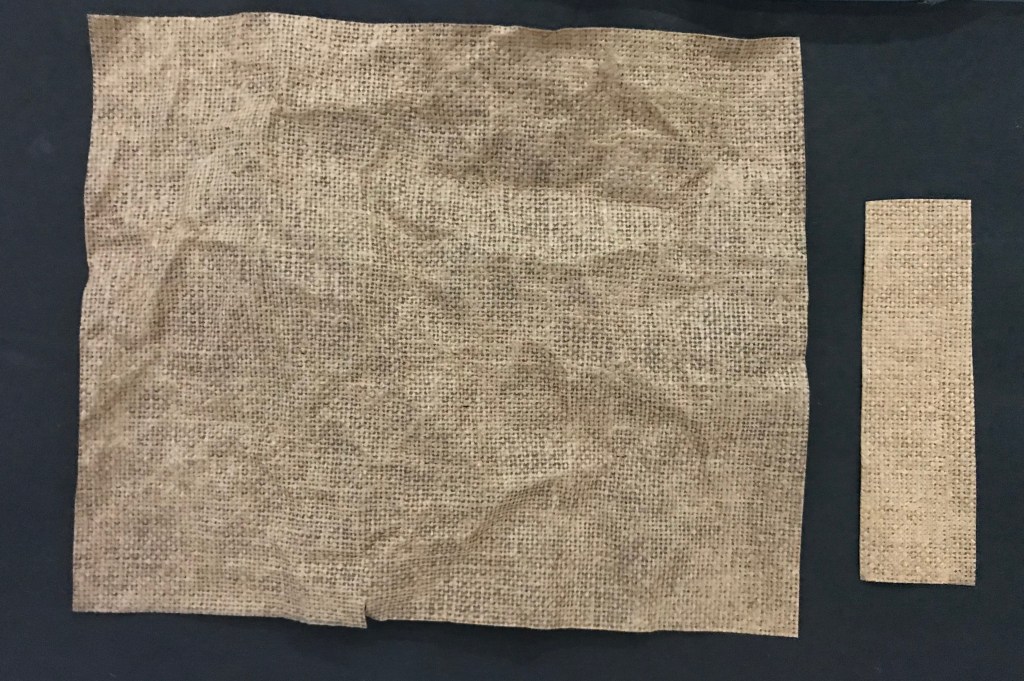
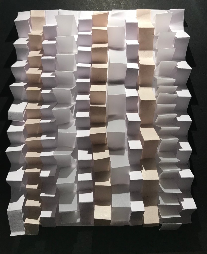
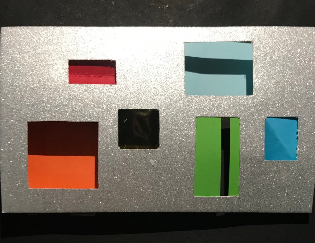
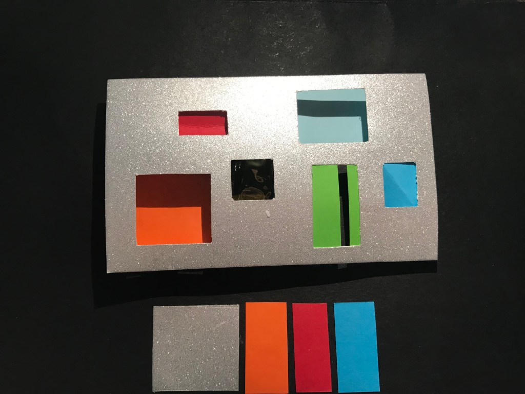
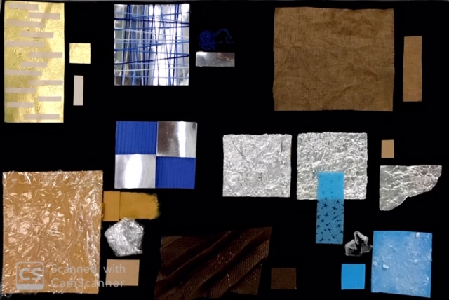
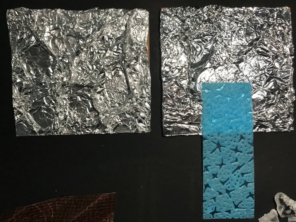
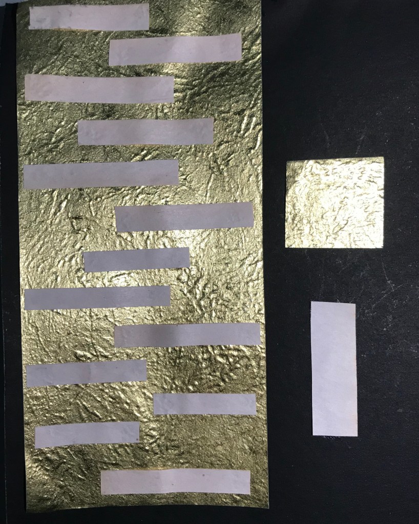
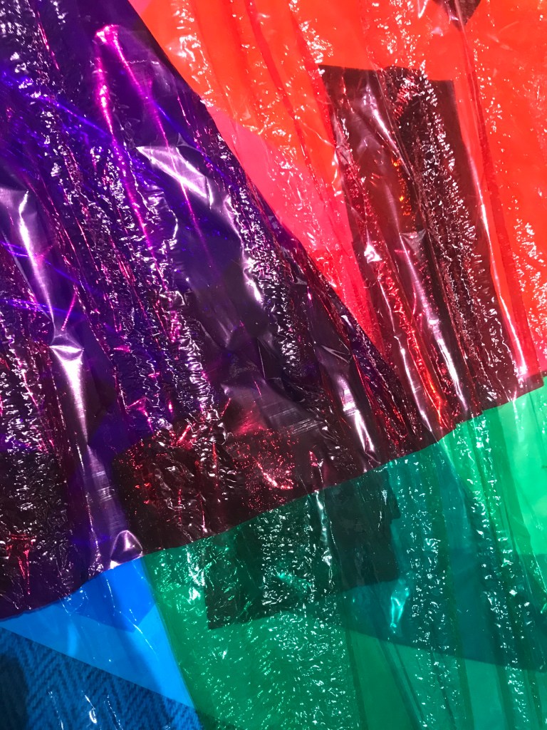
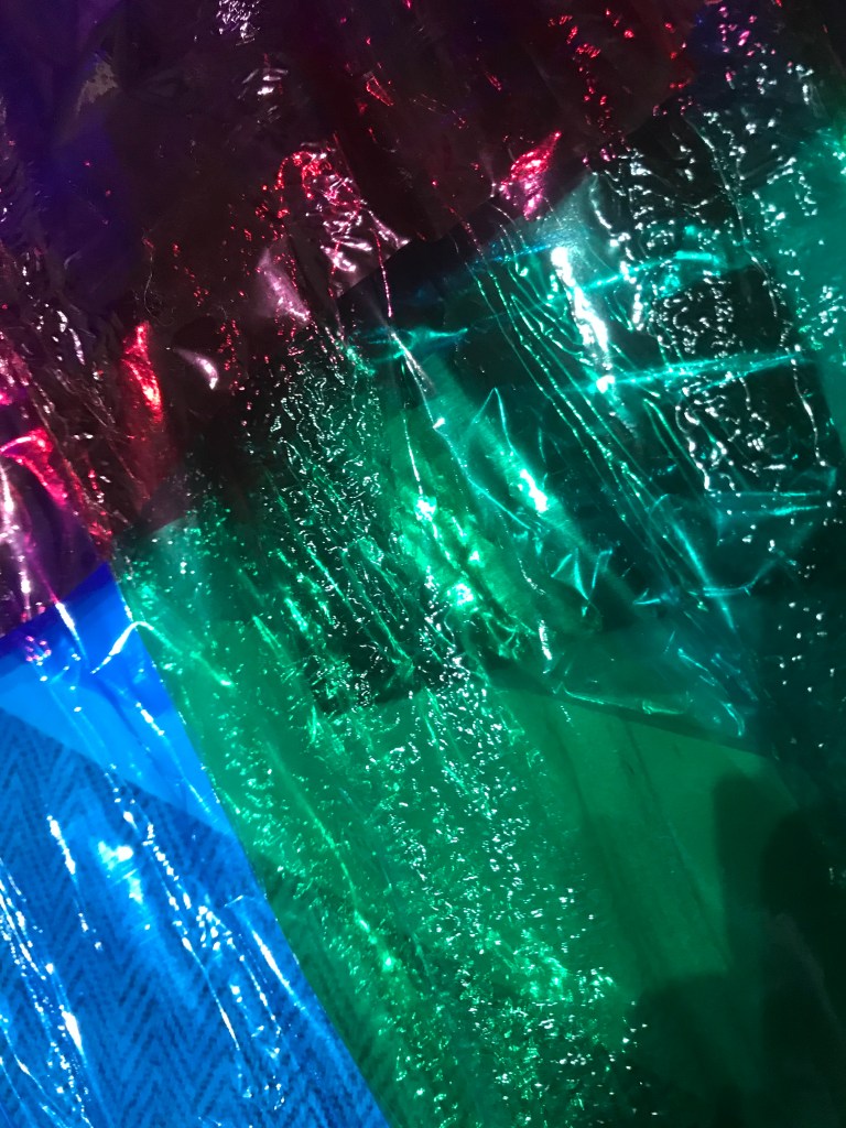
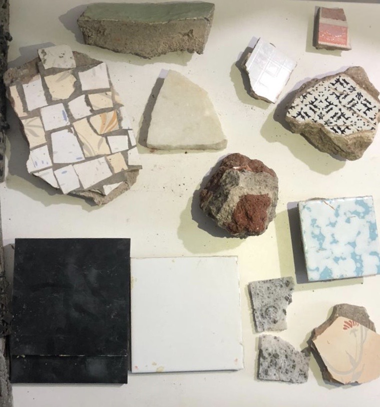
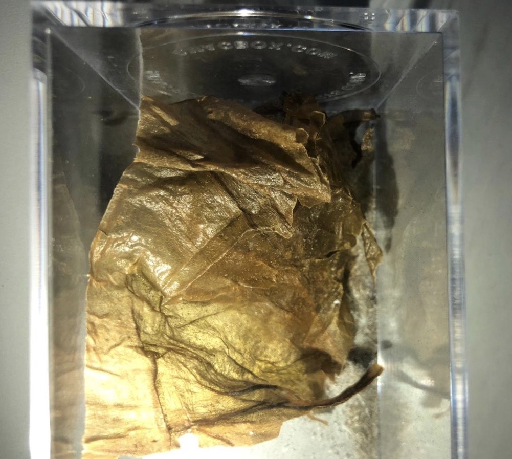
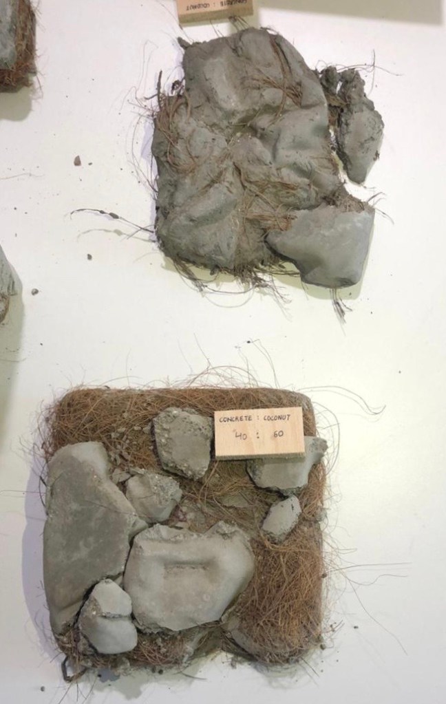
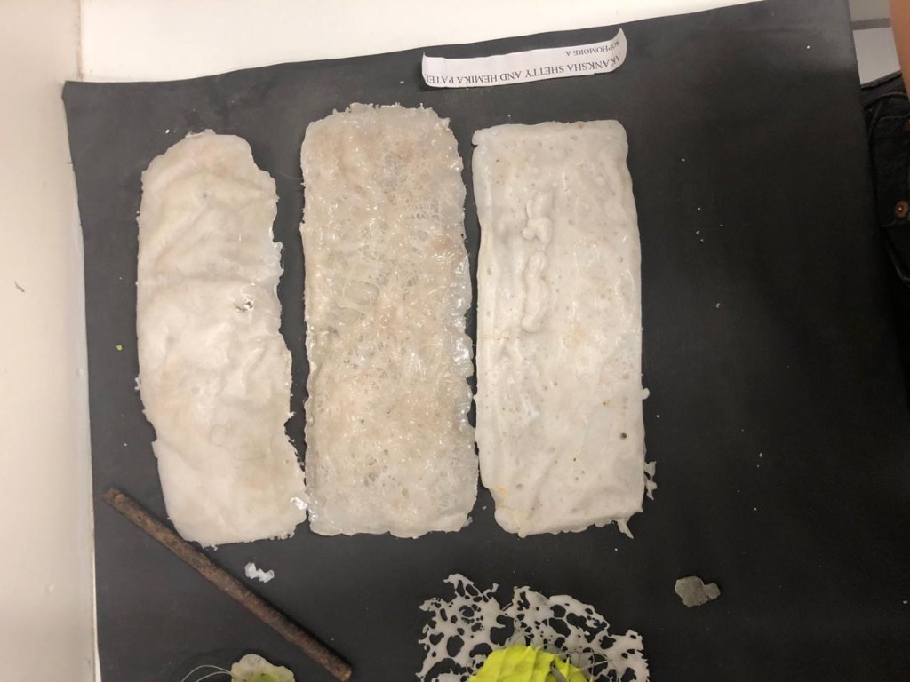
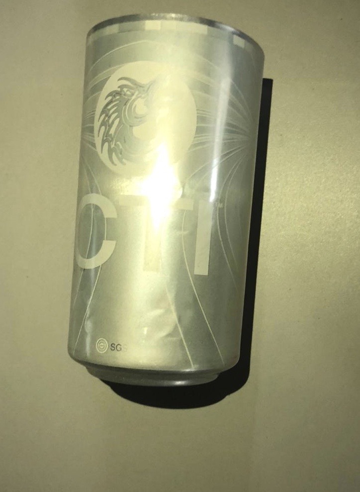
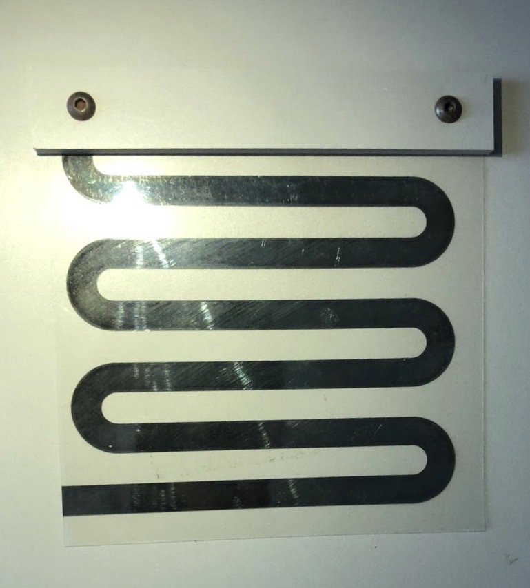
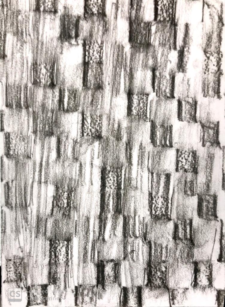
The materials I used in Board (2) :
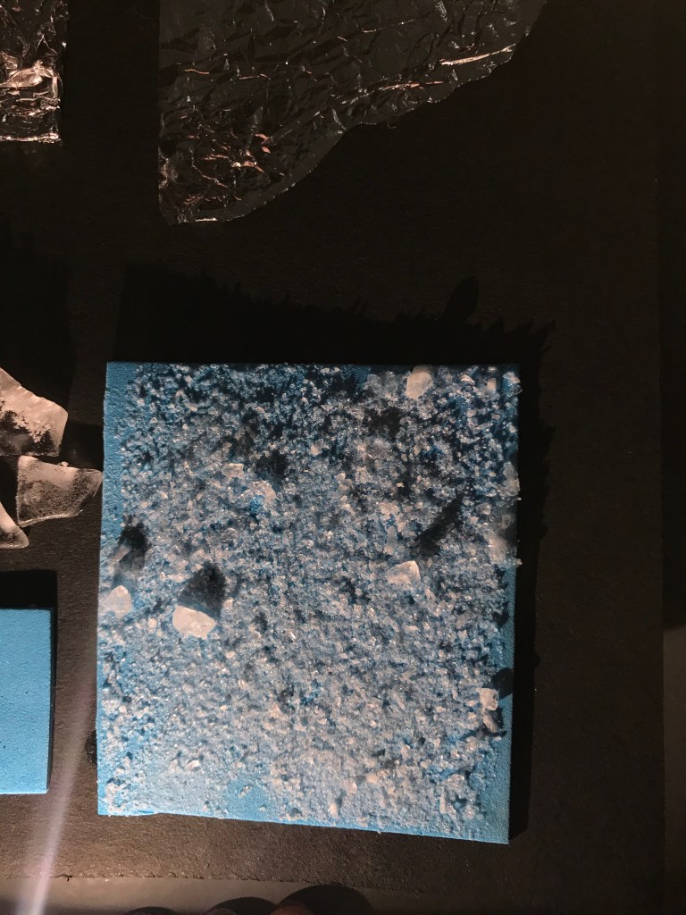
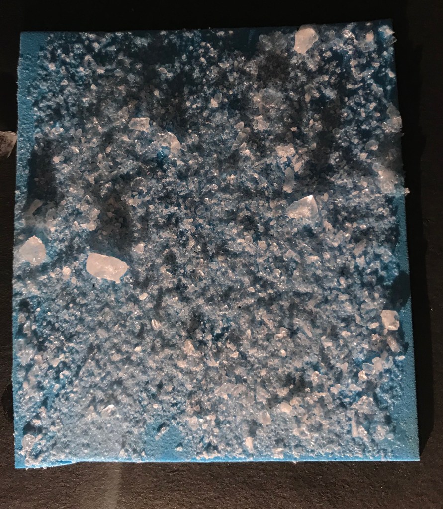
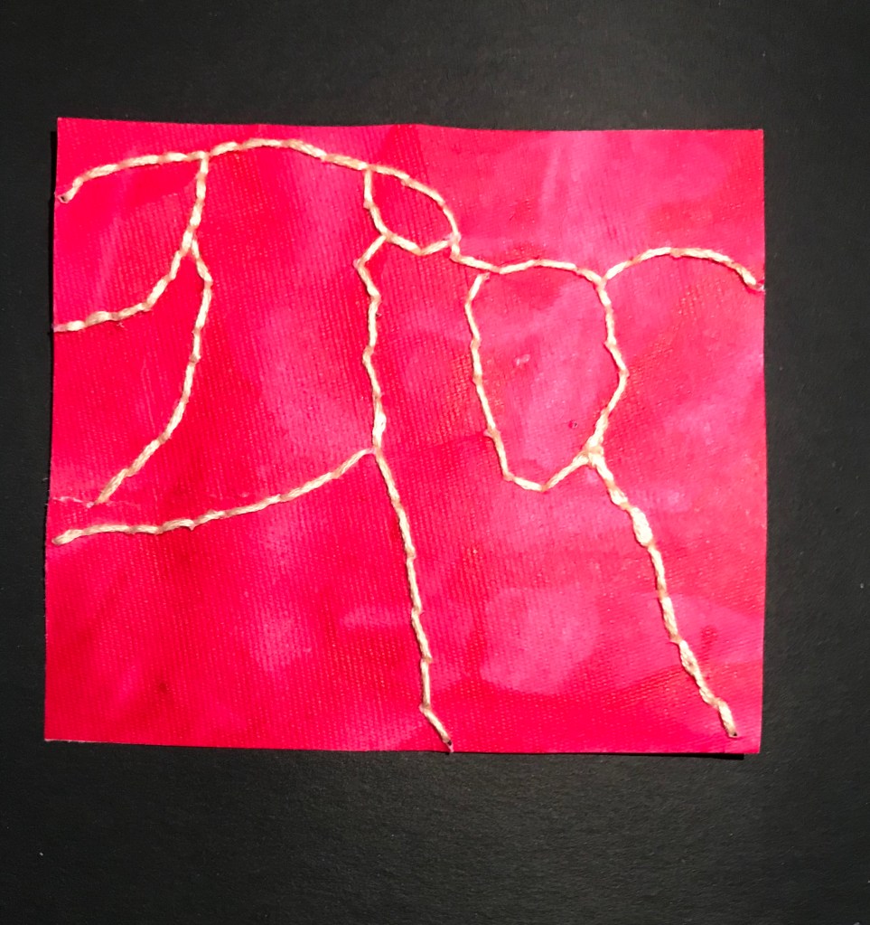
PARTS OF THE WHOLE BOARD
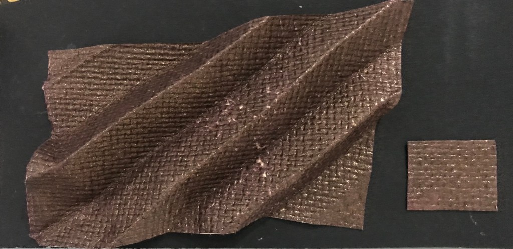
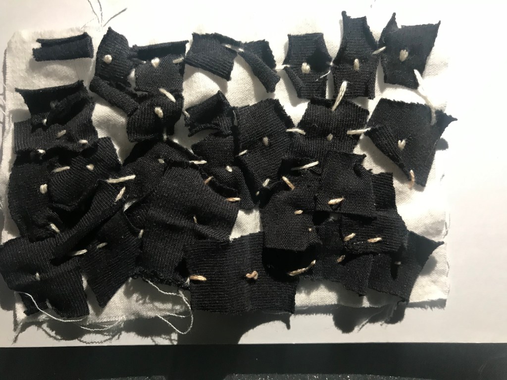
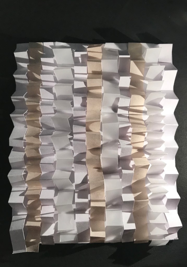
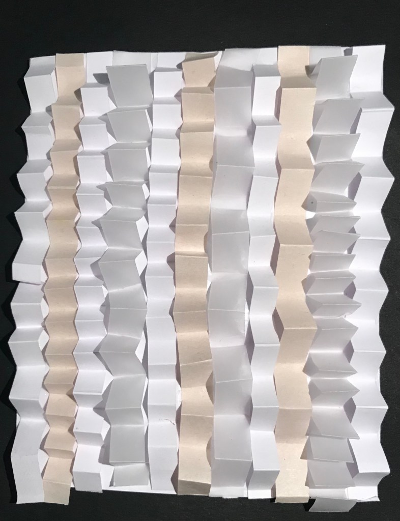
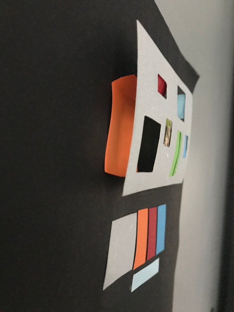
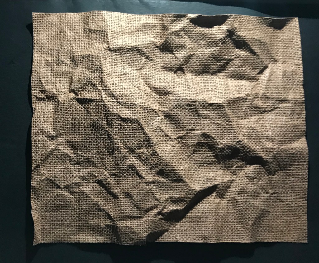
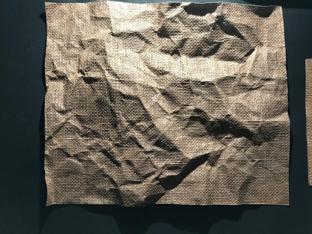
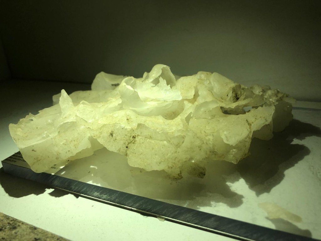
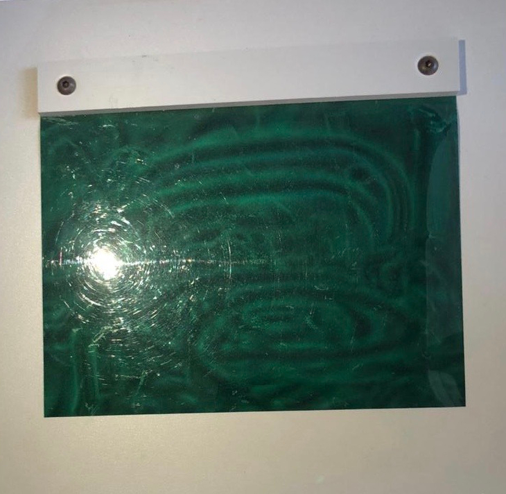
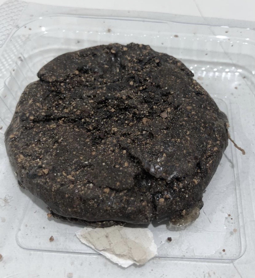
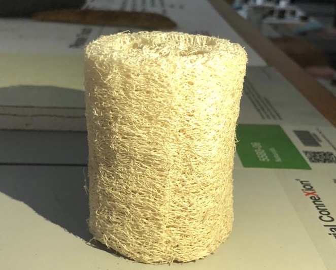
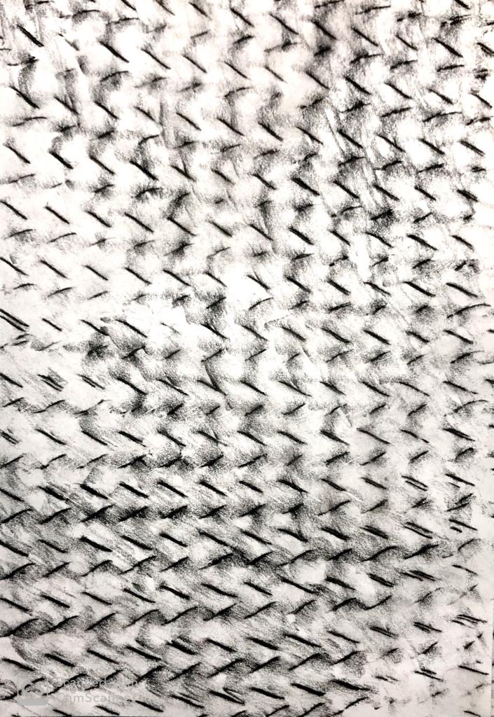
IMAGES WITH LIGHT FROM DIFFERENT ANGLE (1)
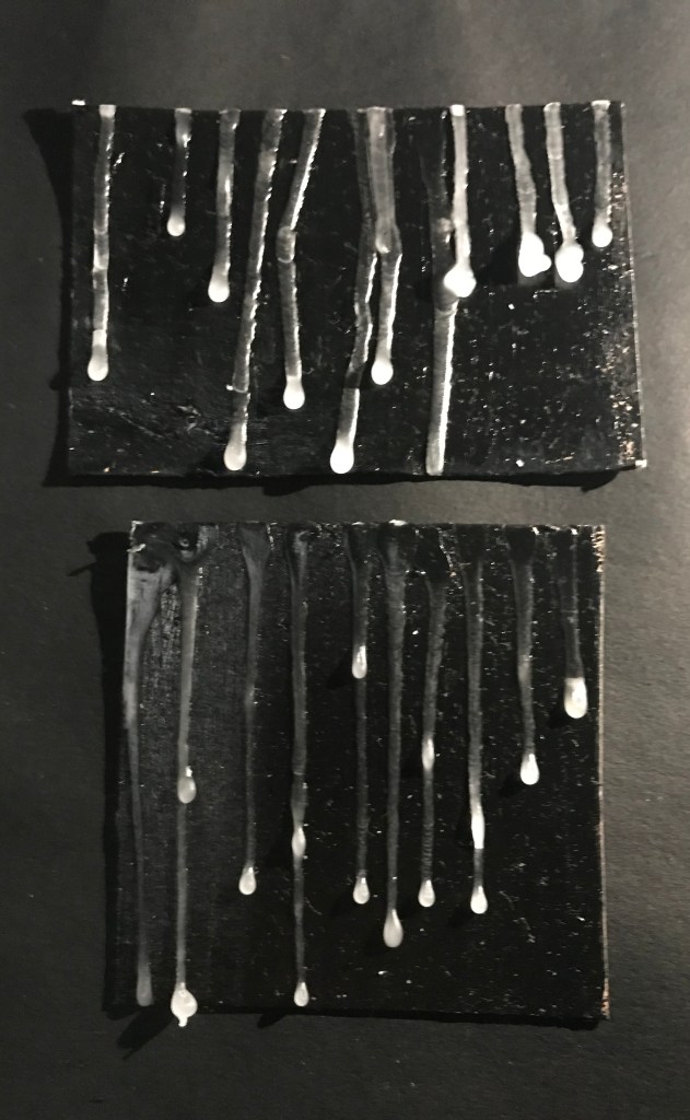
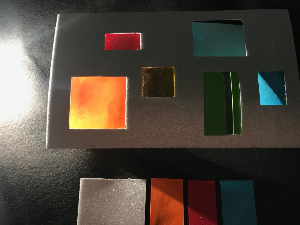
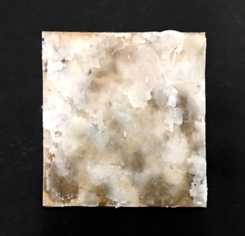
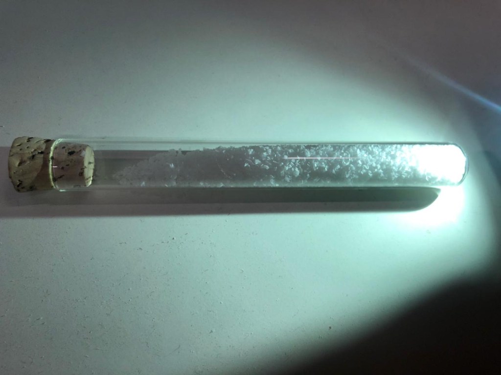
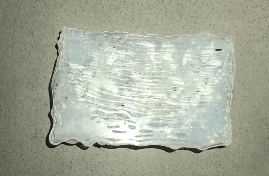
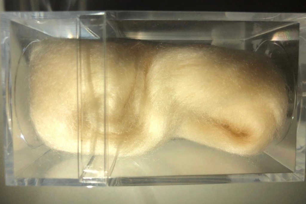
I rolled cellophane paper and kept one side of it exposed to the sun and it created this texture. It really looks fascinating to me.

Date : 28/02/2020
This week we bought around 20 texture sheets and we started off with creating a few textures. Since it was the start I couldn’t come up with much in class. Even though it was the start a lot of things were left to be done. Many things had to be worked and understood about.
Date : 14/01/2020
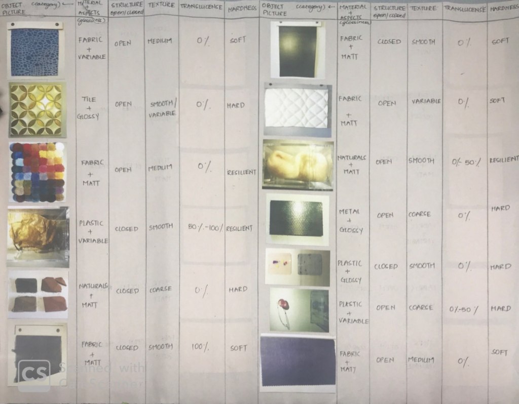
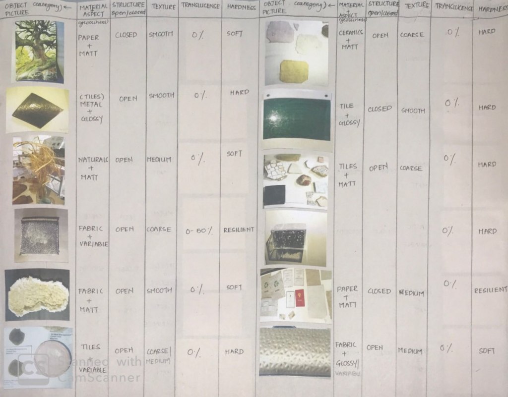
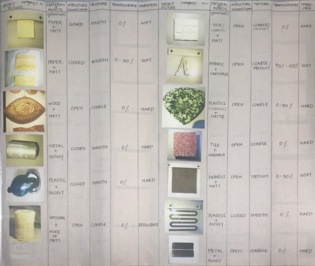
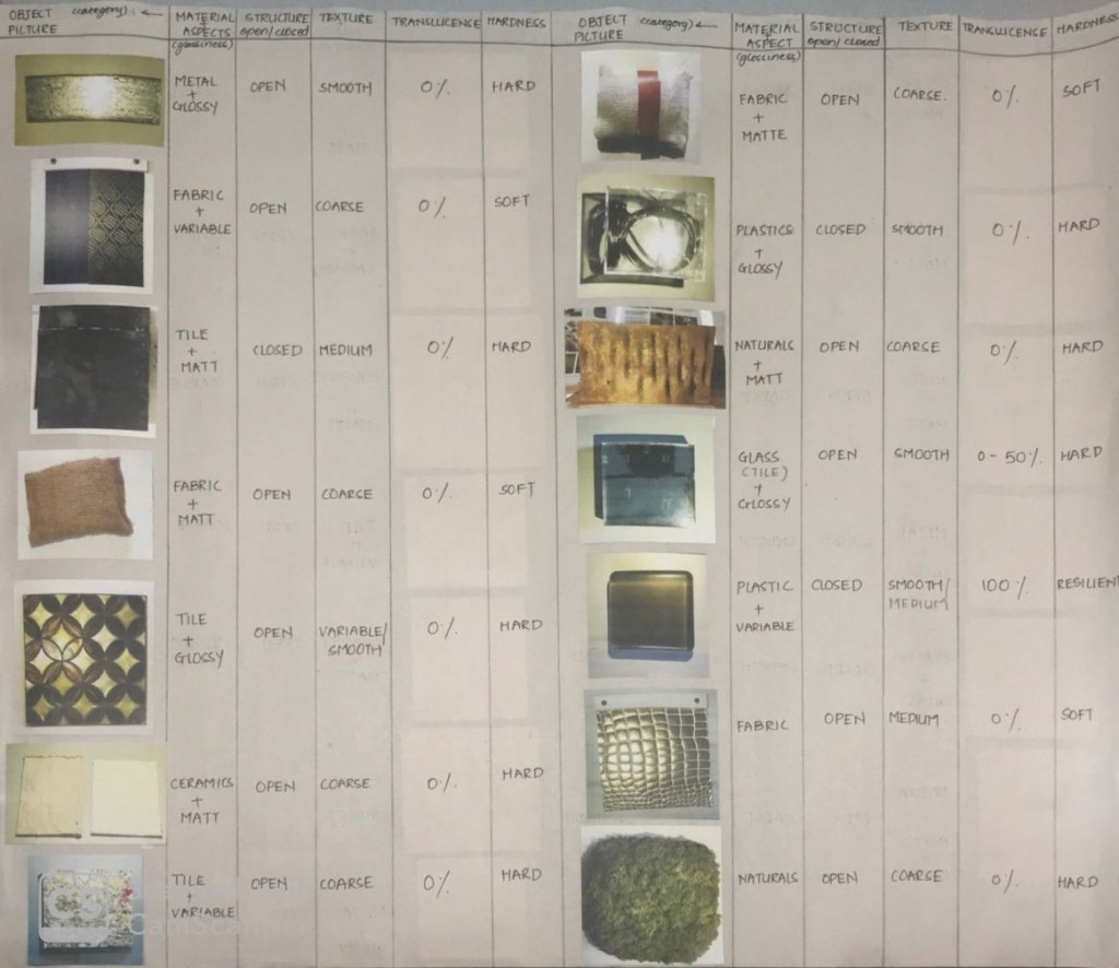
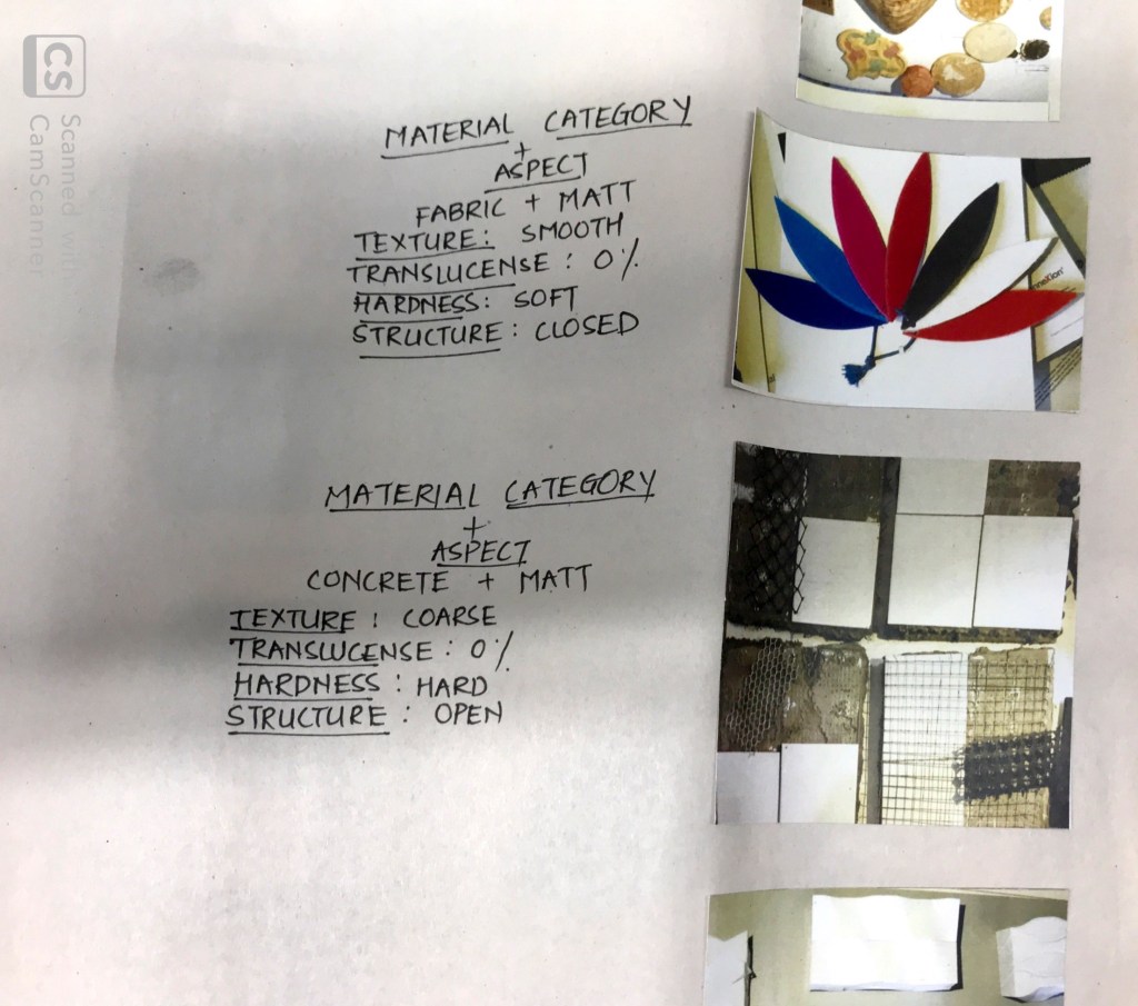
With every progressing week we were getting more involved and intense with studio Lab and analysis of materials sometimes with or without light. This week we had a lot to deal with a lot of materials which were in our college’s material lab. We had to scrutinize them and see if those objects absorb, transmit or reflect light. So we did make a lot of notes and observed it with different intensities of light. So this gave us leeway to observe it with utmost freedom. There were about more than 100 objects giving us a wide spectrum to explore. After taking the picture of as many materials we could and observe them we were given a list of things and then distinguish them according to the categories. This assignment had a lot of questions which were to be answered and there were a lot of debates with my classmates while clicking pictures together. It definitely helped me get a detailed view on the transmission, absorption and reflection of light since I was absent for the first two weeks. Even though it was getting clear with time, counting in the ongoing and previous assignments with a few arguments and questioning with my friends did help me sum up a lot of things.

I also created a table on a few aspects which we were asked to classify on. Following are a few pictures of the table I made.
Date : 07/01/2020
This was an article which we read and discussed in last class. So here I tried to summarize it on the basis of how much I understood. This article definitely gave a clear perspective of what we are trying to achieve and learn. It also provided a lot of basic information of light as well as how materials and colours are a part of this circle.
LIGHT AND MATERIALS
by Marietta Millet
Light and Materials are inseparably connected to each other, indeed they actually determine each other; neither of them is visible to the human eye until the two of them come together.
The article started off with some bold and inevitable statements related to light and the surface implying that none of them exists individually, they are always interconnected and dependent on each other. Most of us feel that materials or colours, they lead the way or act as a protagonist, maybe a starting point of designing a space. But the writer claimed that there have been some great architects who have let themselves be conducted by light in order to choose a material for their work. Light has been acting as a bridge between the human eye and the surface which is meant to interact. Since they both rely on each other both of them are equally important to perceive a space. There were many important aspects which I got to read about the behaviour of light within a space. For example, Materials are a key to understanding light in architecture because they directly affect the quality and quantity of light. The other basic and primary key points are as follows,
An emphasis on materials is grounded on the interaction between light and materials. Highlights arise from glossy materials reflecting discrete points from light. Definition of surface texture comes from Grazing light.
Grazing lights are basically directional lights which are fixed at a certain angle (most of the time it is an acute angle) used to revelate the inner qualities or structure of the materials when light passes through them.
The start of the article was filled with basic information about light and its primary use. Further on she has talked a upon a lot of examples where light acts as a communicator to perceive a space relating to the materials where both of them play their own parts.
In this article she has explored many examples of the coexistence of light and its surfaces and materials concluding that light itself can be a material which can clearly be seen after going through these examples how vividly lights have been used in every space, an object or an installation.
The link to the article:
LIGHT AND MATERIALS
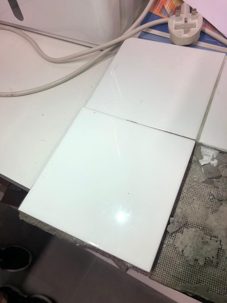
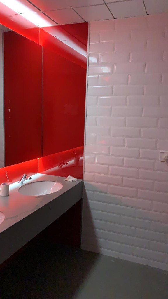
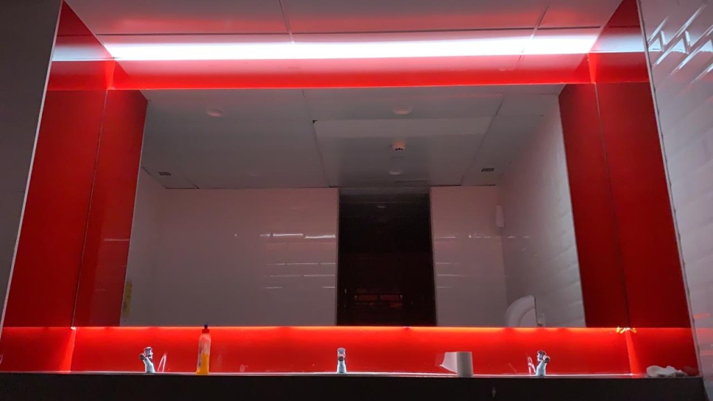
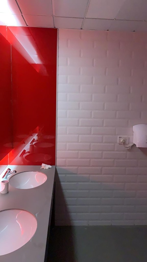
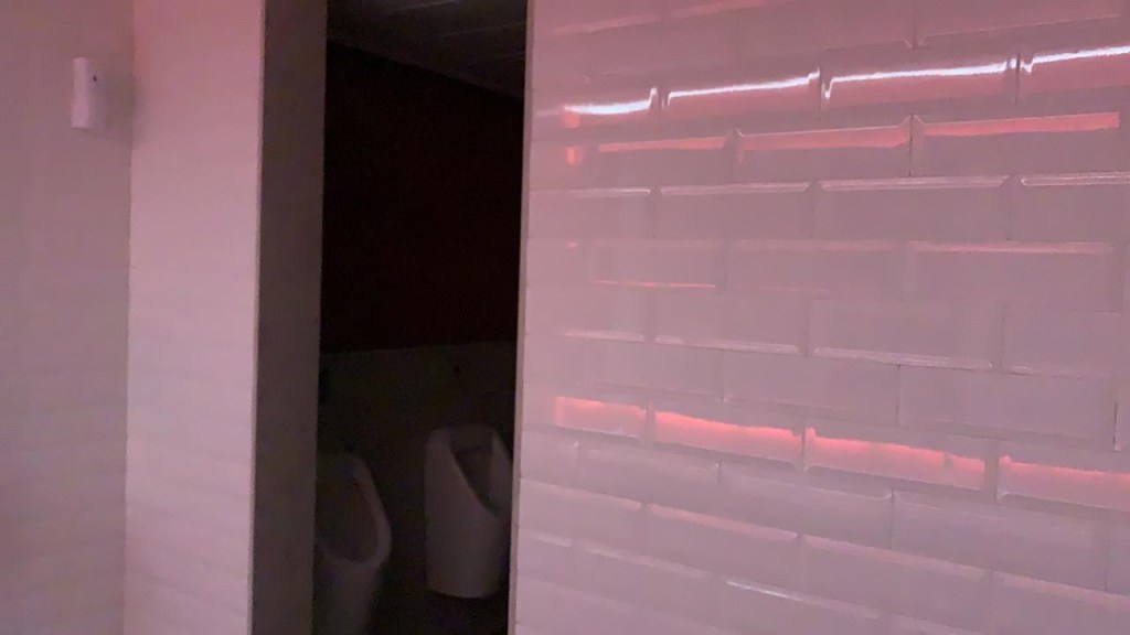
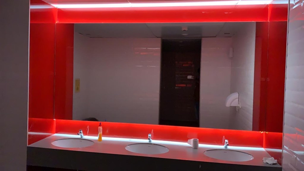
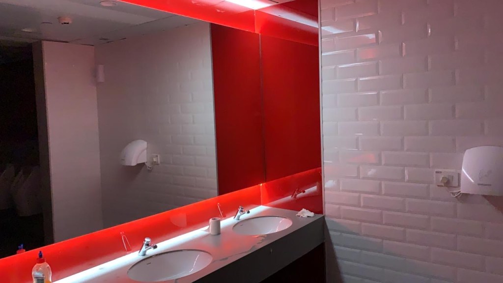
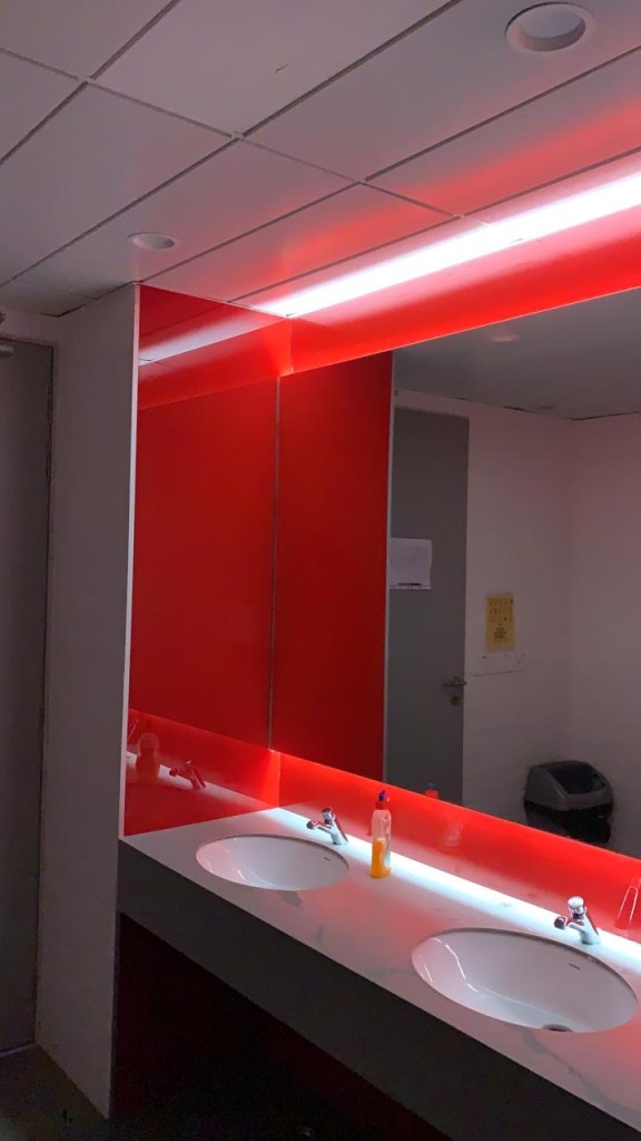
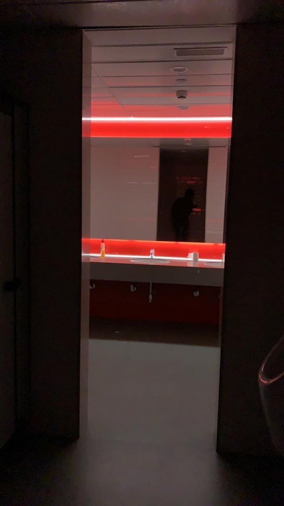
Today we also came across a space in our college which we discussed in class. We saw how light is transmitted, reflected and absorbed. In most areas light was reflecting because of the material which was used in the washroom. The red tile when light falls on it, it reflects the colour red because of the colour. The white tile, on the sides of the walls which is in the shape of the rectangles has grooves in the middle transmits light on the area of the grooves. The ceiling has tiles with a matt finish which does not reflect light as much as it reflects with the tiles on the walls.
Last week since we did a small exercise on finding the 20 textures, this week we took up assignments which were taken to a new level. Fitting it on paper itself was a task. There were many repairs and retry’s especially finding a texture which would fit in scale.
Date : 31/01/2020
Today we studied different architectural structures where light has played a significant role in enhancing the design and how it revolves around light and its finishes.
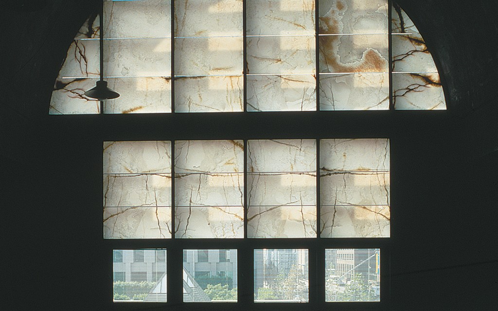
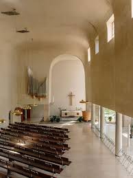
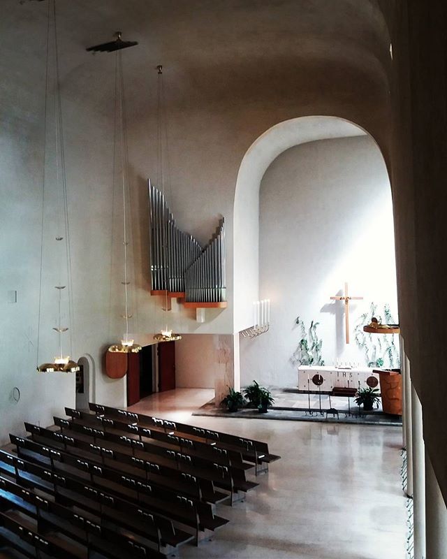
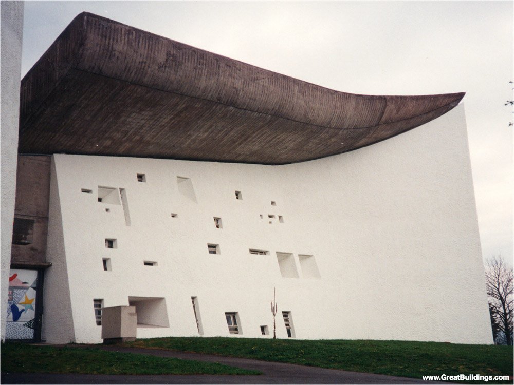
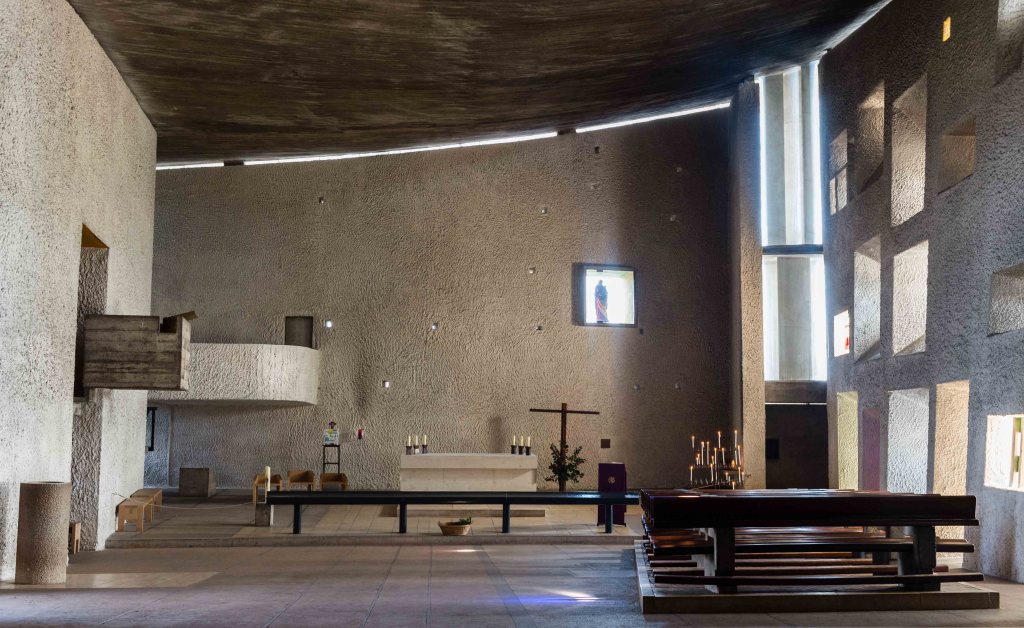
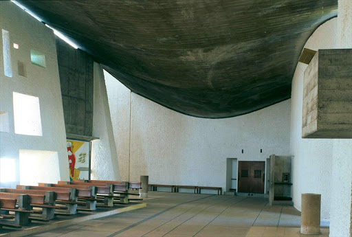
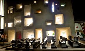
RONCHAMP
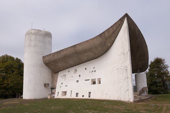
Name of the structure : Notre Dame du Ronchamp
Architect : Le Corbusier
Year : 1954
Location : France
Known for : Religious site of Catholic tradition
Description : Ronchamp is a very famous church built in the 20th century. It is a church which has a very modern touch, ahead of its time making it one of the most extravagant architectural structures distinguished by the other churches which were intricately designed for the purpose of showing grandeur. The interior of this church is simple. The main focus of the architect was depicting spatial purity. He wanted to give an ethereal, meditative touch and made it reflective where humans can observe peace to spot the purest of his sentiments, to align and explore his inner emotions and pray. In the interiors it has an irregular arrangement of glazed windows where some are plain and some are coloured which is the most attractive part of the church which were useful during the study of light. Each window has its own shape and form which eventually affects the passage of light going through it. The roof of the church has exposed concrete which is raw and has a few marks because of the castings.

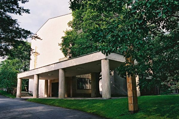
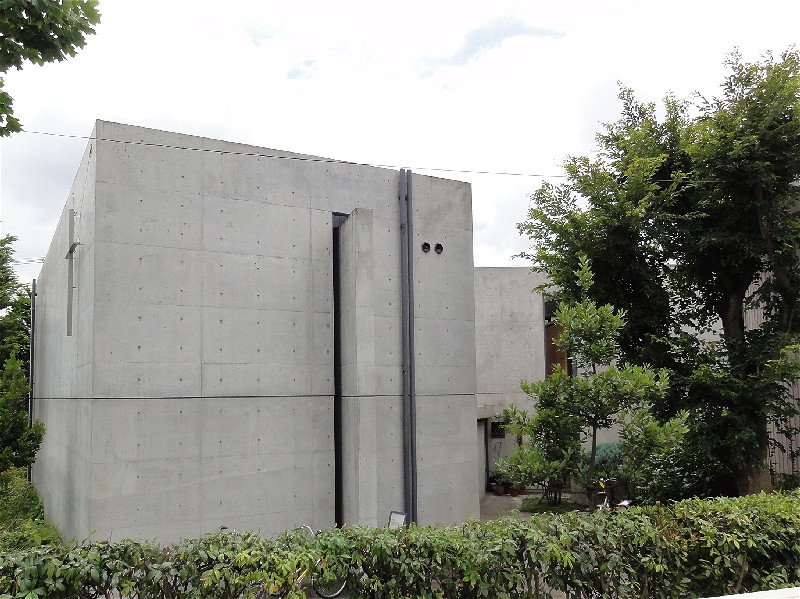
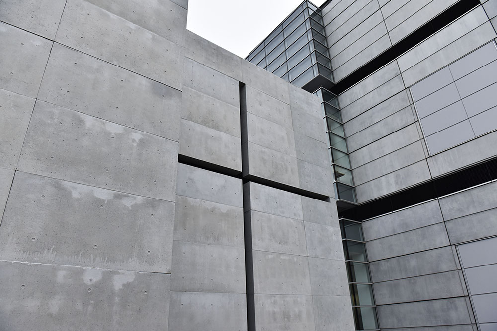
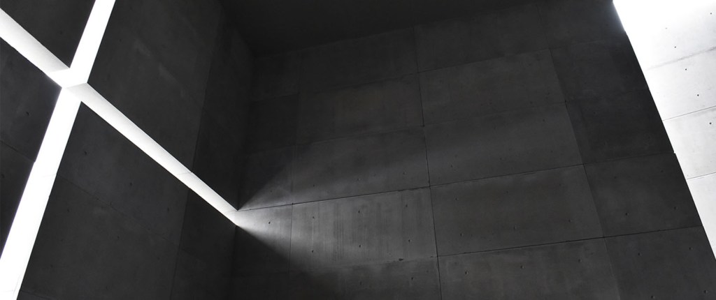
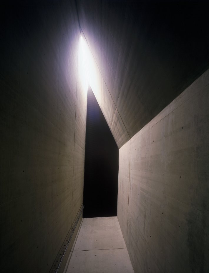
CHURCH OF LIGHT
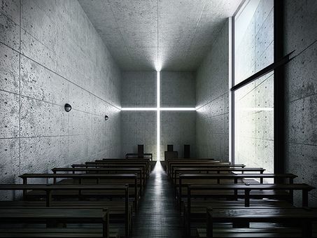
Name of the structure: Church of Light
Architect : Tadao Ando
Year : 1989
Location : Outskirts of Osaka, Japan
Known for : Main chapel of the Ibaraki Kasugaoka Church
Description : Tadao Ando is a Japanese Architect who focuses on the principles of minimalism and minimalist aesthetics. The church of light is a very simple building which does justice to the phrase ‘less is more’. The primary material used in this chapel is concrete. This structure speaks of peace and tranquility. The cross is engraved in the wall with horizontal and vertical line which is filled with light which passes through the void. The interior of the walls has a rough finish and its texture intensifies depending upon the amount of light striking the walls in the interiors.
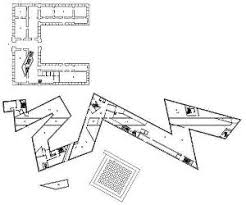
JEWISH MUSEUM
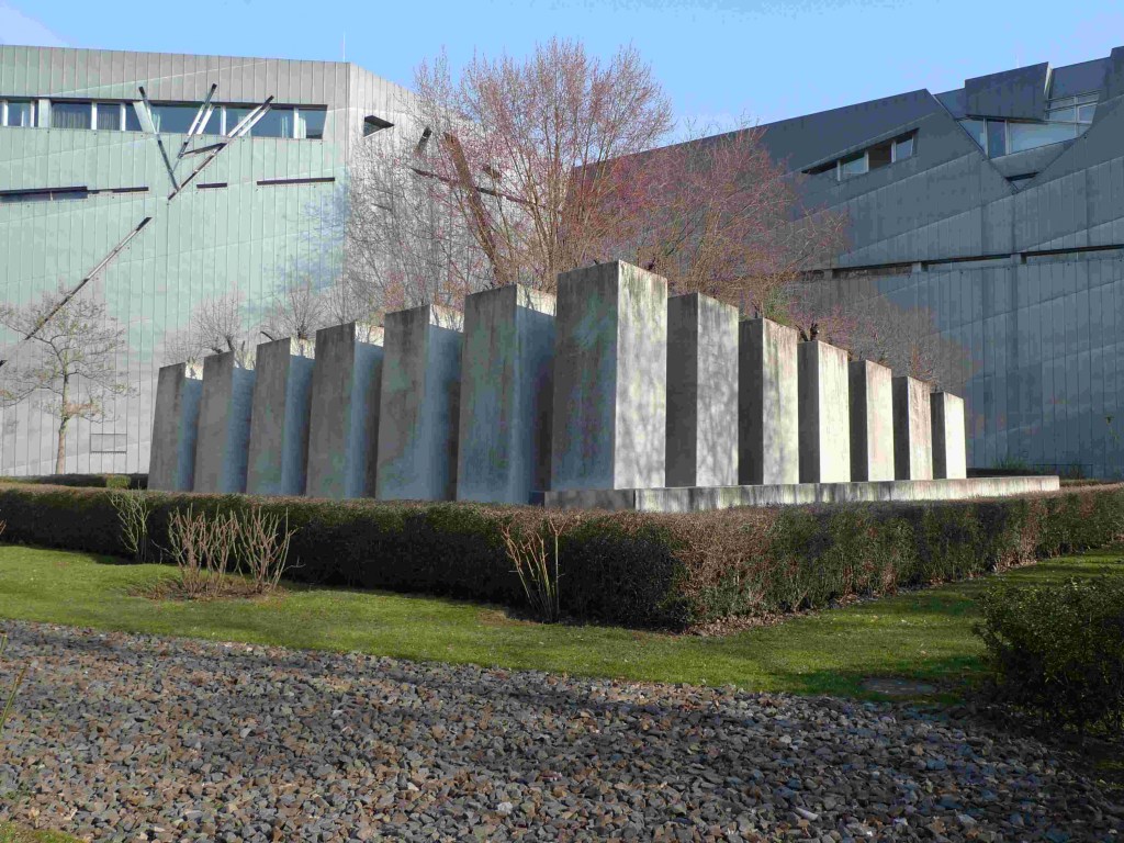
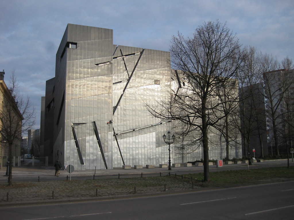
Name of the structure : Jewish Museum
Architect : Daniel Libeskind
Year : 2001
Location : Berlin, Germany
Known for : Documentation of German-Jewish history
Description : The American architect Daniel Libeskind designed one of the most legendary building with the most mesmerizing interiors and exteriors which had attracted around lakhs of people from Germany as well as around the globe. The museum gives out a disturbing, distorting and a disintegrated feeling when one explores the interiors of it.
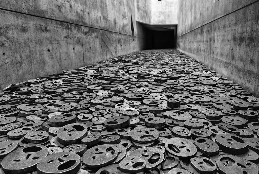
“The official name of the project is ‘Jewish Museum’ but I have named it ‘Between the Lines’ because for me it is about two lines of thinking, organization, and relationship.” —Daniel Libeskind
He designed the floor plan based on two lines the building’s visible zigzagging line and an invisible straight line. The initial is adapted by an abstraction of the Jewish star of the David which extended over the site. This structure had historical importance to represent the Jews lifestyle before, during and after the Holocaust. He associated his emotions which he felt because of the absence of the Jewish culture in Germany which included emptiness, absence to depict through the interiors and exteriors as a medium of expression. The interior consists of exposed concrete adding on a layer of a cold vibe. It has a very complex interior where the observer feels confused with the dead ends and confusing routes showing how the Jewish people felt during the World War II. It also has silver linings in between them the reinforced concretes, a representational symbol used by Libeskind to show a a ray of hope and light in places where one feels stranded and no way of escape. These were a few ways he expressed the brutal phase that the Jews faced during the Second World War.
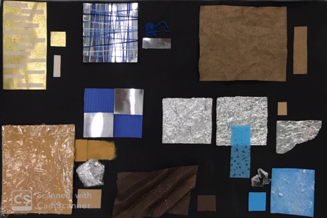
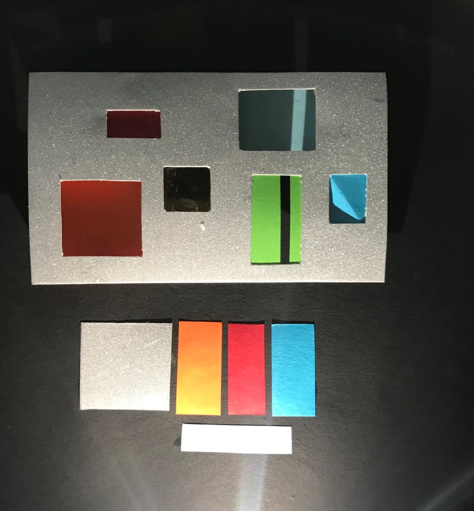
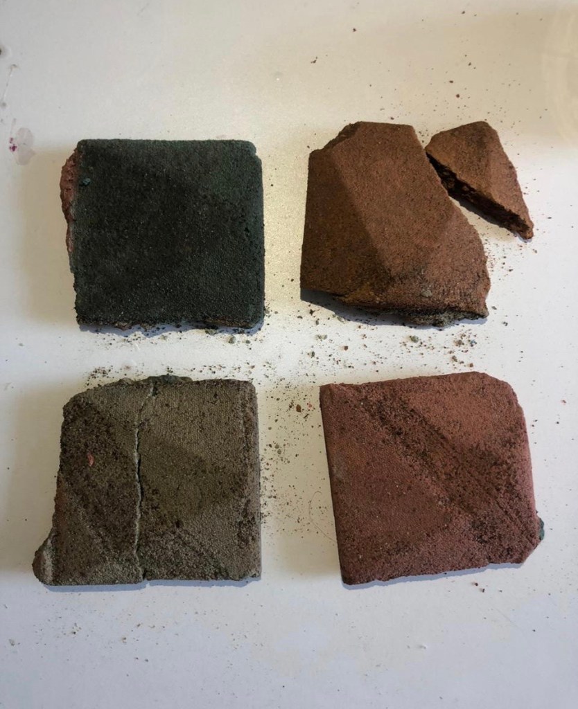
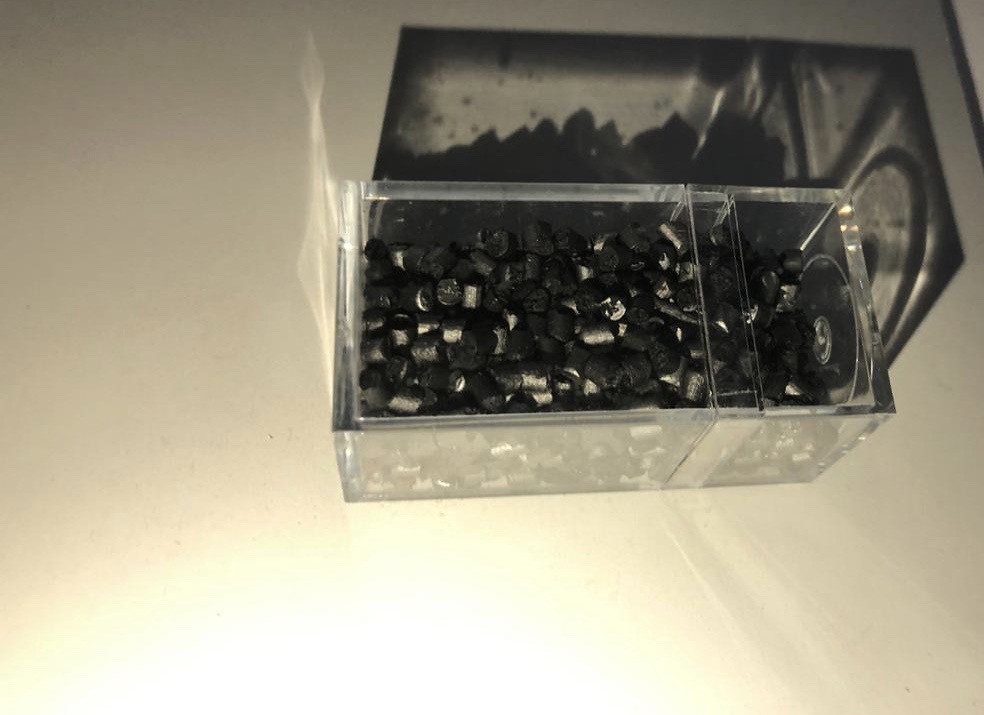
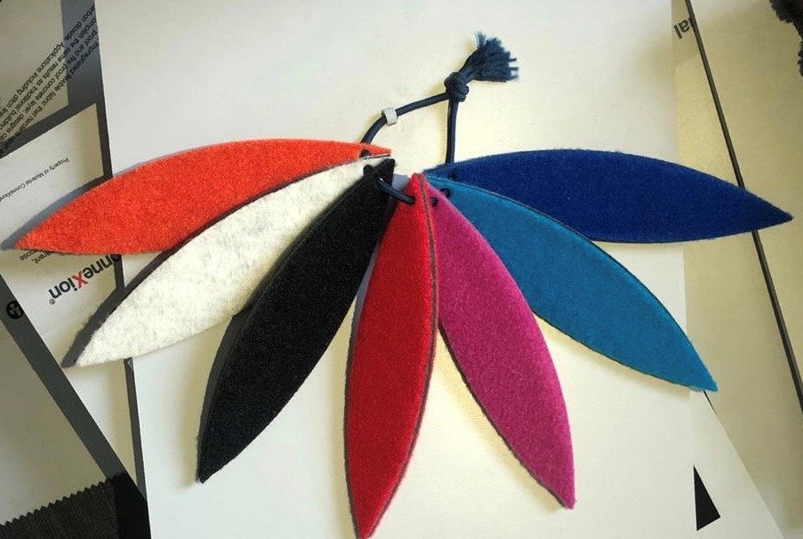
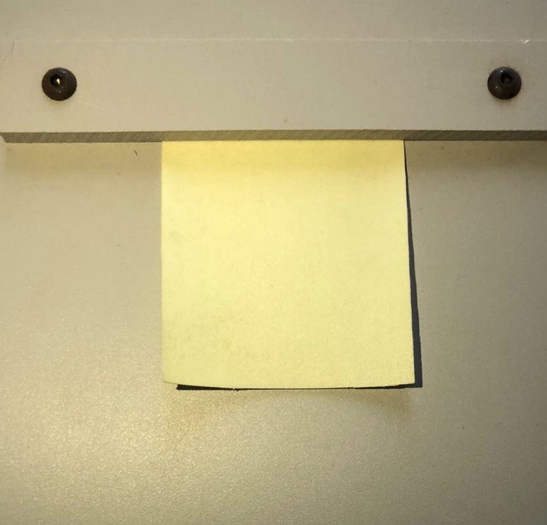
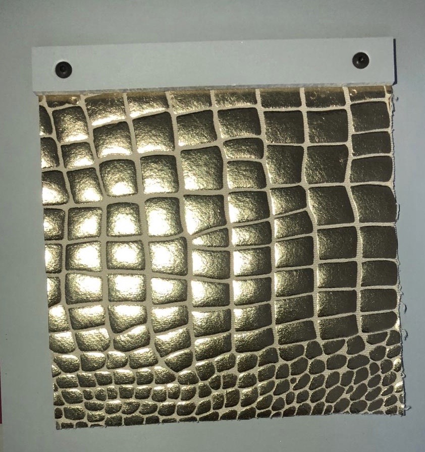
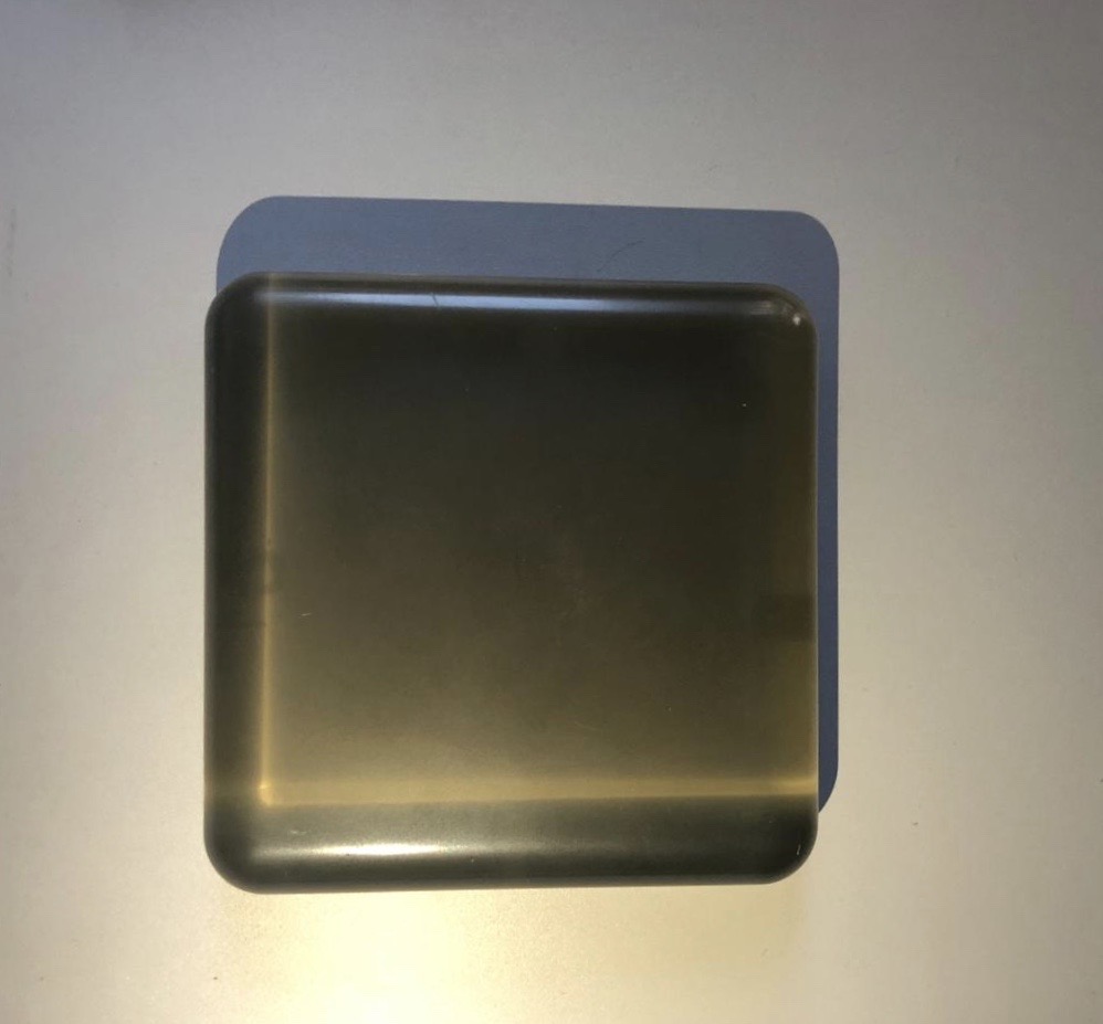
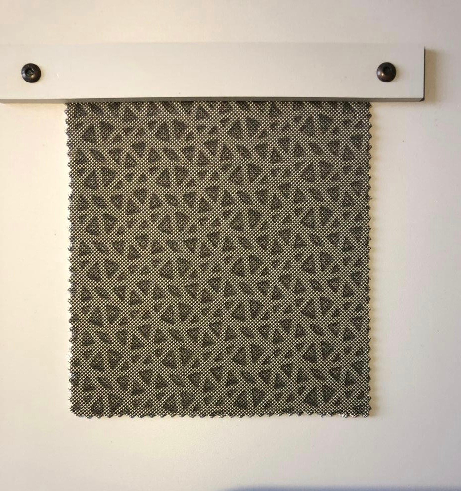
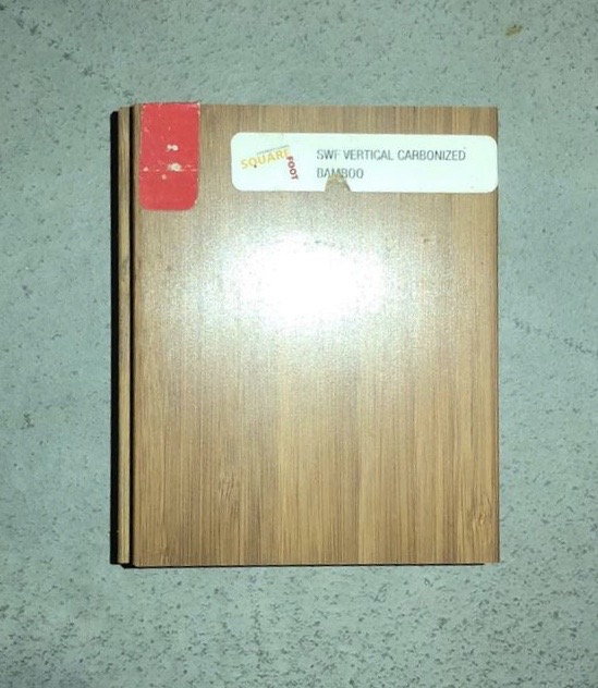
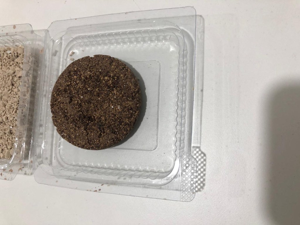
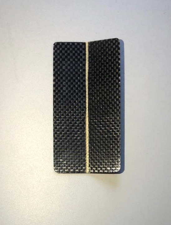
LAST CLASS WE WERE GIVEN AN ASSIGNMENT ABOUT COLLECTING AROUND 20 TEXTURES WHICH WERE AVAILABLE AROUND US. FOLLOWING ARE THE 20 TEXTURES:
Date : 24/01/2020
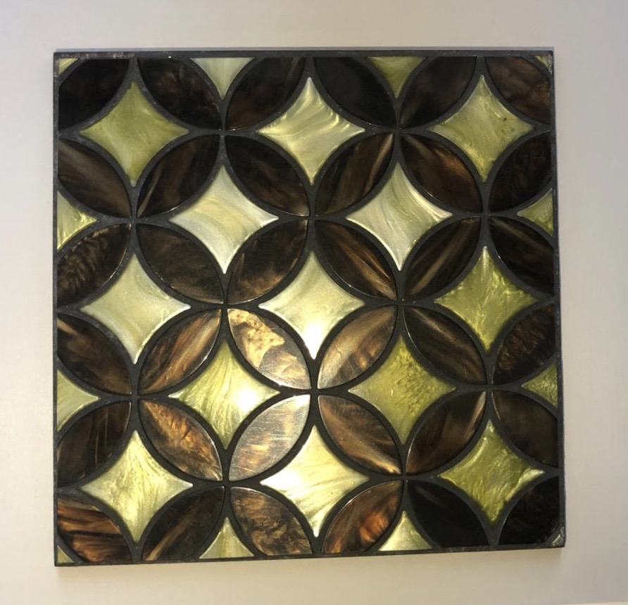
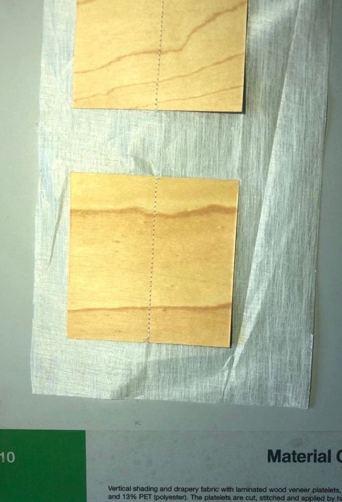
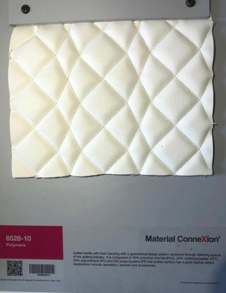
With every new class an initiation to a new spectrum of something which was associated with light and its surfaces was introduced and this time it was ‘TEXTURES’. Textures are appearance of surfaces or characteristics of the surface which can be sensed visually and through touch. Through textures a space can have a variety of boards to look at and invests in the visual interest of a space. Textures are usually smooth, glossy, matt, rough, hard, soft, etc and such results can be created by using paints and materials. Texture also engages the viewer. They are classified into two sets of textures namely:
Textures going further also affects a number of aspects when it is dealing with the space or an object in it. But how do these textures have anything to do with light? Since the textures have to be used to a limited scale and it not only is the aspect that completes a space. It has objects and a few colours to be harmonised with.
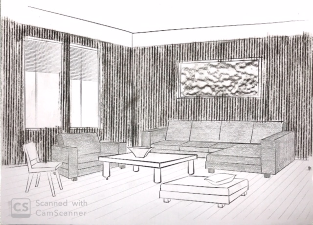
We saw how textures affects the visual size of the space. One example we saw in class was furniture with heavy or rough textures end up absorbing more light but furnishings with smooth surfaces reflects more light than the rough ones which creates an illusion of an expanded space.
Texture also affects colour. Because of the colour on the surface the light is either absorbed or reflected. A smooth surface reflects more light as it is reflected in a linear direction making the surface lighter and at the same time impacting the space. On the rough surface it absorbs more light when it hits the surface and scatters in all directions leading to shadows making shadows and eventually creates a dark surface.
The third was applying texture to smooth surfaces. An accent piece of painting and faux finishes can be used to give an embossed or a three dimensional look on a flat surface. We further discussed methods of painting which are used to give a texture look on the wall. Some of them which I have come across are stones, sponges and faux finishes include marble
After learning a few points on these we did a small exercise relating to it. Words which describe the texture of the following objects:
How do materials transmit light? It can be again classified into three types when they do transmit light:
