Date : 31/01/2020
Today we studied different architectural structures where light has played a significant role in enhancing the design and how it revolves around light and its finishes.
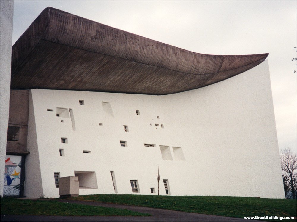
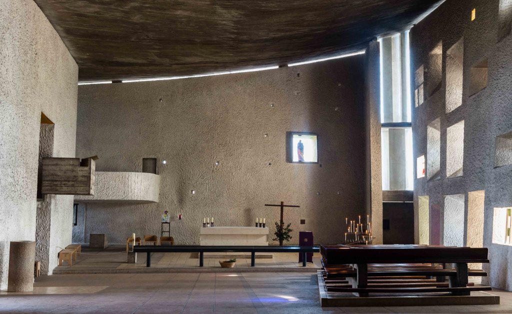
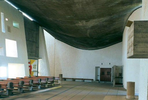
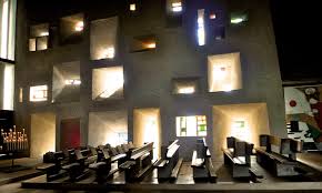
RONCHAMP
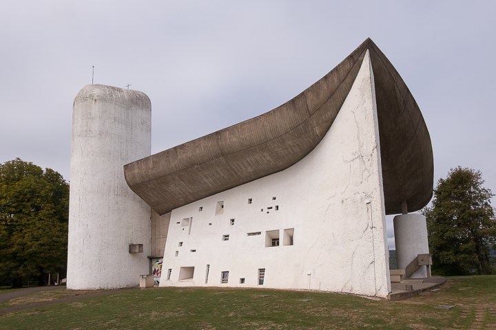
Name of the structure : Notre Dame du Ronchamp
Architect : Le Corbusier
Year : 1954
Location : France
Known for : Religious site of Catholic tradition
Description : Ronchamp is a very famous church built in the 20th century. It is a church which has a very modern touch, ahead of its time making it one of the most extravagant architectural structures distinguished by the other churches which were intricately designed for the purpose of showing grandeur. The interior of this church is simple. The main focus of the architect was depicting spatial purity. He wanted to give an ethereal, meditative touch and made it reflective where humans can observe peace to spot the purest of his sentiments, to align and explore his inner emotions and pray. In the interiors it has an irregular arrangement of glazed windows where some are plain and some are coloured which is the most attractive part of the church which were useful during the study of light. Each window has its own shape and form which eventually affects the passage of light going through it. The roof of the church has exposed concrete which is raw and has a few marks because of the castings.

CHURCH OF LIGHT
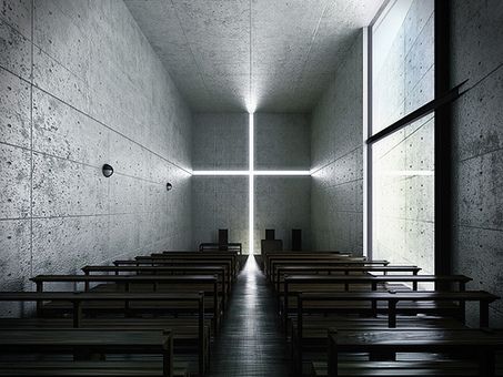
Name of the structure: Church of Light
Architect : Tadao Ando
Year : 1989
Location : Outskirts of Osaka, Japan
Known for : Main chapel of the Ibaraki Kasugaoka Church
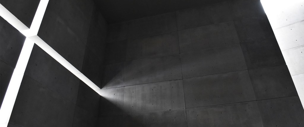
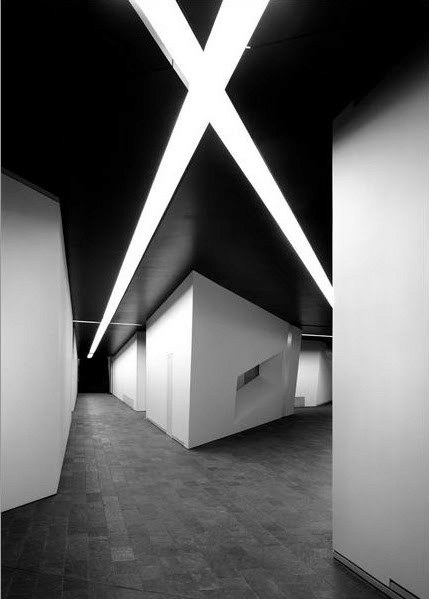
Description : Tadao Ando is a Japanese Architect who focuses on the principles of minimalism and minimalist aesthetics. The church of light is a very simple building which does justice to the phrase ‘less is more’. The primary material used in this chapel is concrete. This structure speaks of peace and tranquility. The cross is engraved in the wall with horizontal and vertical line which is filled with light which passes through the void. The interior of the walls has a rough finish and its texture intensifies depending upon the amount of light striking the walls in the interiors.
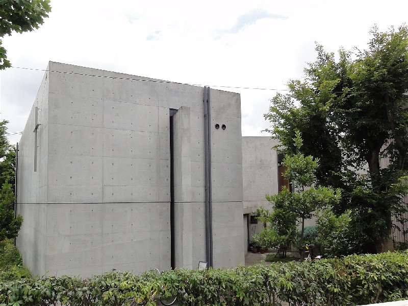
JEWISH MUSEUM
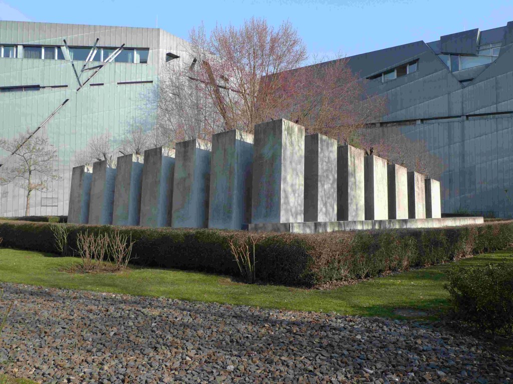
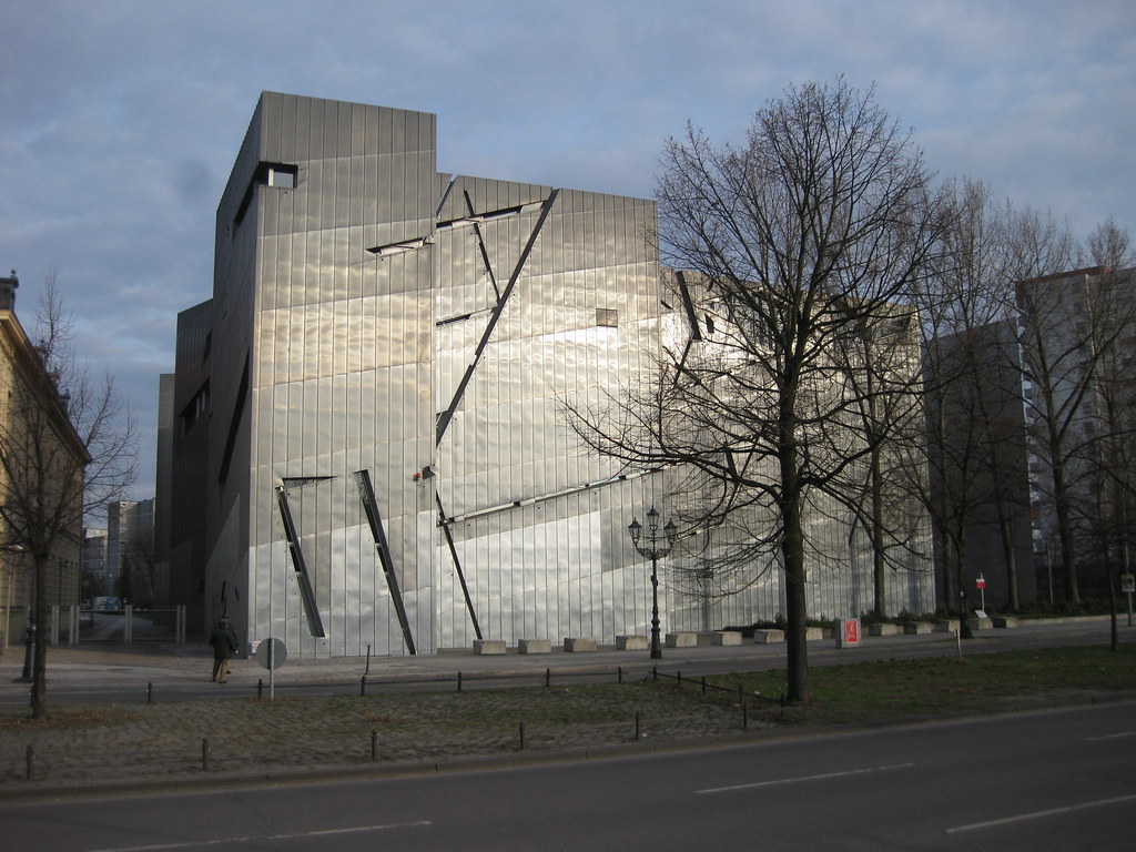
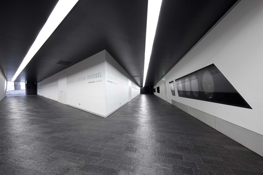
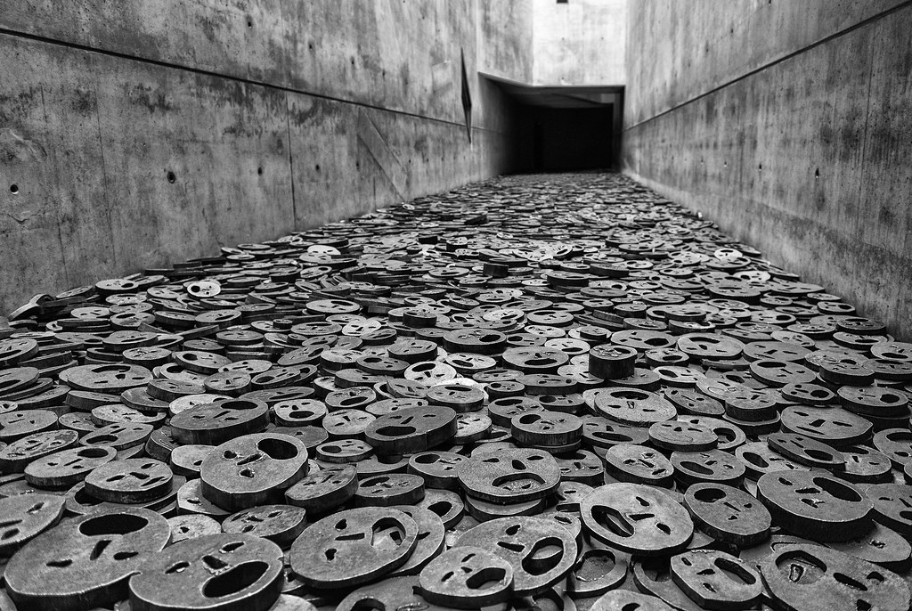
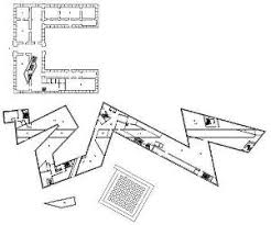
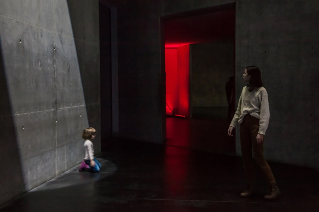
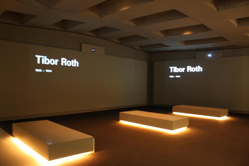
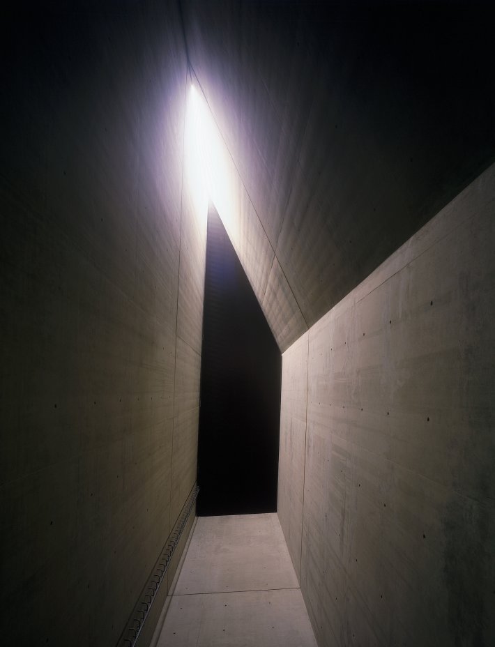
Name of the structure : Jewish Museum
Architect : Daniel Libeskind
Year : 2001
Location : Berlin, Germany
Known for : Documentation of German-Jewish history
Description : The American architect Daniel Libeskind designed one of the most legendary building with the most mesmerizing interiors and exteriors which had attracted around lakhs of people from Germany as well as around the globe. The museum gives out a disturbing, distorting and a disintegrated feeling when one explores the interiors of it.
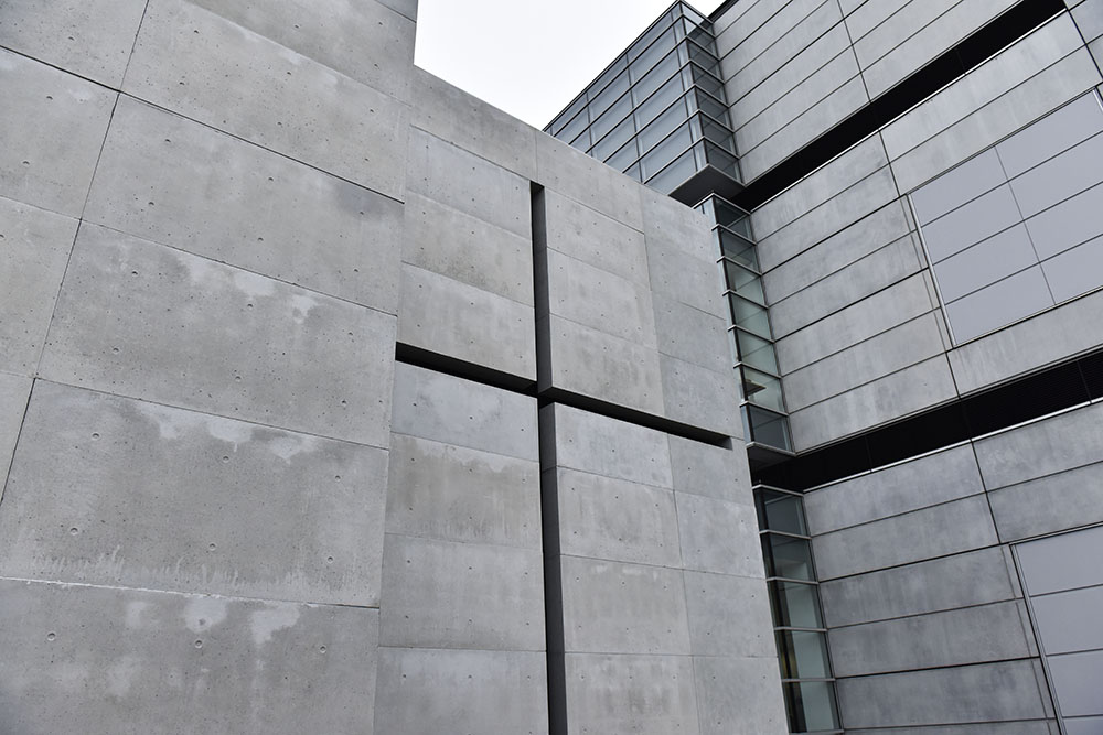
“The official name of the project is ‘Jewish Museum’ but I have named it ‘Between the Lines’ because for me it is about two lines of thinking, organization, and relationship.” —Daniel Libeskind
He designed the floor plan based on two lines the building’s visible zigzagging line and an invisible straight line. The initial is adapted by an abstraction of the Jewish star of the David which extended over the site. This structure had historical importance to represent the Jews lifestyle before, during and after the Holocaust. He associated his emotions which he felt because of the absence of the Jewish culture in Germany which included emptiness, absence to depict through the interiors and exteriors as a medium of expression. The interior consists of exposed concrete adding on a layer of a cold vibe. It has a very complex interior where the observer feels confused with the dead ends and confusing routes showing how the Jewish people felt during the World War II. It also has silver linings in between them the reinforced concretes, a representational symbol used by Libeskind to show a a ray of hope and light in places where one feels stranded and no way of escape. These were a few ways he expressed the brutal phase that the Jews faced during the Second World War.
LAST CLASS WE WERE GIVEN AN ASSIGNMENT ABOUT COLLECTING AROUND 20 TEXTURES WHICH WERE AVAILABLE AROUND US. FOLLOWING ARE THE 20 TEXTURES: